Package Exports
- input-color-picker
- input-color-picker/package.json
Readme
InputColorPicker Angular Library.
A library of color pickers in input format.
You can check out the demo here.
Installation
npm install input-color-picker --saveUsage
Import into your @NgModule.
import { NgModule } from '@angular/core'
import { FormsModule } from '@angular/forms'
import { InputColorPickerModule } from 'input-color-picker'

@NgModule({

  imports: [

    FormsModule,
    InputColorPickerModule
  ],
  declarations: []
})
export class MyModule {}
Then, using your component.
@Component( {
selector: 'app',
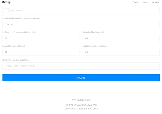
template: '<input-color-picker [(ngModel)]="color" [col]="40" [boxHeight]="48" [colorWidth]="20" [colorHeight]="20" [placeholder]="\'Color selection\'"></input-color-picker>'
} )
export class AppComponent {
public color: string
/* Optional */
this.palette = [ { color: '#ffffff', name: 'White' } ... ]
}Parameter
| Name | Type | Description | Default |
|---|---|---|---|
| [col] | number | Number of colors to include in one line | 40 |
| [palette] | array | [{color:"#ffffff",name="White"} ... ] | If you set a value, the palette will change to that value. |
| [boxHeight] | number | Box height (px) | 48 |
| [colorWidth] | number | Color width (px) | 20 |
| [colorHeight] | number | Color height (px) | 20 |
| [placeholder] | string | Placeholder before color selection | 'Color selection' |
Change Log
1.0.0 : Initial release.
License
MIT