Package Exports
- mat-timepicker
This package does not declare an exports field, so the exports above have been automatically detected and optimized by JSPM instead. If any package subpath is missing, it is recommended to post an issue to the original package (mat-timepicker) to support the "exports" field. If that is not possible, create a JSPM override to customize the exports field for this package.
Readme
Angular Material Timepicker
Installation
npm install mat-timepicker||yarn add mat-timepicker
Features:
- Clock view dialog for selecting hour and minutes and options for dialog toggle customizations.
- Input time editing.
- Validations: minDate / maxDate (options: strict - datetime check / non-strict - time check).
- The timepicker can be used with template and reactive forms.
Configuration and usage
Keep in mind that the selector for the timepicker directive is input[matTimepicker]
your.module.ts
import { MatTimepickerModule } from 'mat-timepicker';

@NgModule({
  declarations: [...],
  imports: [
    MatTimepickerModule
  ],
  ...
})
export class YourModule { }
Simple Case
<input matTimepicker>More Complex Case
<mat-form-field appearance="fill">
  <mat-label>TIMEPICKER</mat-label>

  <!-- The timepicker input -->
  <input matTimepicker #t="matTimepicker" #time="ngModel" [minDate]="minValue" [maxDate]="maxValue"
    [strict]="false" id="timepicker-example" mode="24h" [ngModel]="defaultValue"
    placeholder="Please select time..." name="time" [errorStateMatcher]="customErrorStateMatcher" required
    (timeChange)="timeChangeHandler($event)" (invalidInput)="invalidInputHandler()">

  <!-- An icon for the timepicker input that will open the timepicker dialog when clicked -->
  <mat-icon matSuffix (click)="t.showDialog()">access_time</mat-icon>

  <!-- Error that will be shown when the input date is invalid -->
  <mat-error *ngIf="time.touched && time.invalid">Invalid Date</mat-error>
</mat-form-field>
MatTimepicker Directive API
@Input() required = false;
@Input() disabled = false;
@Input() placeholder = null;

/* Override the label of the ok button. */
@Input() okLabel = 'Ok';

/* Override the label of the cancel button. */
@Input() cancelLabel = 'Cancel';

/** Override the ante meridiem abbreviation. */
@Input() anteMeridiemAbbreviation = 'am';

/** Override the post meridiem abbreviation. */
@Input() postMeridiemAbbreviation = 'pm';

/* Sets the clock mode, 12-hour or 24-hour clocks are supported. */
@Input() mode: '12h' | '24h' = '24h';

/* Set the color of the timepicker control */
@Input() color: ThemePalette = 'primary';

/* Set the value of the timepicker control */
/* ⚠️(when using template driven forms then you should use [ngModel]="someValue")⚠️ */
@Input() value: Date = new Date();

/* Minimum time to pick from */
@Input() minDate: Date;

/* Maximum time to pick from */
@Input() maxDate: Date;

/* Disables the dialog open when clicking the input field */
@Input() disableDialogOpenOnClick = false;

/* Input that allows you to control when the control is in an errored state */
/* (check out the demo app) */
@Input() errorStateMatcher: ErrorStateMatcher;

/* Strict mode checks the full date (Day/Month/Year Hours:Minutes) when doing the minDate maxDate validation. If you need to check only the Hours:Minutes then you can set it to false */
@Input() strict = true;

/* Emits when time has changed */
@Output() timeChange: EventEmitter<any> = new EventEmitter<any>();

/* Emits when the input is invalid */
@Output() invalidInput: EventEmitter<any> = new EventEmitter<any>();
Check out the Demo App! (Please note that stackblitz sometimes fails to run Angular applications properly and that doesn't mean that the library is broken)
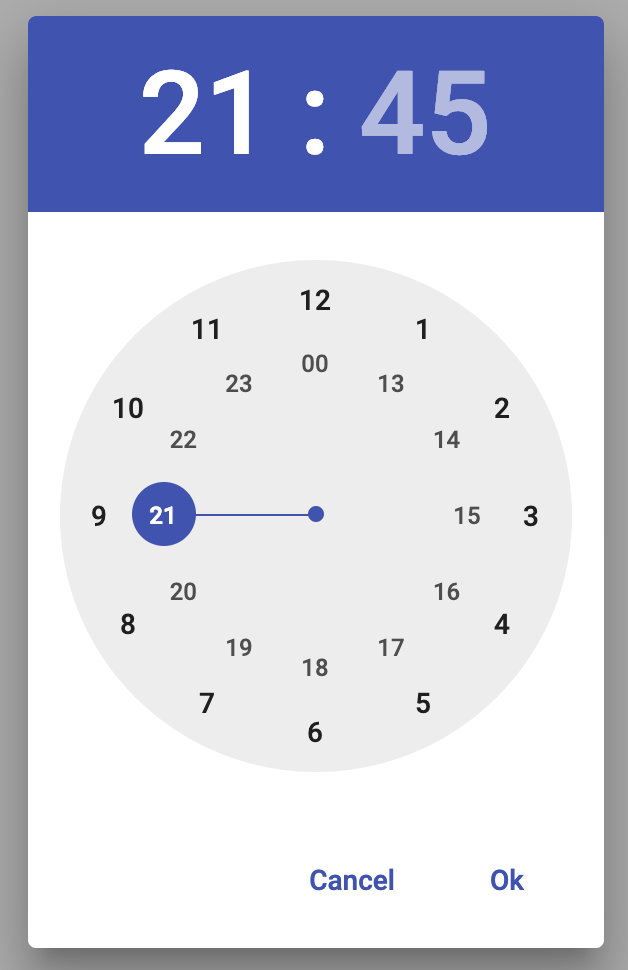
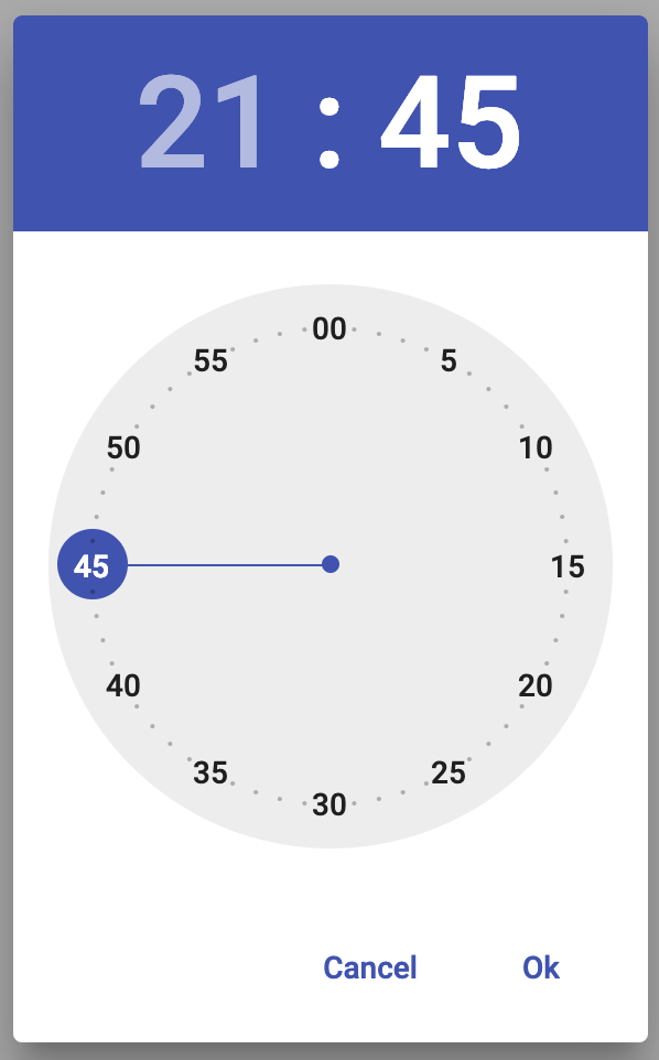
Dialog View
Hour Select (24h):

Minutes Select:
