
Package Exports
- mui-tiptap-editor
- mui-tiptap-editor/icons
Readme
mui-tiptap-editor
A customizable and easy to use Tiptap styled WYSIWYG rich text editor styled with Material UI.

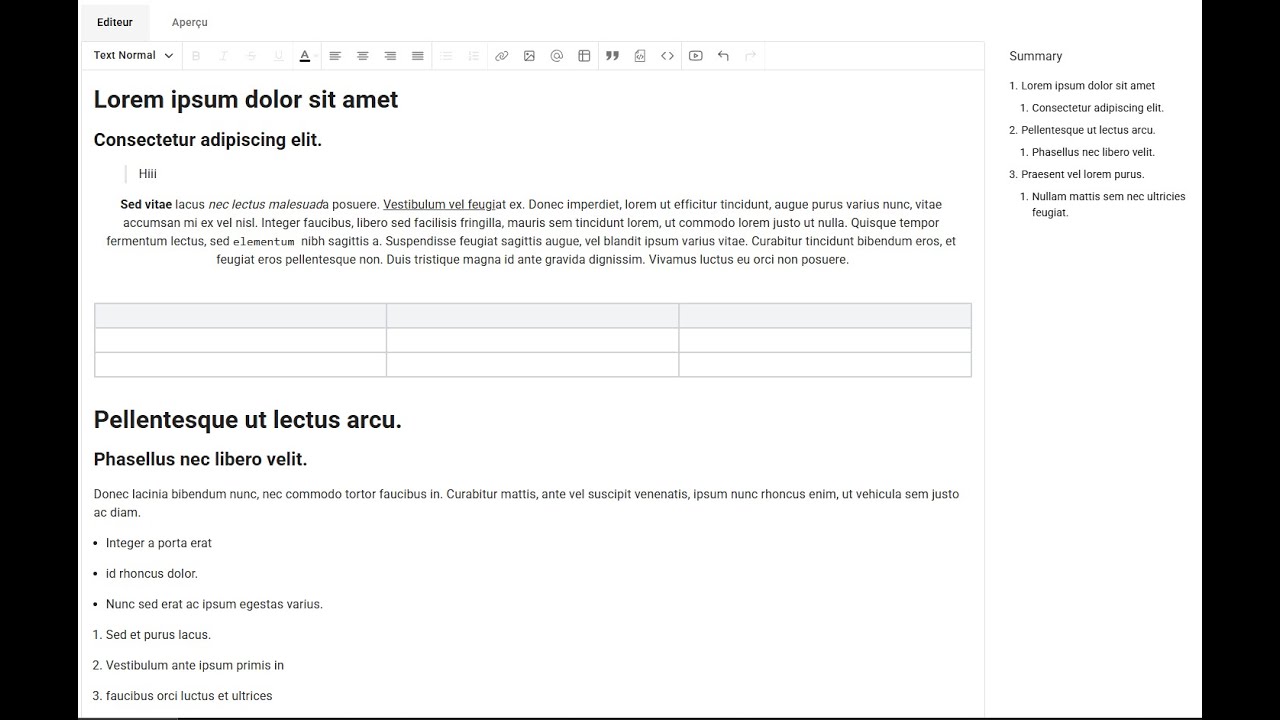
Table of Contents
Demo
Installation
npm install mui-tiptap-editor
or
yarn add mui-tiptap-editor
Please note that @mui/material (and their @emotion/ peers) are peer dependencies, meaning you should ensure they are installed before installing mui-tiptap-editor.
npm install @mui/material @emotion/react @emotion/styledor
yarn add @mui/material @emotion/react @emotion/styledGet started
Simple usage
import { TextEditor, TextEditorReadOnly } from 'mui-tiptap-editor';
import { useState } from "react";

function App() {
  const [value, setValue] = useState<string>("");

  const handleChange = (newValue: string) => setValue(newValue);

  return (
    <div>
      <TextEditor value={value} onChange={handleChange} />
      {value && <TextEditorReadOnly value={value} />}
    </div>
  );
}
Using mentions
import { TextEditor, ITextEditorOption } from 'mui-tiptap-editor';

const mentions: ITextEditorOption[] = [
  { label: "Lea Thompson", value: "id1" },
  { label: "Cyndi Lauper", value: "id2" },
  { label: "Tom Cruise", value: "id3" },
];

const currentUser: ITextEditorOption = mentions[0];

function App() {
  return (
    <TextEditor mentions={mentions} user={currentUser} userPathname="/profile" />
  );
}
Image upload
- The image can be uploaded to the server via an API call or inserted directly into the content as a base64 string.
- The image can be uploaded using the upload button, or pasted or dropped.
- Add or modify the alt text and the caption (title) of the image.
- Delete the selected image using the `Delete` key on the keyboard.
// Example: Uploading an image via an API call using fetch
// The returned value must be either the image URL (string) or an object with image attributes (src, alt, id, title, etc.)
const uploadFile = async (file: File) => {
  const formData = new FormData();
  formData.append("file", file);
  const response = await fetch("https://api.escuelajs.co/api/v1/files/upload", {
    method: "POST",
    body: formData,
  });
  const data = await response.json();
  // or return data.location
  return { id: data.filename, src: data.location };
};

function App() {
  return (
    <TextEditor
      uploadFileOptions={{
        uploadFile, // If not provided, the image will be stored as a base64 string
        maxSize: 5,  // Default is 10MB
        maxFilesNumber: 2,  // Default is 5
        allowedMimeTypes: ['image/jpeg', 'image/png', 'image/jpg'], // All image types allowed if not specified
        imageMaxWidth: 400, // Default to 1920
        imageMaxHeight: 400, // Default to 1080
      }}
    />
  );
}
See more examples of TextEditor usage here.
Read only
- Using the built-in read-only editor:
import { TextEditorReadOnly } from 'mui-tiptap-editor';

<TextEditorReadOnly value="<h1>Hello word!</h1>" />- Displaying content without using the editor:
If you only need to render HTML content (e.g., to display it on a website), you can use the
tiptap-parserpackage.
<TiptapParser content="<h1>Hello world</h1>" />Customization
Toolbar
Display only specific menus as needed:
<TextEditor toolbar={['bold', 'italic', 'underline']} />Override labels
  <TextEditor
    labels={{
      editor: {
        editor: "Editeur",
        preview: "Aperçu"
      },
      toolbar: {
        bold: "Gras",
        upload: "Ajouter une image",
        // ...
      },
      headings: {
        h1: "En-tête 1",
        // ...
      },
      table: {
        table: "Tableau",
        deleteColumn: "Supprimer la colonne",
        // ....
      },
      link: {
        link: "Lien",
        // ...
      },
      youtube: {
        link: "Lien",
        insert: "Insérer la vidéo Youtube",
        title: "Insérer une vidéo Youtube",
      },
      upload: {
        fileTooLarge: "Fichier trop volumineux",
        // ...
      }
    }}
  />
Styles
Root styles
import './index.css';

<TextEditor
  value="<p>Hello word!</p>"
  rootClassName="root"
/>
/* ./index.css */
.root {
background-color: #fff;
}
.root .MuiTab-root.Mui-selected {
background-color: yellow;
}Individual element styles
<TextEditor
  value="<p>Hello word!</p>"
  label="Content"
  tabClassName="bg-black"
  labelClassName="text-sm"
  inputClassName="border border-gray-200"
  toolbarClassName="bg-gray-500"
/>
}
Props
| props | type | Default value | Description |
|---|---|---|---|
| toolbar | string[] |
heading, bold, italic, strike, link, underline, image, code, orderedList, bulletList, align, codeBlock, blockquote, table, history, youtube, color, mention | The list of toolbar buttons to display. |
| placeholder | string |
empty | Placeholder text. |
| label | string |
empty | Label for the input. |
| error | string |
empty | Error message to display |
| withFloatingMenu | boolean |
false | Show or hide the floating menu |
| withBubbleMenu | boolean |
true | Show or hide the bubble menu |
| inputClassName | string |
empty | Override input styles |
| toolbarClassName | string |
empty | Override the toolbar menu styles |
| tabsClassName | string |
empty | Override the tabs (preview, editor) styles |
| tabClassName | string |
empty | Override a single tab’s style |
| errorClassName | string |
empty | Override the error message styles |
| rootClassName | string |
empty | Override the main container styles |
| labelClassName | string |
empty | Override the label styles |
| tableOfContentsClassName | string |
empty | Override the table of contents styles |
| bubbleMenuToolbar | string[] |
['bold', 'italic', 'underline', 'link'] |
Similar to toolbar props |
| floatingMenuToolbar | string[] |
['bold', 'italic', 'underline', 'link'] |
Similar to toolbar props |
| mentions | ITextEditorOption[] |
undefined | List of mentionable users. |
| user | ITextEditorOption |
undefined | Current user |
| value | string |
empty | Value of the input |
| onChange | (value: string) => void |
- | Function to call when the input change |
| userPathname | string |
/user | Path for mentioned user links. (eg: /user/user_id) |
| labels | ILabels |
null | OOverride text labels (useful for i18n). |
| disableTabs | boolean |
false | If true, the Editor/Preview tabs are hidden. |
| toolbarPosition | top or bottom |
bottom | Position of the toolbar |
| id | string |
empty | Used if using multiple editors on the same page, to identify uniquely each editor |
| uploadFileOptions | ImageUploadOptions |
null | Override image upload default options like max size, max file number, ... |
| disableTableOfContents | boolean |
false | If true, the table of contents is hidden. |
| tableOfContentPosition | top, left or right |
right | Position of the table of contents (Only if disableTableOfContents is false). |
|...all tiptap features|EditorOptions|empty| Can access to all tiptap useEditor props
See here how to use all the TextEditor props.
ImageUploadOptions
| props | type | Default value | Description |
|---|---|---|---|
| uploadFile | function |
undefined | Function to upload and store images on your server. |
| maxSize | number |
10 | Maximum image size in MB. |
| maxFilesNumber | number |
5 | Maximum number of images uploaded at once. |
| allowedMimeTypes | string[] |
null | Allowed MIME types (default: all). |
| imageMaxWidth | number |
1920 | Maximum image width. |
| imageMaxHeight | number |
1080 | Maximum image height. |
| maxMediaLegendLength | number |
100 | Maximum length for image captions. |
New features
| Versions | Features |
| v0.12.0 |
|
|---|---|
| v0.11.0 |
|
| v0.10.0 |
|
| v0.09.33 |
|
| v0.9.29 |
|
| v0.9.19 |
|
| v0.9.11 |
|
Contributing
Read the contribution guide here.