
Package Exports
- ng-otp-input
This package does not declare an exports field, so the exports above have been automatically detected and optimized by JSPM instead. If any package subpath is missing, it is recommended to post an issue to the original package (ng-otp-input) to support the "exports" field. If that is not possible, create a JSPM override to customize the exports field for this package.
Readme
ng-otp-input
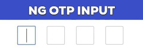
A fully customizable, one-time password input component for the web built with Angular.
Installation
npm install --save ng-otp-inputUsage
Add NgOtpInputModule to imports app.module.ts something like
import { BrowserModule } from  '@angular/platform-browser';
import { NgModule } from  '@angular/core';
import { AppComponent } from  './app.component';
import { NgOtpInputModule } from  'ng-otp-input';

    @NgModule({
    declarations: [AppComponent],
    imports: [ BrowserModule,
    NgOtpInputModule],
    bootstrap: [AppComponent]
    })
Add component to your page:
<ng-otp-input (onInputChange)="onOtpChange($event)" [config]="{length:5}"></ng-otp-input>API
| Name | Type | Required | default | Description |
|---|---|---|---|---|
| config | object | true | {length:4} | Various configuration options to customize the component |
| onOtpChange | function | true | -- | Function that will receive the otp |
| setValue | function | false | -- | Call setValue method of component to update component value. See example below |
Config options
| Name | Type | Required | default | Description |
|---|---|---|---|---|
| length | number | true | 4 | Number of OTP inputs to be rendered. |
| inputStyles | object | false | -- | Style applied to each input.Check https://angular.io/api/common/NgStyle for more info. |
| inputClass | string | false | -- | Class applied to each input. |
| containerClass | string | false | -- | Class applied to container element. |
| containerStyles | object | false | -- | Style applied to container element.Check https://angular.io/api/common/NgStyle for more info. |
| allowNumbersOnly | bool | false | -- | set true to allow only numbers as input | allowKeyCodes | string[] | false | -- | By default numbers alphabets and _ - are allowed.Y ou can define other key codes if needed. |
| isPasswordInput | bool | false | -- | set true for password type input |
| disableAutoFocus | bool | false | -- | First input will be auto focused on component load and to next empty input on setValue excecution.Set this flag to true to prevent this behaviour |
| placeholder | string | false | -- | input placeholder |
| letterCase | string | -- | -- | Set value to Upper or Lower to change the otp to upper case or lower case |
Updating component value using setValue method
Component value can be updated using setValue method of the component example:-
<ng-otp-input #ngOtpInput ></ng-otp-input> //add hash to ng-otp-input component
then in your component reference using @ViewChild and call setValue method when you want to set the value of component like
//Get reference using ViewChild and the specified hash
@ViewChild('ngOtpInput') ngOtpInputRef:any;

yourMethod(){
  this.ngOtpInputRef.setValue(yourValue);
  //yourvalue can be any string or number
}
Disable inputs
Inputs can be disabled by getting the otp form instance of the component and calling disable method
1.Get the component ref in the same way as done in SetValue method above 2.Call disable method of otpForm as follow
this.ngOtpInputRef.otpForm.disable();
License
Contributing
Add a star to show your support and feel free to open issues and pull requests!