
Package Exports
- ngx-i24-circular-progress
- ngx-i24-circular-progress/package.json
Readme
NgxI24CircularProgress
Lightweight plugin to render simple, animated and retina optimized pie charts
Features
- highly customizable
- very easy to implement
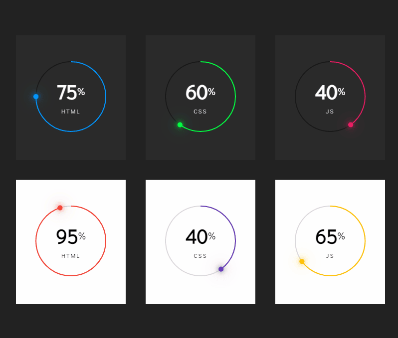
Demo
Get started
Installation
$ npm i ngx-i24-circular-progress@latestExample
TS
Module
import { NgxI24CircularProgressModule } from 'ngx-i24-circular-progress';
@NgModule({
  declarations: [ AppComponent ],
  imports: [BrowserModule, NgxI24CircularProgressModule  ],
  bootstrap: [AppComponent]
})
export class AppModule { }
Component
import { Component } from '@angular/core';
@Component({
 selector: 'app-root',
 templateUrl: './app.component.html',
 styleUrls: ['./app.component.scss']
})
export class AppComponent {
 option = {
   primaryColor: '#0495fc',
   secondaryColor: '#191919',
   percentColor: '#fff',
   textColor: '#ffffffbf',
   percent: 75,
   text: 'html',
   circleRadius: 70
 };
}
HTML
<ngx-i24-circular-progress [option]="option"></ngx-i24-circular-progress>Options
| Property (Type) | Default | Description |
|---|---|---|
| primaryColor | #0495fc | The color of the active bar |
| secondaryColor | #191919 | The color of the inactive bar |
| strokeWidth | 2 | The stroke width of the circle |
| dotWidth | 5 | The width and the height of the dot |
| numberColor | #000 | The color of the number |
| percentColor | #000 | The color of the percent sign |
| textColor | #000000bf | The color of the text |
| numberFontSize | '2.5em' | The font size of the number |
| percentFontSize | '0.5em' | The font size of the percent sign |
| textFontSize | '0.75em' | The font size of the text |
| percent | 50 | The value must be between 0 - 100 |
| text | 'css' | - |
| circleRadius | 70 | The radius of the circle |
Other Projects
| Name | Link | Description |
|---|---|---|
| ngx-weekday-picker | Link | Lightweight plugin to a pick weekday. |
| ngx-i24-color-picker | Link | A lightweight plugin to pick a color. |
Donation

Copyright
Copyright (c) 2022 Yaseen Alrefaee, contributors. Released under the MIT