
Package Exports
- ngx-scrolltop
This package does not declare an exports field, so the exports above have been automatically detected and optimized by JSPM instead. If any package subpath is missing, it is recommended to post an issue to the original package (ngx-scrolltop) to support the "exports" field. If that is not possible, create a JSPM override to customize the exports field for this package.
Readme
Angular ScrollTop Button


Lightweight, Material Design inspired button for scroll-to-top of the page. No dependencies. Pure Angular!
✓ Angular 11, Ivy and Angular Universal (SSR) compatible
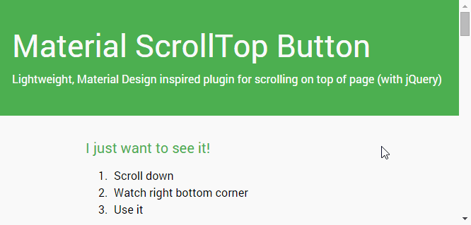
Just hit the button to smoothly scroll back to the top of the page. Here's the demo.
- Lightweight (~2 kB gzipped)
- No dependencies!
- Material Design inspired
@angular/materialcompatible (example)- Angular 5+ compatible
- Component or directive way
- Smoothly animated
- a11y ready
- Highly customizable options...
Demo (example)
Watch this demo page
Or play with it live on stackblitz.com/edit/ngx-scrolltop
Install
Automatically (recommended) 🚀
ng add ngx-scrolltopEverything's done! (module imported and all settings automatically set in your project.)
Now just see some options and examples.
Manually (old-school) 🛠
Via yarn or npm
yarn add ngx-scrolltop # npm install ngx-scrolltop --saveSetup (manually)
...
+ import { NgxScrollTopModule } from 'ngx-scrolltop';
...

@NgModule({
  imports: [
    ...
+   NgxScrollTopModule
  ],
  ...
  bootstrap: [AppComponent]
})
export class AppModule { }
Usage
Component way (default)
In app.component.html you just need to add your new button. Usually at the end of file.
<ngx-scrolltop></ngx-scrolltop>Directive way
Your custom element somewhere in you application...
Important: (no style applied, everything is up to you. Of course I recommend position: fixed, ...)
<span ngxScrollTop class="my-custom-element-with-my-style__no-lib-style-applied-here">
  ↑ My Custom Element. ↑
</span>
Options
Component
| Option | Type | Default | Description |
|---|---|---|---|
| mode | 'smart' | 'classic' | 'classic' | Smart mode shows button only when you scroll more than two screens down and then you will try to go back to top. Classic mode shows button immediately when you scroll at least one screen down. |
| backgroundColor | string | #212121 | Background color (you can use all values for backgroud-color css property). You can override theme color |
| symbolColor | string | #fafafa | Symbol color (you can use all values for fill svg property). You can override theme color |
| size | number | 40 | Button size [in pixels]. (Symbol will be resized automatically) |
↑ |
|||
| position | 'left' | 'right' | 'right' | Left or right, that is the question... |
| theme | NgxScrollTopTheme | 'gray' | Material color themes |
Symbol
Since version v2.0.0 you can use content projection for your own symbol.
<ngx-scrolltop> ↑ </ngx-scrolltop>Or you can even use your own components or fonts (e.g. fontAwesome)
<ngx-scrolltop>
  <i class="fa fa-arrow-up"></i>
</ngx-scrolltop>
Directive
| Option | Type | Default | Description |
|---|---|---|---|
| [ngxScrollTopMode] | 'smart' | 'classic' | 'classic' | Smart mode shows button only when you scroll more than two screens down and then you will try to go back to top. Classic mode shows button immediately when you scroll at least one screen down. |
Examples
Advanced example (component)
app.component.html
<ngx-scrolltop
  [size]="50"
  backgroundColor="#33691e"
  symbolColor="#fff"
  mode="smart"
  position="left"
  theme="pink"
>
  ↑
</ngx-scrolltop>
Angular Material example (directive)
@angular/material required
app.component.html
<button
  ngxScrollTop
  [ngxScrollTopMode]="'smart'"
  class="my-custom-style"
  color="primary"
  mat-mini-fab
>
  top
</button>
app.component.scss
.my-custom-style {
  position: fixed;
  right: 20px;
  bottom: 20px;
}
Dependencies
No dependencies! Pure Angular.
🧪 Experiments
Angular 12 + IVY (Goodbye ngcc)
If you're brave enough, you can play with the experimental version, which is only compiled with IVY and fully supports Angular 12 (actually Angular 11.1.x+)
yarn add ngx-scrolltop@ng12Development (notes for me)
Publish Stable
yarn release:patch
# yarn release:minor
# yarn release:major
Publish next channel
- Bump version
-beta.0inpackage.json yarn publish:next
Donation
If this project have helped you save time please consider making a donation for some 🍺 or 🍵 ;)
License
Copyright © 2021 Lukas Bartak
Proudly powered by nature 🗻, wind 💨, tea 🍵 and beer 🍺 ;)
All contents are licensed under the MIT license.