
Package Exports
- ngx-slide-modal
This package does not declare an exports field, so the exports above have been automatically detected and optimized by JSPM instead. If any package subpath is missing, it is recommended to post an issue to the original package (ngx-slide-modal) to support the "exports" field. If that is not possible, create a JSPM override to customize the exports field for this package.
Readme
Bootstrap Slide Modal for Angular 🔥 🔥 🔥
A Bootstrap slide modal module which fits perfectly for implementing welcome modal.
Installation 🚴♂️
npm install ngx-slide-modal --save
This package requires Bootstrap CSS.If you have not installed Bootstrap CSS, put this CDN on your index.html header tag 📚:
// index.html

<head>
...
    <link rel="stylesheet" href="https://stackpath.bootstrapcdn.com/bootstrap/4.3.1/css/bootstrap.min.css" integrity="sha384-ggOyR0iXCbMQv3Xipma34MD+dH/1fQ784/j6cY/iJTQUOhcWr7x9JvoRxT2MZw1T" crossorigin="anonymous">
</head>
Example Usage ❓
Add the NgxSlideModalModule to module imports to use the ngx-slide-modal component.
...
import { NgxSlideModalModule } from 'ngx-slide-modal';
...
@NgModule({
declarations: [
...
],
imports: [
...
NgxSlideModalModule
....
],
providers: [],
bootstrap: [...]
})
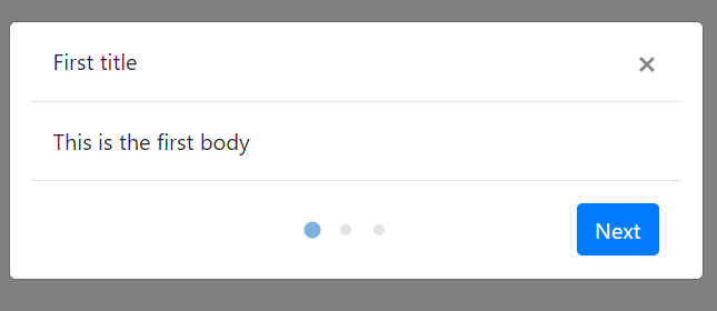
export class YourModule { }Use ngx-slide-modal component inside any of your component template which shares the same module. Put the modal-title directive for the title of the modal and modal-body directive for the body of the modal. The order of the panels will always be in sequential order if there are multiple panel bodies.
<ngx-slide-modal
    isVisible="true"
    num_of_panel="3"
    slide_title="true"
    [show_dot]="true"
    >
    <div modal-title>
        First title
    </div>
    <div modal-title>
        Second title
    </div>
    <div modal-title>
        Third title
    </div>
    <div modal-body>
        This is the first body
    </div>
    <div modal-body>
        This is the second body
    </div>
    <div modal-body>
        Hello there
    </div>
</ngx-slide-modal >
Things to note
NgxSlideModalwill only show up whenisVisibleis set to true. 😎- The number of elements with
modal-bodydirective has to match thenum_of_panelinput. - If
slide_titleinput is set totrue, the num of elements withmodal-titledirective also has to match thenum_of_panelinput - Element with
modal-bodydirective has to have block display, which meansdivis an ideal element for wrapping the content of the modal body.
API
Input
| Name | Type | Default | Description |
|---|---|---|---|
isVisible |
boolean | false |
Whether the modal is visible or not 👻. We support two-way data binding ⛖ |
num_of_panel |
number | 1 |
The total number of panels. 🔢 |
slide_title |
boolean | false |
Whether the title slides along with the modal body. If it is set to false, the slide title will stay still while the panel body changes. |
active_panel |
number | 1 |
The initial active panel index will always be 1. You can set the current active panel to any number less than the num_of_panel input 😌 |
show_dot |
boolean | false |
Whether the navigation dot is visible or not. 🧿 |
animate_speed |
number | 300 |
The speed for the slide panel transition animation ⚡ |
next_button_text |
string | Next |
The text for the next button that is used to change the active panel ⏭️ |
close_button_text |
string | Close |
The text for the close button that is used to close the panel ❌ |
Output
| Name | Type | Default | Description |
|---|---|---|---|
onNext |
EventEmitter | Specify a EventEmitter that will be emitted when a user clicks the next button. The EventEmitter will pass the new active panel index to the function parameter 🍳. | |
onClose |
EventEmitter | Specify a EventEmitter that will be emitted when a user clicks the close modal button 🏀 |