
Package Exports
- node-red-contrib-ui-iro-color-picker
This package does not declare an exports field, so the exports above have been automatically detected and optimized by JSPM instead. If any package subpath is missing, it is recommended to post an issue to the original package (node-red-contrib-ui-iro-color-picker) to support the "exports" field. If that is not possible, create a JSPM override to customize the exports field for this package.
Readme
node-red-contrib-ui-iro-color-picker
Alternative color picker node utilizing the iro.js widget. The main credit goes to James, thank you for this nice widget.
The node-red node is highly customizable inside the editor by choosing and combining several components either as a widget or a popup window.
This is my first dashboard node so any input is highly appreciated.
My main goal of getting a colour picker on mobile devices usable with my thumb is not achieved jet. I could not solve the modal popup to be exclusively on top of everything else. If someone more experienced than I in safari or angular could perhaps help me:
help needed
- fix modal popup on safari (some other ui elements still are shown above the picker widget) Any iOS / Safari / webkit expert?
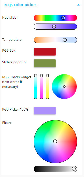
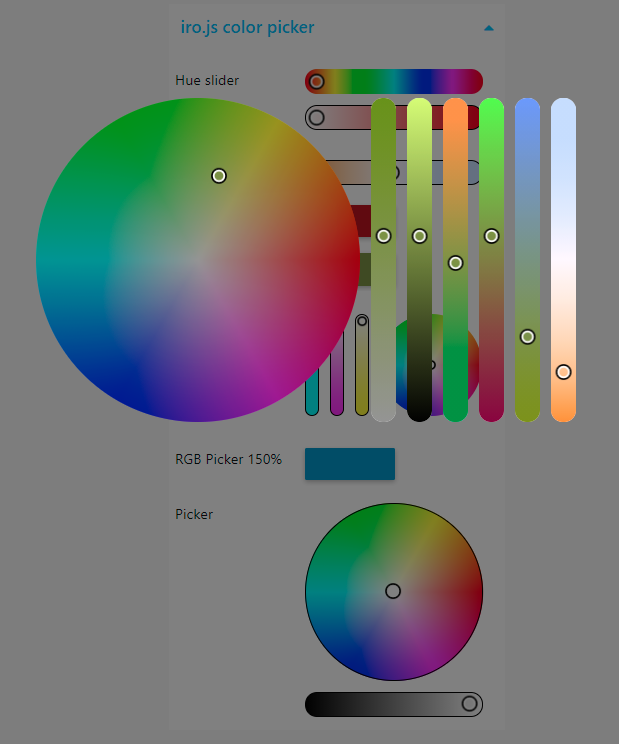
screenshots
Install
Either use the Editor - Menu - Manage Palette - Install option, or run the following command in your Node-RED user directory (typically ~/.node-red) after installing Node-RED-dashboard.
npm i node-red-contrib-ui-iro-color-pickerInputs
Send msg.payload to this node to change the color of the color picker widget. The format can be any of the color formats iro.js supports (see output formats)
Send msg.enablefalse to disable the widget.
Outputs
Node will send the color value as msg.payload. The format can be defined in the configuration dialog
General configuration
- Label:
- a text string to show on the left
- an indent for the widget to align the widget nicely
- Type:
The node can showup as a widget or a popup window
- as widget the picker will be placed in the remaining space left by the label. Depending of the selected components the widget will take the necessary height or scaled to fit.
- popup center click centered to the current mouse position
- popup center group centered to the group
- popup center window centered in the browser window
- if as popup the widget can be scaled relative to the group width
- the background color and alpha can be specified
- the background can follow the picked color
- bypass messages select this to pass all incoming messages to the output
- send
- when released send a message when the user release the mouse button
- on user interaction send on every user interaction
- the output can be limited either by a maximum frequency or dynamically
- if when confirmed is checked new messages are blocked until the last message is confiremd by the backend. This should adopt the updates according to the backend speed and the network
- if unchecked a maximum update frequency in messages per second can be defined.
- payload choose the desired output format.
- topic topic to be added to the message
- name name of the node inside the editor
Component configuration
iro.js offers a variety of different color picker styles. These can be combined as required showing a part of the color definition
- direction the components can be arranged either vertically or horizontally
- components a combination out of several components can be selected and sorted.
- Each component has these general options
- border color
- width border width in pixel. 0 or none to disable
- color wheel: The classic color wheel showing the hue. (Should be combined with a saturation slider)
- lightness fade to fade the wheel according to the lightness level constant to show full colors only
- starting angle of 0° hue level
- direction of the color wheel to be drawn
- color box: Classic color box showing the saturation and lightness of a color. (Should be combined with a hue slider or wheel)
- the hight in pixel of the box can be specified. 0 or none for a square
- sliders several different sliders can be selected and combined
- hue
- saturation
- value (lightness)
- red
- green
- blue
- alpha (transparency)
- color temperature in ° Kelvin
- minimum value (>2.000°K)
- maximum value (<40.000°K)
- Each component has these general options
Requirements
- Node-RED v19.4 or greater
- Node-RED-dashboard v2.13.0 or greater