
Package Exports
- rc-progress
- rc-progress/assets/index.css
This package does not declare an exports field, so the exports above have been automatically detected and optimized by JSPM instead. If any package subpath is missing, it is recommended to post an issue to the original package (rc-progress) to support the "exports" field. If that is not possible, create a JSPM override to customize the exports field for this package.
Readme
rc-progress
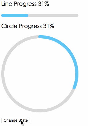
Progress Bar.


Example
http://react-component.github.io/progress/
Screenshots
Browsers
- support IE9+, Chrome, Firefox, Safari
Install

Usage
import { Line, Circle } from 'rc-progress';

ReactDOM.render(<div>
  <Line percent="10" strokeWidth="4" strokeColor="#D3D3D3" />
  <Circle percent="10" strokeWidth="4" strokeColor="#D3D3D3" />
</div>, container);
API
props
| name | type | default | description |
|---|---|---|---|
| strokeWidth | Number | 1 | Width of the stroke. Unit is percentage of SVG canvas size. |
| strokeColor | String | #2db7f5 | Stroke color. |
| trailWidth | Number | 1 | Width of the trail stroke. Unit is percentage of SVG canvas size. Trail is always centered relative to actual progress path. If trailWidth are not defined, it same as strokeWidth. |
| trailColor | String | #D9D9D9 | Color for lighter trail stroke underneath the actual progress path. |
| strokeLinecap | String | 'round' | The shape to be used at the end of the progress bar, can be `butt`, `square` or `round`. |
| prefixCls | String | rc-progress | prefix className for component |
| className | String | customized className | |
| style | Object | style object will be added to svg element | |
| percent | Number | 0 | the percent of the progress |
| gapDegree | Number | 0 | the gap degree of half circle, 0 - 360 |
| gapPosition | String | top | the gap position, value: top, bottom, left, right. |
Installation
npm install --save rc-progressDevelopment
npm install
npm start
License
rc-progress is released under the MIT license.