
Package Exports
- rc-slider
- rc-slider/assets/index.css
- rc-slider/lib/Handle
- rc-slider/lib/Slider
This package does not declare an exports field, so the exports above have been automatically detected and optimized by JSPM instead. If any package subpath is missing, it is recommended to post an issue to the original package (rc-slider) to support the "exports" field. If that is not possible, create a JSPM override to customize the exports field for this package.
Readme
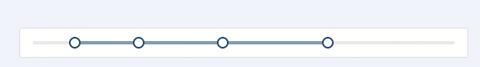
rc-slider
slider ui component for react


Screenshots


Feature
- Supports IE9, IE9+, Chrome, Firefox, Safari
Keyboard
install
Usage
require('rc-slider/assets/index.css');

var React = require('react');
var ReactDOM = require('react-dom');
var Slider = require('rc-slider');
ReactDOM.render(<Slider />, container);
API
props
| name | type | default | description |
|---|---|---|---|
| className | String | rc-slider | Additional css class for the root dom node |
| min | number | 0 | The minimum value of the slider |
| max | number | 100 | The maximum value of the slider |
| marks | object{number: string} or object{number: object{ style, label }} | {} | Mark on the slider. The key determines the position, and the value determines what will show. If you want to set the style of a specific mark point, the value should be an object which contains `style` and `label` properties. |
| step | number or `null` | 1 | Value to be added or subtracted on each step the slider makes. Must be greater than zero. max - min should be evenly divisible by the step value. When `marks` is not an empty object, `step` can be set to `null`, to make marks as steps. |
| range | boolean or number | false | Determines the type of slider. If range is `true`, two handles will be rendered in order to select a range. If range is a number, multiple handles will be rendered (number + 1). Using `range={true}` is equivalent to `range={1}`. |
| allowCross | boolean | true | When `range` is `true`, `allowCross` could be set as `true` to allow those handles to cross. |
| pushable | boolean or number | true | When `range` is `true`, `pushable` could be set as `true` to allow pushing of surrounding handles when moving an handle. When set to a number, the number will be the minimum ensured distance between handles. Example: |
| vertical | boolean | false | If vertical is `true`, the slider will be vertical. |
| defaultValue | number or [number, number, ...] | 0 or [0, 0] | Set initial positions of handles. If range is `false`, the type of `defaultValue` should be `number`. Otherwise, `[number, number, ...]` |
| value | number or [number, number, ...] | Set current positions of handles. If range is `false`, the type of `defaultValue` should be `number`. Otherwise, `[number, number, ...]` | |
| handle | Component | Provide a custom Handle to use in the slider by passing a component. This component will have a `value` and `offset` props used to define custom styling/content. | |
| included | boolean | true | If the value is `true`, it means a continuous value interval, otherwise, it is a independent value. |
| disabled | boolean | false | If `true`, handles can't be moved. |
| tipTransitionName | string | '' | Set the animation for tooltip if it shows. |
| tipFormatter | function or `null` | Format the value of the tooltip if it shows. If `null` the tooltip will always be hidden. When given a function, the first argument will be the value and the second will be the index of the slider handle. | |
| dots | bool | false | When the `step` value is greater than 1, you can set the `dots` to `true` if you want to render the slider with dots. |
| onChange | function | NOOP | `onChange` will be triggered while the value of Slider changing. |
| onAfterChange | function | NOOP | `onAfterChange` will be triggered when `ontouchend` or `onmouseup` is triggered. |
Development
npm install
npm start
Example
http://localhost:8005/examples/
online example: http://react-component.github.io/slider/
Test Case
http://localhost:8005/tests/runner.html?coverage
Coverage
License
rc-slider is released under the MIT license.