
Package Exports
- rc-tabs
- rc-tabs/assets/index.css
- rc-tabs/lib/InkTabBar
- rc-tabs/lib/InkTabBarMixin
- rc-tabs/lib/ScrollableInkTabBar
- rc-tabs/lib/ScrollableInkTabBar.js
- rc-tabs/lib/ScrollableTabBarMixin
- rc-tabs/lib/SwipeableTabContent
- rc-tabs/lib/TabBar
- rc-tabs/lib/TabContent
- rc-tabs/lib/TabContent.js
This package does not declare an exports field, so the exports above have been automatically detected and optimized by JSPM instead. If any package subpath is missing, it is recommended to post an issue to the original package (rc-tabs) to support the "exports" field. If that is not possible, create a JSPM override to customize the exports field for this package.
Readme
rc-tabs
React Tabs


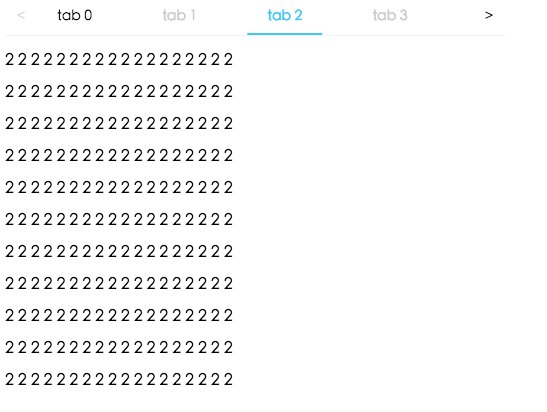
Screenshot
Example
http://localhost:8000/examples
online example: http://react-component.github.io/tabs/
install
Feature
Keyboard
- left and up: switch to previous tab
- right and down: switch to next tab
Usage
import Tabs, { TabPane } from 'rc-tabs';
import TabContent from 'rc-tabs/lib/TabContent';
import ScrollableInkTabBar from 'rc-tabs/lib/ScrollableInkTabBar';

var callback = function(key){

}

React.render(
  (
    <Tabs
      defaultActiveKey="2"
      onChange={callback}
      renderTabBar={()=><ScrollableInkTabBar />}
      renderTabContent={()=><TabContent />}
    >
      <TabPane tab='tab 1' key="1">first</TabPane>
      <TabPane tab='tab 2' key="2">second</TabPane>
      <TabPane tab='tab 3' key="3">third</TabPane>
    </Tabs>
  ),
  document.getElementById('t2'));
API
Tabs
props:
| name | type | default | description |
|---|---|---|---|
| activeKey | String | current active tabPanel's key | |
| tabBarPosition | String | tab nav 's position. one of ['left','right','top','bottom'] | |
| defaultActiveKey | String | first active tabPanel's key | initial active tabPanel's key if activeKey is absent |
| renderTabBar | ():React.Node | How to render tab bar | |
| renderTabContent | ():React.Node | How to render tab content | |
| onChange | (key: string): void | called when tabPanel is changed | |
| destroyInactiveTabPane | Boolean | false | whether destroy inactive tabpane when change tab |
TabPane
props:
| name | type | default | description |
|---|---|---|---|
| key | Object | corresponding to activeKey | |
| style | Object | ||
| placeholder | React.Node | lazyrender children | |
| tab | React.Node | current tab's title corresponding to current tabPane |
lib/TabBar
| name | type | default | description |
|---|---|---|---|
| onTabClick | (key: string): void | callback when tab clicked | |
| style | bar style | ||
| extraContent | React Node | extra content placed one the right of tab bar |
lib/InkTabBar
tab bar with ink indicator, in addition to tab bar props, extra props:
| name | type | default | description |
|---|---|---|---|
| styles | { inkBar } | can set inkBar style |
lib/ScrollableInkTabBar
scrollable tab bar with ink indicator, same with tab bar/ink bar props.
lib/TabContent
| name | type | default | description |
|---|---|---|---|
| style | {} | tab content style | |
| animated | true | whether tabpane change with animation |
lib/SwipeableTabContent
swipeable tab panes, in addition to lib/TabContent props, extra props:
| name | type | default | description |
|---|---|---|---|
| hammerOptions | {} | options for react-hammerjs |
Note
If you want to support old browsers(which does not support flex/css-transition), please load the following script inside head to add no-flexbox/no-csstransition css classes
https://as.alipayobjects.com/g/component/modernizr/2.8.3/modernizr.min.jsDevelopment
npm install
npm start
Test Case
npm test
npm run chrome-test
Coverage
npm run coverageopen coverage/ dir
License
rc-tabs is released under the MIT license.