
Package Exports
- rc-tooltip
- rc-tooltip/assets/bootstrap.css
This package does not declare an exports field, so the exports above have been automatically detected and optimized by JSPM instead. If any package subpath is missing, it is recommended to post an issue to the original package (rc-tooltip) to support the "exports" field. If that is not possible, create a JSPM override to customize the exports field for this package.
Readme
rc-tooltip
tooltip ui component for react


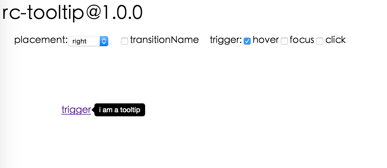
Screenshots
Feature
- support ie8,ie8+,chrome,firefox,safari
install

Usage
var Tooltip = require('rc-tooltip');
var React = require('react');
React.render(<Tooltip placement="left" trigger={['click']} overlay={<span>tooltip</span>}><a href='#'>hover</a></Tooltip>, container);
Example
http://localhost:8000/examples/index.md
online example: http://react-component.github.io/tooltip/build/examples/
API
props
| name | type | default | description |
|---|---|---|---|
| className | String | additional css class of root dom node | |
| renderPopupToBody | true | whether render popup to body | |
| prefixCls | String | rc-tooltip | prefix class name |
| transitionName | String | same as https://github.com/react-component/css-transition-group | |
| onVisibleChange | Function | call when visible is changed | |
| visible | boolean | whether tooltip is visible | |
| defaultVisible | boolean | whether tooltip is visible initially | |
| placement | String|Object | one of ['left','right','top','bottom'] or alignConfig of [dom-align](https://github.com/yiminghe/dom-align) | |
| overlay | React.Element | popup content |
Development
npm install
npm start
Test Case
http://localhost:8000/tests/runner.html?coverage
Coverage
License
rc-tooltip is released under the MIT license.