
Package Exports
- react-avatar-edit
This package does not declare an exports field, so the exports above have been automatically detected and optimized by JSPM instead. If any package subpath is missing, it is recommended to post an issue to the original package (react-avatar-edit) to support the "exports" field. If that is not possible, create a JSPM override to customize the exports field for this package.
Readme
react-avatar
👤 Load, crop and preview avatar with ReactJS component
Demo
Demo website
Install
npm i react-avatar-edit
Usage
import React from 'react'
import ReactDOM from 'react-dom'
import Avatar from 'react-avatar-edit'

class App extends React.Component {

  constructor(props) {
    super(props)
    const src = './example/einshtein.jpg'
    this.state = {
      preview: null,
      src
    }
    this.onCrop = this.onCrop.bind(this)
    this.onClose = this.onClose.bind(this)
  }

  onClose() {
    this.setState({preview: null})
  }

  onCrop(preview) {
    this.setState({preview})
  }

  render () {
    return (
      <div>
        <Avatar
          width={390}
          height={295}
          onCrop={this.onCrop}
          onClose={this.onClose}
          src={this.state.src}
        />
        <img src={this.state.preview} alt="Preview" />
      </div>
    )
  }
}

ReactDOM.render(<App /> , document.getElementById('root'))
Component properties
| Prop | Type | Description |
|---|---|---|
| img | Image | The Image object to display |
| src | String/Base64 | The url to base64 string to load (use urls from your domain to prevent security errors) |
| width | Number | The width of the editor |
| height | Number | The height of the editor (image will fit to this height if neither imageHeight, nor imageWidth is set) |
| imageWidth | Number | The desired width of the image, can not be used together with imageHeight |
| imageHeight | Number | The desired height of the image, can not be used together with imageWidth |
| cropRadius | Number | The crop area radius in px (default: 100) |
| cropColor | String | The crop border color (default: white) |
| lineWidth | Number | The crop border width (default: 4) |
| minCropRadius | Number | The min crop area radius in px (default: 30) |
| backgroundColor | Sting | The color of the image background (default: white) |
| closeIconColor | String | The close button color (default: white) |
| shadingColor | String | The shading color (default: grey) |
| shadingOpacity | Number | The shading area opacity (default: 0.6) |
| mimeTypes | String | The mime types used to filter loaded files (default: image/jpeg,image/png) |
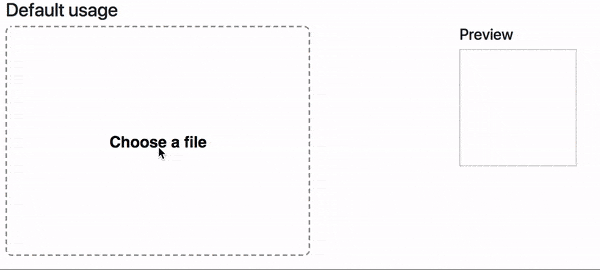
| label | String | Label text (default: Choose a file) |
| labelStyle | Object | The style object for preview label (use camel case for css properties fore example: fontSize) |
| borderStyle | Object | The style for object border preview (use camel case for css properties fore example: fontSize) |
| onImageLoad(image) | Function | Invoked when image based on src prop finish loading |
| onCrop(image) | Function | Invoked when user drag&drop event stop and return croped image in base64 sting |
| onFileLoad(file) | Function | Invoked when user upload file with internal file loader |
| onClose() | Function | Invoked when user clock on close editor button |
Contributing
- To start developer server please use
npm run start - To build production bundle use
npm run build