
Package Exports
- react-chat-ai-widget
- react-chat-ai-widget/dist/style.css
Readme
🤖 ChatWidget
A ready-to-use React component that lets you integrate an intelligent chatbot powered by Hugging Face or Replicate easily and securely.
No complex setup or model configuration needed. Just add your access_token from Hugging Face or Replicate, and you're done.
🚀 Installation
npm install react-chat-ai-widget🧠 What It Does
This component lets you deploy a chatbot in seconds. Perfect for websites, educational apps, support assistants, and more.
✅ No backend required
✅ 100% token security via specialized proxy
✅ Minimal configuration
✅ Compatible with Hugging Face or Replicate (use one, not both)
✨ Basic Usage
import { ChatWidget } from 'react-chat-ai-widget';

<ChatWidget
  data={{
    useCase: "customer-support" // customer-support per default,
    questions: [
      {
        question: "What is the open hours of the InsightFlow?",
        answer:
          "The open hours of the InsightFlow are Monday to Friday from 10am to 4pm",
        category: "general",
        confidence: 0.98
      },
      {
        question: "Who wrote Don Quixote?",
        answer: "Miguel de Cervantes",
        category: "literature",
        confidence: 0.92
      }
    ]
  }}
  huggingface="YOUR_HUGGINGFACE_TOKEN" // or use replicate
  // replicate="YOUR_REPLICATE_TOKEN"
  direction="left" // left default value
/>
🎨 Styling the Widget
To ensure the React Chat AI Widget renders correctly, you must import the widget styles in your main entry file — typically main.jsx, main.tsx, index.js, or index.ts.
Add the following import statement:
import "react-chat-ai-widget/node_modules/dist/React-Chat-Widget";🧩 Component Props
| Prop | Type | Required | Description |
|---|---|---|---|
data |
object | ✅ | Contains questions and answers the bot can use. |
huggingface |
string | ⚠️ | Hugging Face token. Do not use together with replicate. |
replicate |
string | ⚠️ | Replicate token. Do not use together with huggingface. |
direction |
string | ❌ | Chat appearance side (left, right). Default: right. |
📘 data Format
You can optionally define a useCase to control the behavior of the AI depending on your application context.
Available useCase values:
"customer-support": Friendly and helpful tone for assisting users."documentation": Answers based on structured technical information."qa-bot": Default question-answer behavior with flexible logic."strict-compliance": Very controlled and policy-aware responses.
{
  useCase: "qa-bot", // optional
  questions: [
    {
      question: "Your question?",
      answer: "The bot's answer.",
      category: "General category",
      confidence: 0.85 // range 0 to 1
    },
    // add as many as you need
  ]
}
🔐 Security
Your tokens are fully protected:
- ✅ Hugging Face or Replicate
access_tokens are never exposed directly. - ✅ All requests are processed through a secure, specialized proxy.
- ✅ All communication is encrypted and handled safely.
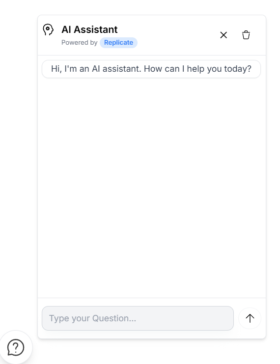
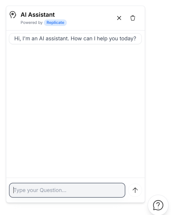
🖼️ Preview Images
Here are a few UI previews of the chatbot:
| Chat aligned left | Chat aligned right |
|---|---|
 |
 |
✅ Features
- 🧩 Plug-and-play: integrate in seconds
- 🎯 Fully customizable with your own Q&A
- 📚 Perfect for smart FAQs or help assistants
- ⚙️ Works with top AI providers
⚠️ Notes
- Do not use both
huggingfaceandreplicateprops at the same time. - Make sure to use a valid token from your Hugging Face or Replicate account.
- Use the
directionprop to set chat alignment.
🚧 Upcoming Features
Here’s what’s coming soon to make your chatbot even more flexible and powerful:
📝 Customizable Chat Title
🔧 Add a title prop to personalize the header text of your chat window.
Example: “AI Support”, “Ask me anything”, “Virtual Assistant”
🎨 Style Overrides
🧩 Introduce a styles prop to allow full UI customization.
Define your own fonts, borders, paddings, colors, and more to match your brand.
🌈 Background Color
🖼 Add a backgroundColor prop to easily change the chat container’s background.
From dark mode to pastel themes—make it your own!
📝 Choose your own model and the entire
🖼 Can choose your own model of the both service and the entire configuration of the model. like max_tokens, temperature, etc.