
Package Exports
- react-circular-slider-bar
This package does not declare an exports field, so the exports above have been automatically detected and optimized by JSPM instead. If any package subpath is missing, it is recommended to post an issue to the original package (react-circular-slider-bar) to support the "exports" field. If that is not possible, create a JSPM override to customize the exports field for this package.
Readme
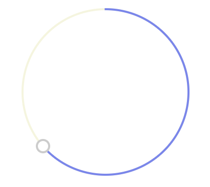
React Circular Slider Bar
Enjoy a circular slider bar component for React with no unnecessary dependencies
Key Features:
- Simple to use
- Highly customizable
- No extra dependencies
- Style based: no images / SVGs
Check the demo!
Getting started
install
npm install --save-dev react-circular-slider-barusage example
import React from 'react';
import CircularSlider from 'react-circular-slider-bar';

const myApp = () => (
  <div>
    ...my awesome stuff...
    <CircularSlider
      r={50}
      trackWidth={10}
      thumbWidth={10}
      onChange={value => console.log(value)}
    />
  </div>
);

export default myApp;
Props
| prop | type | deafult |
|---|---|---|
| r | number | 80 |
| initialAngle | number | 90 |
| trackWidth | number | 2 |
| trackColor | string | #f5f5dc |
| arcColor | string | #7985f1 |
| thumbWidth | number | 10 |
| thumbColor | string | white |
| thumbBorderWidth | number | 2 |
| thumbBorderColor | string | #cccccc |
| onChange | func | value => {} |