
Package Exports
- react-codes-input
- react-codes-input/index.js
This package does not declare an exports field, so the exports above have been automatically detected and optimized by JSPM instead. If any package subpath is missing, it is recommended to post an issue to the original package (react-codes-input) to support the "exports" field. If that is not possible, create a JSPM override to customize the exports field for this package.
Readme
react-codes-input

A react component for PIN, verify code and passcode entering. Online demo examples.
Online Demo
Codesandbox Examples
Version of 16.8.6 or higher of react and react-dom is required.
  "peerDependencies": {
    "react": ">= 16.8.6",
    "react-dom": ">= 16.8.6"
  }
Installation
npm install react-codes-input --saveDonation
Thanks for donating me a donut! ⁄(⁄ ⁄•⁄ω⁄•⁄ ⁄)⁄
Browser support
Tested on IE9+ IE10+ and Chrome and Safari(10.0.3)
This library uses require attribute of html input element, which not support IE9 from v2.1.0
Docs
| Props | Type | Description | Default | |
|---|---|---|---|---|
| initialFocus | Opt | Bool | Options are ['false', 'true'] | false |
| wrapperRef | Opt | React Ref | none | |
| codeLength | Opt | Number | 6 | |
| id | Opt | Str | random ID | |
| onChange | Opt | Func | (value: string) => void | none |
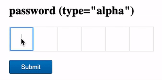
| type | Opt | Default | Options are ['alphanumeric', 'alpha', 'number'] | "alphanumeric" |
| letterCase | Opt | Str | Options are ['upper', 'lower'] | "upper" |
| value | Opt | Str | "" | |
| disabled | Opt | Bool | Options are [false, true] | false |
| hide | Opt | Bool | Options are [false, true] | false |
| placeholder | Opt | Str | "" | |
| focusColor | Opt | Str | "#007bff" | |
| classNameComponent | Opt | Str | "" | |
| classNameWrapper | Opt | Str | "" | |
| classNameCodeWrapper | Opt | Str | "" | |
| classNameEnteredValue | Opt | Str | "" | |
| classNameCode | Opt | Str | "" | |
| classNameCodeWrapperFocus | Opt | Str | {} | |
| customStyleComponent | Opt | Obj | {} | |
| customStyleWrapper | Opt | Obj | {} | |
| customStyleCodeWrapper | Opt | Obj | {} | |
| customStyleEnteredValue | Opt | Obj | {} | |
| customStyleCode | Opt | Obj | {} | |
| customStyleCodeWrapperFocus | Opt | Obj | {} | |
| customStylePlaceholder | Opt | Obj | {} |
import ReactCodesInput from 'react-codes-input';
import 'react-codes-input/lib/react-codes-input.min.css';


<ReactCodesInput
  initialFocus="" // Opt. Bool. Default false. Options are ['false', 'true'].
  wrapperRef="" // Opt. React Ref. Default none.
  codeLength="" // Opt. Number. Default 6.
  id="" // Opt. Str. Default random ID.
  onChange="" // Opt. Func. Default none.
  type="" // Opt. Str. Default "alphanumeric". Options are ['alphanumeric', 'alpha', 'number'].
  letterCase="upper" // Opt. Str. Default "upper". Options are ['upper', 'lower'].
  value="" // Opt. Str. Default "".
  disabled={false} // Opt. Bool. Default false. Options are [false, true].
  hide={false} // Opt. Bool. Default false. Options are [false, true].
  placeholder="" // Opt. Str. Default "".
  focusColor="" // Opt. Str. Default "007bff".
  classNameComponent="" // Opt. Str. Default "".
  classNameWrapper="" // Opt. Str. Default "".
  classNameCodeWrapper="" // Opt. Str. Default "".
  classNameEnteredValue="" // Opt. Str. Default "".
  classNameCode="" // Opt. Str. Default "".
  classNameCodeWrapperFocus="" // Opt. Str. Default {}.
  customStyleComponent={} // Opt. Obj. Default {}.
  customStyleWrapper={} // Opt. Obj. Default {}.
  customStyleCodeWrapper={} // Opt. Obj. Default {}.
  customStyleEnteredValue={} // Opt. Obj. Default {}.
  customStyleCode={} // Opt. Obj. Default {}.
  customStyleCodeWrapperFocus={} // Opt. Obj. Default {}.
  customStylePlaceholder={} // Opt. Obj. Default {}.
/>
Contributors ✨
Thanks goes to these wonderful people (emoji key):
 Edward Xiao 💻 📖 🚇 ⚠️ 👀 |
 bulhiCzar 💻 📖 🐛 |
This project follows the all-contributors specification. Contributions of any kind welcome!