
Package Exports
- react-edit-list
- react-edit-list/index.js
This package does not declare an exports field, so the exports above have been automatically detected and optimized by JSPM instead. If any package subpath is missing, it is recommended to post an issue to the original package (react-edit-list) to support the "exports" field. If that is not possible, create a JSPM override to customize the exports field for this package.
Readme
react-edit-list


Universal Editable List React Component
react-edit-list allows for easy creation of editable lists in React that can be interfaced with a database
- Fully customizable
- Zero-dependency
- Supports async callbacks for calling externals APIs
- Supports input validation
- Supports optional
nullfields - Supports custom field types
Installation
npm i --save react-edit-layersUsage
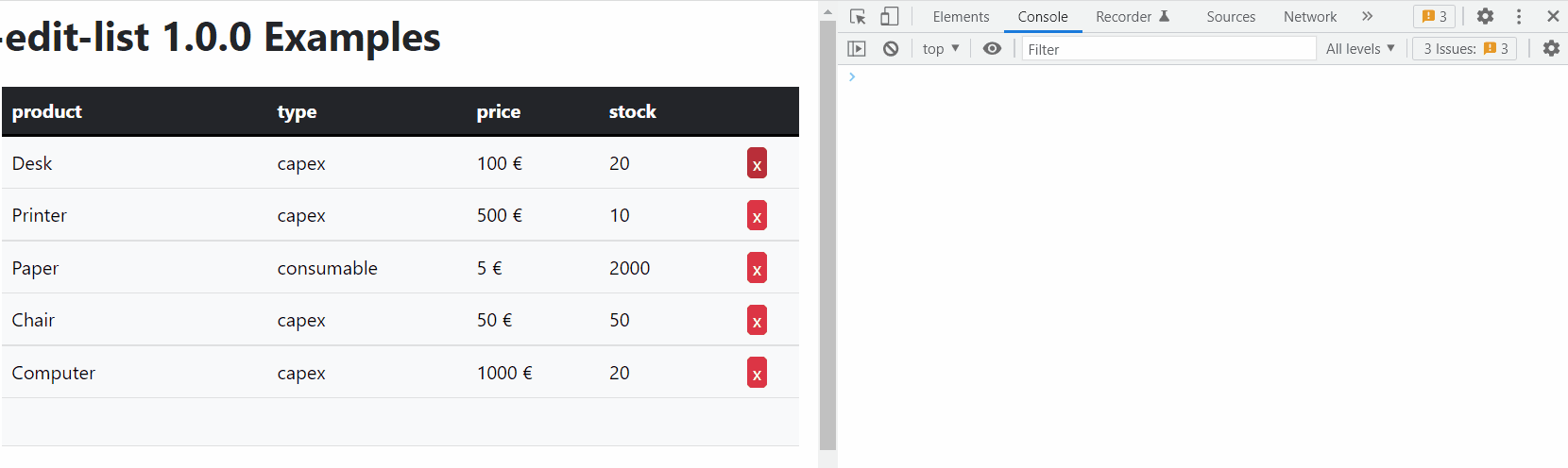
Refer to the examples
API
Table of Contents
- Element
- Schema
- Row
- Props
- schema
- onLoad
- format
- edit
- editProps
- headers
- onChange
- onInsert
- onUpdate
- onDelete
- defaultValues
- className
- btnValidateClassName
- btnDeleteClassName
- btnCancelClassName
- headClassName
- bodyClassName
- trClassName
- thClassName
- tdClassName
- inputClassName
- btnValidateElement
- btnDeleteElement
- btnCancelElement
- disableUpdate
- disableDelete
- disableInsert
- ReactEditList
Element
Field type
Type: ("id" | "string" | "number" | Array<{name: string, value: (string | undefined)}> | "custom")
Schema
Schema for the data
Type: Array<{name: string, type: Element}>
Row
A row of data
Type: Record<string, Value>
Props
ReactEditList properties
schema
The schema for the data
Type: Schema
onLoad
Will be called to load the data, can be asynchronous
Type: function (): (Array<Row> | Promise<Array<Row>>)
format
Custom field formatters
Type: Record<string, Formatter>
edit
Custom field editors
Type: Record<string, Editor>
editProps
Custom props to be passed to the field editors
Type: Record<string, Record<string, any>>
headers
Custom headers, set to null to completely disable headers
Type: Record<string, JSX.Element>
onChange
Called on every change with all the elements
Return boolean to deny the operation
Type: function (data: Array<Row>): (boolean | void | Promise<(boolean | void)>)
onInsert
Called after insertion of a new element
Return boolean to deny the operation
Return a new item to modify its contents
Type: function (item: Row): (boolean | void | Row | Promise<(boolean | void | Row)>)
onUpdate
Called after updating an existing element
Return boolean to deny the operation
Return a new item to modify its contents
Type: function (updated: Row, old: Row): (boolean | void | Row | Promise<(boolean | void | Row)>)
onDelete
Called after deleting an element
Return boolean to deny the operation
Type: function (item: Row): (boolean | void | Promise<(boolean | void)>)
defaultValues
Optional default values for new elements
Type: Row
className
Optional CSS class name
Type: string
btnValidateClassName
Optional validate button class name
Type: string
btnDeleteClassName
Optional delete button class name
Type: string
btnCancelClassName
Optional cancel button class name
Type: string
headClassName
Optional table head class name
Type: string
bodyClassName
Optional table body class name
Type: string
trClassName
Optional table TR class name
Type: string
thClassName
Optional table TH class name
Type: (string | Record<string, string>)
tdClassName
Optional table TD class name
Type: (string | Record<string, string>)
inputClassName
Optional table INPUT class name
Type: string
btnValidateElement
Optional custom button element
Type: JSX.Element
btnDeleteElement
Optional custom button element
Type: JSX.Element
btnCancelElement
Optional custom button element
Type: JSX.Element
disableUpdate
Disable updating
Type: boolean
disableDelete
Disable deleting
Type: boolean
disableInsert
Disable inserting
Type: boolean
ReactEditList
An universal editable list for React
Parameters
propsProps {Props}
Returns JSX.Element