
Package Exports
- react-inputs-validation
This package does not declare an exports field, so the exports above have been automatically detected and optimized by JSPM instead. If any package subpath is missing, it is recommended to post an issue to the original package (react-inputs-validation) to support the "exports" field. If that is not possible, create a JSPM override to customize the exports field for this package.
Readme
react-inputs-validation


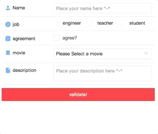
React form input validation components. Online demo examples.
Online Demo
Codesandbox Examples
- Example of online demo form playground
- Example of custom control(when
check: false) - Example of custom function(when providing
customFunc) - Example of custom function further control(when providing
customFunc) - Example of custom locales(when providing
window.REACT_INPUTS_VALIDATION['customErrorMessage']) - Example of phone and email validation(handled with
customFunc) - Example of async checking username existence (Async checking for
<Textbox>and<Textarea>only. Handled withcustomFunc) - Example of asyncMsgObj (when providing
asyncMsgObj) - Example of AREA CODE select (with
react-custom-flag-select)
Make sure you have react@16.8.6 installed.
  "peerDependencies": {
    "react": "^16.8.6",
    "react-dom": "^16.8.6"
  }
1.x, 2.x, 3.x docs go here
Docs Link (4.x)
Custom Error Message Guid(can be multiple locales)
Example of phone and email validation
Installation
npm install react-inputs-validation --saveDonation
Thanks for donating me a donut! ⁄(⁄ ⁄•⁄ω⁄•⁄ ⁄)⁄
Browser support
Tested on IE9+ and Chrome and Safari(10.0.3)
Docs
Textbox
| Props | Type | Description | Default | |
|---|---|---|---|---|
| attributesWrapper | Opt | Obj | Modify wrapper general attributes. { id: 'myTextInputWrapperId' ... } |
{} |
| attributesInput | Opt | Obj | Modify input general attributes. { id: 'myTextInputId', maxLength: 524288, name: 'myTextInputName', type: 'password', autoComplete: 'On', placeholder: 'my placeholder text', ... } |
{} |
| value | Opt | Str | "" | |
| disabled | Opt | Bool | false | |
| validate | Opt | Bool | If you have a submit button and trying to validate all the inputs of your form at once, toggle it to true, then it will validate the field and pass the result via the "validationCallback" you provide. | false |
| validationCallback | Opt | Func | Return the validation result. | none |
| classNameInput | Opt | Str | "" | |
| classNameWrapper | Opt | Str | "" | |
| classNameContainer | Opt | Str | "" | |
| customStyleInput | Opt | Obj | {} | |
| customStyleWrapper | Opt | Obj | {} | |
| customStyleContainer | Opt | Obj | {} | |
| onChange | Req | Func | (val, e) => {}. Will return the value. | (val, e) => {} |
| onBlur | Opt | Func | In order to validate the value on blur, you MUST provide a function, even if it is an empty function. Missing this, the validation on blur will not work. | none |
| onFocus | Opt | Func | none | |
| onClick | Opt | Func | none | |
| onKeyUp | Opt | Func | By providing onKeyUp, the component will perform the checking every time when user types. |
none |
| validationOption | Opt | obj | validationOption object, see below | {} |
| validationOption.name | Opt | Str | To display in the Error message. i.e Please enter your ${name}. | "" |
| validationOption.check | Opt | Bool | To determin if you need to validate. | true |
| validationOption.required | Opt | Bool | To determin if it is a required field. | true |
| validationOption.type | Opt | Str | Validation type, options are ['string', 'number', 'alphanumeric', 'alpha' |
"string" |
| validationOption.numberType | Opt | Str | Validation number type, options are ['decimal', 'int']. Handy when the validation type is number. | "decimal" |
| validationOption.showMsg | Opt | Bool | To determin display the error message or not. | true |
| validationOption.min | Opt | Num | Validation of min length when validationOption['type'] is string, min amount when validationOption['type'] is number. | 0 |
| validationOption.max | Opt | Num | Validation of max length when validationOption['type'] is string, max amount when validationOption['type'] is number. | 0 |
| validationOption.length | Opt | Num | Validation of exact length of the value. | 0 |
| validationOption.compare | Opt | Str | Compare this value to 3 to see if they are equal. | "" |
| validationOption.customFunc | Opt | Func | Custom function. Returns true or err message or { error: true, message: 'message', showOnSuccess: true }. | none |
| validationOption.reg | Opt | Bool | Custom regex. | "" |
| validationOption.regMsg | Opt | Str | Custom regex error message. | "" |
| validationOption.locale | Opt | Str | For error message display. Current options are ['zh-CN', 'en-US']; Default is 'en-US'. If your are looking for more options, you can take a look at 'window.REACT_INPUTS_VALIDATION' section, which provides the extensibility for your own locale. | "en-US" |
| validationOption.msgOnError | Opt | Str | Show your custom error message no matter what(except the message from customFunc) when it has error if it is provied. | "" |
| validationOption.msgOnSuccess | Opt | Str | Show your custom success message no matter what when it has error if it is provied. | "" |
| asyncMsgObj.error | Opt | Bool | (Server response) Backend validation result. | false |
| asyncMsgObj.message | Opt | Str | (Server response) Your AJAX message. For instance, provide it when backend returns 'USERNAME ALREADY EXIST' (For Textbox or Textarea, better reffer to Example of async checking username existence | "" |
| asyncMsgObj.showOnError | Opt | Bool | (Server response) Show AJAX error message or not. | true |
| asyncMsgObj.showOnSuccess | Opt | Bool | (Server response) Show AJAX success message or not. | false |
import { Textbox } from 'react-inputs-validation';
import 'react-inputs-validation/lib/react-inputs-validation.min.css';

<Textbox
  attributesWrapper={{}} // Optional.
  attributesInput={{ // Optional.
    id: 'Name',
    name: 'Name',
    maxLength: 10,
    type: 'text',
    placeholder: 'Place your name here ^-^',
  }}
  value={name} //Optional.[String].Default: "".
  disabled={false} //Optional.[Bool].Default: false.
  validate={validate} //Optional.[Bool].Default: false. If you have a submit button and trying to validate all the inputs of your form at once, toggle it to true, then it will validate the field and pass the result via the "validationCallback" you provide.
  validationCallback={res => this.setState({ hasNameError: res, validate: false })} //Optional.[Func].Default: none. Return the validation result.
  classNameInput="" //Optional.[String].Default: "".
  classNameWrapper="" //Optional.[String].Default: "".
  classNameContainer="" //Optional.[String].Default: "".
  customStyleInput={{}} //Optional.[Object].Default: {}.
  customStyleWrapper={{}} //Optional.[Object].Default: {}.
  customStyleContainer={{}} //Optional.[Object].Default: {}.
  onChange={(name, e) => {
    this.setState({ name });
    console.log(e);
  }} //Required.[Func].Default: () => {}. Will return the value.
  onBlur={e => {
    console.log(e);
  }} //Optional.[Func].Default: none. In order to validate the value on blur, you MUST provide a function, even if it is an empty function. Missing this, the validation on blur will not work.
  // onFocus={(e) => {console.log(e)}} //Optional.[Func].Default: none.
  // onClick={(e) => {console.log(e)}} //Optional.[Func].Default: none.
  // onKeyUp={(e) => {console.log(e)}} //Optional.[Func].Default: none.
  validationOption={{
    name: 'Name', //Optional.[String].Default: "". To display in the Error message. i.e Please enter your ${name}.
    check: true, //Optional.[Bool].Default: true. To determin if you need to validate.
    required: true, //Optional.[Bool].Default: true. To determin if it is a required field.
    // type: 'string', //Optional.[String].Default: "string". Validation type, options are ['string', 'number', 'alphanumeric', 'alpha'].
    // numberType: 'decimal', // Optional.[String].Default: "decimal". Validation number type, options are ['decimal', 'int']. Handy when the validation type is number.
    // showMsg: true, //Optional.[Bool].Default: true. To determin display the error message or not.
    // min: 2, //Optional.[Number].Default: 0. Validation of min length when validationOption['type'] is string, min amount when validationOption['type'] is number.
    // max: 10, //Optional.[Number].Default: 0. Validation of max length when validationOption['type'] is string, max amount when validationOption['type'] is number.
    // length: 2, //Optional.[Number].Default: 0. Validation of exact length of the value.
    // compare: '3', //Optional.[String].Default: "" Compare this value to 3 to see if they are equal.
    // reg: /^\d{18}|\d{15}$/, //Optional.[Bool].Default: "" Custom regex.
    // regMsg: 'failed in reg.test(${value})', //Optional.[String].Default: "" Custom regex error message.
    // locale: 'en-US', //Optional.[String].Default: "en-US". For error message display. Current options are ['zh-CN', 'en-US']; Default is 'en-US'. If your are looking for more options, you can take a look at 'window.REACT_INPUTS_VALIDATION' section, which provides the extensibility for your own locale.
    // msgOnError: "Your custom error message if you provide the validationOption['msgOnError']", //Optional.[String].Default: "" Show your custom error message no matter what(except the message from customFunc) when it has error if it is provied.
    // msgOnSuccess: "Your custom success message if you provide the validationOption['msgOnSuccess']. Otherwise, it will not show, not even green border.", //Optional.[String].Default: "". Show your custom success message no matter what when it has error if it is provied.
    // customFunc: res => { //Optional.[Func].Default: none. Custom function. Returns true or err message or { error: true, message: 'message', showOnSuccess: true }
    //   if (res != 'milk') {
    //     return 'Description cannot be other things but milk';
    //   }
    //   return true;
    // }
  }}
  // asyncMsgObj={{
  //   error: false, // Optional.[Bool].Default: false. (Server response) Backend validation result.
  //   message: '', // Optional.[String].Default: "". (Server response) Your AJAX message. For instance, provide it when backend returns 'USERNAME ALREADY EXIST'
  //   showOnError: true, // Optional.[Bool].Default: true. (Server response) Show AJAX error message or not.
  //   showOnSuccess: false, // Optional.[Bool].Default: false. (Server response) Show AJAX success message or not.
  // }}
/>;
Radiobox
| Props | Type | Description | Default | |
|---|---|---|---|---|
| attributesWrapper | Opt | Obj | Modify wrapper general attributes. { id: 'myWrapperId' ... } |
{} |
| attributesInputs | Opt | Array | Modify each radio input general attributes. [{ id: 'myRadioId1' },{ id: 'myRadioId2' }] |
[] |
| value | Opt | Str | "" | |
| disabled | Opt | Bool | false | |
| validate | Opt | Bool | If you have a submit button and trying to validate all the inputs of your form at once, toggle it to true, then it will validate the field and pass the result via the "validationCallback" you provide. | false |
| validationCallback | Opt | Func | Return the validation result. | none |
| optionList | Req | Array | [{id: 'teacher', name: 'teacher'}] | [] |
| classNameInput | Opt | Str | "" | |
| classNameWrapper | Opt | Str | "" | |
| classNameContainer | Opt | Str | "" | |
| classNameOptionListItem | Opt | Str | "" | |
| customStyleInput | Opt | Obj | {} | |
| customStyleWrapper | Opt | Obj | {} | |
| customStyleContainer | Opt | Obj | {} | |
| customStyleOptionListItem | Opt | Obj | {} | |
| onBlur | Opt | Func | In order to validate the value on blur, you MUST provide a function, even if it is an empty function. Missing this, the validation on blur will not work. | none |
| onChange | Req | Func | (val, e) => {}. Will return the value. | (val, e)=>{} |
| onFocus | Opt | Func | none | |
| onClick | Opt | Func | none | |
| validationOption | Opt | obj | validationOption object, see below | {} |
| validationOption.name | Opt | Str | To display in the Error message. i.e Please enter your ${name}. | "" |
| validationOption.check | Opt | Bool | To determin if you need to validate. | true |
| validationOption.required | Opt | Bool | To determin if it is a required field. | true |
| validationOption.showMsg | Opt | Bool | To determin display the error message or not. | true |
| validationOption.locale | Opt | Str | For error message display. Current options are ['zh-CN', 'en-US']; Default is 'en-US'. If your are looking for more options, you can take a look at 'window.REACT_INPUTS_VALIDATION' section, which provides the extensibility for your own locale. | "en-US" |
| validationOption.msgOnError | Opt | Str | Show your custom error message no matter what when it has error if it is provied. | "" |
| validationOption.msgOnSuccess | Opt | Str | Show your custom success message no matter what when it has error if it is provied. | "" |
| asyncMsgObj.error | Opt | Bool | (Server response) Backend validation result. | false |
| asyncMsgObj.message | Opt | Str | (Server response) Your AJAX message. For instance, provide it when backend returns 'USERNAME ALREADY EXIST' | "" |
| asyncMsgObj.showOnError | Opt | Bool | (Server response) Show AJAX error message or not. | true |
| asyncMsgObj.showOnSuccess | Opt | Bool | (Server response) Show AJAX success message or not. | false |
import { Radiobox } from 'react-inputs-validation';
import 'react-inputs-validation/lib/react-inputs-validation.min.css';

<Radiobox
  attributesWrapper={{ id: 'job' }} //Optional.
  attributesInputs={[{ id: 'job1', name: 'job1' }, { id: 'job1', name: 'job1' }]} //Optional.
  disabled={false} //Optional.[Bool].Default: false.
  value={job} //Optional.[String].Default: "".
  validate={validate} //Optional.[Bool].Default: false. If you have a submit button and trying to validate all the inputs of your form at once, toggle it to true, then it will validate the field and pass the result via the "validationCallback" you provide.
  validationCallback={res =>
    this.setState({ hasJobError: res, validate: false })} //Optional.[Func].Default: none. Return the validation result.
  optionList={JOB_OPTIONS_LIST}
  classNameInput="" //Optional.[String].Default: "".
  classNameWrapper="" //Optional.[String].Default: "".
  classNameContainer="" //Optional.[String].Default: "".
  classNameOptionListItem="" //Optional.[String].Default: "".
  customStyleInput={{}} //Optional.[Object].Default: {}.
  customStyleWrapper={{}} //Optional.[Object].Default: {}.
  customStyleContainer={{
    display: 'flex',
    justifyContent: 'flex-start'
  }} //Optional.[Object].Default: {}.
  customStyleOptionListItem={{ marginRight: '20px' }} //Optional.[Object].Default: {}.
  onChange={(job, e) =>{
    this.setState({ job });
    console.log(e);
  }} //Required.[Func].Default: () => {}. Will return the value.
  onBlur={(e) => {console.log(e)}} //Optional.[Func].Default: none.
  // onFocus={(e) => {console.log(e)}} //Optional.[Func].Default: none.
  // onClick={(e) => {console.log(e)}} //Optional.[Func].Default: none.
  validationOption={{
    name: 'Name', //Optional.[String].Default: "". To display in the Error message. i.e Please enter your ${name}.
    check: true, //Optional.[Bool].Default: true. To determin if you need to validate.
    required: true, //Optional.[Bool].Default: true. To determin if it is a required field.
    // showMsg: true, //Optional.[Bool].Default: true. To determin display the error message or not.
    // locale: 'en-US', //Optional.[String].Default: "en-US". For error message display. Current options are ['zh-CN', 'en-US']; Default is 'en-US'. If your are looking for more options, you can take a look at 'window.REACT_INPUTS_VALIDATION' section, which provides the extensibility for your own locale.
    // msgOnError: "Your custom error message if you provide the validationOption['msgOnError']", //Optional.[String].Default: "". Show your custom error message no matter what when it has error if it is provied.
    // msgOnSuccess: "Your custom success message if you provide the validationOption['msgOnSuccess']. Otherwise, it will not show, not even green border." //Optional.[String].Default: "". Show your custom success message no matter what when it has error if it is provied.
  }}
  // asyncMsgObj={{
  //   error: false, // Optional.[Bool].Default: false. (Server response) Backend validation result.
  //   message: '', // Optional.[String].Default: "". (Server response) Your AJAX message. For instance, provide it when backend returns 'USERNAME ALREADY EXIST'
  //   showOnError: true, // Optional.[Bool].Default: true. (Server response) Show AJAX error message or not.
  //   showOnSuccess: false, // Optional.[Bool].Default: false. (Server response) Show AJAX success message or not.
  // }}
/>
Checkbox
| Props | Type | Description | Default | |
|---|---|---|---|---|
| attributesWrapper | Opt | Obj | Modify wrapper general attributes. { id: 'myWrapperId' ... } |
{} |
| attributesInput | Opt | Obj | Modify input general attributes. { id: 'myCheckboxId', ... } |
{} |
| value | Opt | Str | "" | |
| checked | Req | Bool | Recommend using the value returned from onChange callback, which is isChecked. |
false |
| disabled | Opt | Bool | false | |
| validate | Opt | Bool | If you have a submit button and trying to validate all the inputs of your form at once, toggle it to true, then it will validate the field and pass the result via the "validationCallback" you provide. | false |
| validationCallback | Opt | Func | Return the validation result. | none |
| classNameWrapper | Opt | Str | "" | |
| classNameInputBox | Opt | Str | "" | |
| classNameContainer | Opt | Str | "" | |
| customStyleWrapper | Opt | Obj | {} | |
| customStyleInputBox | Opt | Obj | {} | |
| customStyleContainer | Opt | Obj | {} | |
| onBlur | Opt | Func | In order to validate the value on blur, you MUST provide a function, even if it is an empty function. Missing this, the validation on blur will not work. | none |
| onChange | Req | Func | (isChecked, e) => {}. Will return the value. | (val, e)=>{} |
| onFocus | Opt | Func | none | |
| onClick | Opt | Func | none | |
| labelHtml | Req | Html | none | |
| validationOption | Opt | obj | validationOption object, see below | {} |
| validationOption.name | Opt | Str | To display in the Error message. i.e Please enter your ${name}. | "" |
| validationOption.check | Opt | Bool | To determin if you need to validate. | true |
| validationOption.required | Opt | Bool | To determin if it is a required field. | true |
| validationOption.showMsg | Opt | Bool | To determin display the error message or not. | true |
| validationOption.locale | Opt | Str | For error message display. Current options are ['zh-CN', 'en-US']; Default is 'en-US'. If your are looking for more options, you can take a look at 'window.REACT_INPUTS_VALIDATION' section, which provides the extensibility for your own locale. | "en-US" |
| validationOption.msgOnError | Opt | Str | Show your custom error message no matter what when it has error if it is provied. | "" |
| validationOption.msgOnSuccess | Opt | Str | Show your custom success message no matter what when it has error if it is provied. | "" |
| asyncMsgObj.error | Opt | Bool | (Server response) Backend validation result. | false |
| asyncMsgObj.message | Opt | Str | (Server response) Your AJAX message. For instance, provide it when backend returns 'USERNAME ALREADY EXIST' | "" |
| asyncMsgObj.showOnError | Opt | Bool | (Server response) Show AJAX error message or not. | true |
| asyncMsgObj.showOnSuccess | Opt | Bool | (Server response) Show AJAX success message or not. | false |
import { Checkbox } from 'react-inputs-validation';
import 'react-inputs-validation/lib/react-inputs-validation.min.css';

<Checkbox
  attributesWrapper={{}} //Optional.
  attributesInput={{ id: 'agreement', name: 'agreement'}} //Optional.
  value={agreement} //Required.[String].Default: "".
  checked={isAgreementChecked} //Required.[Bool].Default: false.
  disabled={false} //Optional.[Bool].Default: false.
  validate={validate} //Optional.[Bool].Default: false. If you have a submit button and trying to validate all the inputs of your form at once, toggle it to true, then it will validate the field and pass the result via the "validationCallback" you provide.
  validationCallback={res =>
    this.setState({
      hasAgreementError: res,
      validate: false
    })} //Optional.[Func].Default: none. Return the validation result.
  classNameWrapper="" //Optional.[String].Default: "".
  classNameInputBox="" //Optional.[String].Default: "".
  classNameContainer="" //Optional.[String].Default: "".
  customStyleWrapper={{}} //Optional.[Object].Default: {}.
  customStyleInputBox={{}} //Optional.[Object].Default: {}.
  customStyleContainer={{}} //Optional.[Object].Default: {}.
  onBlur={() => {}} //Optional.[Func].Default: none. In order to validate the value on blur, you MUST provide a function, even if it is an empty function. Missing this, the validation on blur will not work.
  // onFocus={(e) => {console.log(e)}} //Optional.[Func].Default: none.
  // onClick={(e) => {console.log(e)}} //Optional.[Func].Default: none.
  onChange={(isAgreementChecked, e) => {
    this.setState({ isAgreementChecked });
    console.log(e);
  }} //Required.[Func].Default: () => {}. Will return the value.
  labelHtml={
    <div style={{ color: '#4a4a4a', marginTop: '2px' }}>
      agree?
    </div>
  } //Required.[Html].Default: none.
  validationOption={{
    name: 'agreement', //Optional.[String].Default: "". To display in the Error message. i.e Please check the ${name}.
    check: true, //Optional.[Bool].Default: true. To determin if you need to validate.
    required: true, //Optional.[Bool].Default: true. To determin if it is a required field.
    // showMsg: true, //Optional.[Bool].Default: true. To determin display the error message or not.
    // locale: 'en-US', //Optional.[String].Default: "en-US". For error message display. Current options are ['zh-CN', 'en-US']; Default is 'en-US'. If your are looking for more options, you can take a look of 'window.REACT_INPUTS_VALIDATION' section, which provides the extensibility for your own locale.
    // msgOnError: "Your custom error message if you provide the validationOption['msgOnError']", //Optional.[String].Default: "". Show your custom error message no matter what when it has error if it is provied.
    // msgOnSuccess: "Your custom success message if you provide the validationOption['msgOnSuccess']. Otherwise, it will not show, not even green border." //Optional.[String].Default: "". Show your custom success message no matter what when it has error if it is provied.
  }}
  // asyncMsgObj={{
  //   error: false, // Optional.[Bool].Default: false. (Server response) Backend validation result.
  //   message: '', // Optional.[String].Default: "". (Server response) Your AJAX message. For instance, provide it when backend returns 'USERNAME ALREADY EXIST'
  //   showOnError: true, // Optional.[Bool].Default: true. (Server response) Show AJAX error message or not.
  //   showOnSuccess: false, // Optional.[Bool].Default: false. (Server response) Show AJAX success message or not.
  // }}
/>
Select
| Props | Type | Description | Default | |
|---|---|---|---|---|
| attributesWrapper | Opt | Obj | Modify wrapper general attributes. { id: 'myWrapperId' ... } |
{} |
| attributesInput | Opt | Obj | Modify input general attributes. { id: 'mySelectId', ... } |
{} |
| value | Opt | Str | "" | |
| disabled | Opt | Bool | false | |
| validate | Opt | Bool | false | |
| validationCallback | Opt | Func | none | |
| optionList | Req | Array | [{id: '1', name: 'Twin Peaks'] | [] |
| classNameSelect | Opt | Str | "" | |
| classNameWrapper | Opt | Str | "" | |
| classNameContainer | Opt | Str | "" | |
| classNameOptionListContainer | Opt | Str | "" | |
| classNameOptionListItem | Opt | Str | "" | |
| customStyleSelect | Opt | Obj | {} | |
| customStyleWrapper | Opt | Obj | {} | |
| customStyleContainer | Opt | Obj | {} | |
| customStyleOptionListContainer | Opt | Obj | {} | |
| customStyleOptionListItem | Opt | Obj | {} | |
| onBlur | Opt | Func | In order to validate the value on blur, you MUST provide a function, even if it is an empty function. Missing this, the validation on blur will not work. | none |
| onChange | Req | Func | (val, e) => {} | |
| onFocus | Opt | Func | none | |
| onClick | Opt | Func | none | |
| validationOption | Opt | obj | {} | |
| validationOption.name | Opt | Str | To display in the Error message. i.e Please enter your ${name}. | "" |
| validationOption.check | Opt | Bool | To determin if you need to validate. | true |
| validationOption.required | Opt | Bool | To determin if it is a required field. | true |
| validationOption.showMsg | Opt | Bool | To determin display the error message or not. | true |
| validationOption.locale | Opt | Str | For error message display. Current options are ['zh-CN', 'en-US']; Default is 'en-US'. If your are looking for more options, you can take a look at 'window.REACT_INPUTS_VALIDATION' section, which provides the extensibility for your own locale. | "en-US" |
| validationOption.msgOnError | Opt | Str | Show your custom error message no matter what when it has error if it is provied. | "" |
| validationOption.msgOnSuccess | Opt | Str | Show your custom success message no matter what when it has error if it is provied. | "" |
| asyncMsgObj.error | Opt | Bool | (Server response) Backend validation result. | false |
| asyncMsgObj.message | Opt | Str | (Server response) Your AJAX message. For instance, provide it when backend returns 'USERNAME ALREADY EXIST' | "" |
| asyncMsgObj.showOnError | Opt | Bool | (Server response) Show AJAX error message or not. | true |
| asyncMsgObj.showOnSuccess | Opt | Bool | (Server response) Show AJAX success message or not. | false |
import { Select } from 'react-inputs-validation';
import 'react-inputs-validation/lib/react-inputs-validation.min.css';

<Select
  attributesWrapper={{}} //Optional.
  attributesInput={{ id: 'country', name: 'country'}} //Optional.
  value={movie} //Optional.[String].Default: "".
  disabled={false} //Optional.[Bool].Default: false.
  validate={validate} //Optional.[Bool].Default: false. If you have a submit button and trying to validate all the inputs of your form at once, toggle it to true, then it will validate the field and pass the result via the "validationCallback" you provide.
  validationCallback={res =>
    this.setState({ hasMovieError: res, validate: false })} //Optional.[Func].Default: none. Return the validation result.
  optionList={MOVIE_OPTIONS_LIST} //Required.[Array of Object(s)].Default: [].
  classNameSelect="" //Optional.[String].Default: "".
  classNameWrapper="" //Optional.[String].Default: "".
  classNameContainer="" //Optional.[String].Default: "".
  classNameOptionListContainer="" //Optional.[String].Default: "".
  classNameOptionListItem="" //Optional.[String].Default: "".
  customStyleSelect={{}} //Optional.[Object].Default: {}.
  customStyleWrapper={{}} //Optional.[Object].Default: {}.
  customStyleContainer={{}} //Optional.[Object].Default: {}.
  customStyleOptionListContainer={{}} //Optional.[Object].Default: {}.
  customStyleOptionListItem={{}} //Optional.[Object].Default: {}.
  onChange={(movie, e) => {
    this.setState({ movie });
    console.log(e);
  }} //Optional.[Func].Default: () => {}. Will return the value.
  onBlur={() => {}} //Optional.[Func].Default: none. In order to validate the value on blur, you MUST provide a function, even if it is an empty function. Missing this, the validation on blur will not work.
  // onFocus={(e) => {console.log(e)}} //Optional.[Func].Default: none.
  // onClick={(e) => {console.log(e)}} //Optional.[Func].Default: none.
  validationOption={{
    name: 'movie', //Optional.[String].Default: "". To display in the Error message. i.e Please select a ${name}.
    check: true, //Optional.[Bool].Default: true. To determin if you need to validate.
    required: true, //Optional.[Bool].Default: true. To determin if it is a required field.
    // showMsg: true, //Optional.[Bool].Default: true. To determin display the error message or not.
    // locale: 'en-US', //Optional.[String].Default: "en-US". For error message display. Current options are ['zh-CN', 'en-US']; Default is 'en-US'. If your are looking for more options, you can take a look at 'window.REACT_INPUTS_VALIDATION' section, which provides the extensibility for your own locale.
    // msgOnError: "Your custom error message if you provide the validationOption['msgOnError']", //Optional.[String].Default: "". Show your custom error message no matter what when it has error if it is provied.
    // msgOnSuccess: "Your custom success message if you provide the validationOption['msgOnSuccess']. Otherwise, it will not show, not even green border." //Optional.[String].Default: "". Show your custom success message no matter what when it has error if it is provied.
  }}
  // asyncMsgObj={{
  //   error: false, // Optional.[Bool].Default: false. (Server response) Backend validation result.
  //   message: '', // Optional.[String].Default: "". (Server response) Your AJAX message. For instance, provide it when backend returns 'USERNAME ALREADY EXIST'
  //   showOnError: true, // Optional.[Bool].Default: true. (Server response) Show AJAX error message or not.
  //   showOnSuccess: false, // Optional.[Bool].Default: false. (Server response) Show AJAX success message or not.
  // }}
/>
Textarea
| Props | Type | Description | Default | |
|---|---|---|---|---|
| attributesWrapper | Opt | Obj | Modify wrapper general attributes. { id: 'myWrapperId' ... } |
{} |
| attributesInput | Opt | Obj | Modify input general attributes. { id: 'myTextareaInputId', maxLength: 524288, name: 'myTextareaInputName', rows: 2, cols: 2, placeholder: 'my placeholder text', ... } |
{} |
| value | Opt | Str | "" | |
| disabled | Opt | Bool | false | |
| validate | Opt | Bool | If you have a submit button and trying to validate all the inputs of your form at once, toggle it to true, then it will validate the field and pass the result via the "validationCallback" you provide. | false |
| validationCallback | Opt | Func | Return the validation result. | none |
| classNameInput | Opt | Str | "" | |
| classNameWrapper | Opt | Str | "" | |
| classNameContainer | Opt | Str | "" | |
| customStyleInput | Opt | Obj | {} | |
| customStyleWrapper | Opt | Obj | {} | |
| customStyleContainer | Opt | Obj | {} | |
| onChange | Req | Func | (val, e) => {}. Will return the value. | (val, e) => {} |
| onBlur | Opt | Func | In order to validate the value on blur, you MUST provide a function, even if it is an empty function. Missing this, the validation on blur will not work. | none |
| onFocus | Opt | Func | none | |
| onClick | Opt | Func | none | |
| onKeyUp | Opt | Func | By providing onKeyUp, the component will perform the checking every time when user types. |
none |
| validationOption | Opt | obj | validationOption object, see below | {} |
| validationOption.name | Opt | Str | To display in the Error message. i.e Please enter your ${name}. | "" |
| validationOption.check | Opt | Bool | To determin if you need to validate. | true |
| validationOption.required | Opt | Bool | To determin if it is a required field. | true |
| validationOption.type | Opt | Str | Validation type, options are ['string']. | "string" |
| validationOption.showMsg | Opt | Bool | To determin display the error message or not. | true |
| validationOption.min | Opt | Num | Validation of min length. | 0 |
| validationOption.max | Opt | Num | Validation of max length. | 0 |
| validationOption.length | Opt | Num | Validation of exact length of the value. | 0 |
| validationOption.customFunc | Opt | Func | Custom function. Returns true or err message or { error: true, message: 'message', showOnSuccess: true }. | none |
| validationOption.reg | Opt | Bool | Custom regex. | "" |
| validationOption.regMsg | Opt | Str | Custom regex error message. | "" |
| validationOption.locale | Opt | Str | For error message display. Current options are ['zh-CN', 'en-US']; Default is 'en-US'. If your are looking for more options, you can take a look at 'window.REACT_INPUTS_VALIDATION' section, which provides the extensibility for your own locale. | "en-US" |
| validationOption.msgOnError | Opt | Str | Show your custom error message no matter what(except the message from customFunc) when it has error if it is provied. | "" |
| validationOption.msgOnSuccess | Opt | Str | Show your custom success message no matter what when it has error if it is provied. | "" |
| asyncMsgObj.error | Opt | Bool | (Server response) Backend validation result. | false |
| asyncMsgObj.message | Opt | Str | (Server response) Your AJAX message. For instance, provide it when backend returns 'USERNAME ALREADY EXIST' (For Textbox or Textarea, better reffer to Example of async checking username existence | "" |
| asyncMsgObj.showOnError | Opt | Bool | (Server response) Show AJAX error message or not. | true |
| asyncMsgObj.showOnSuccess | Opt | Bool | (Server response) Show AJAX success message or not. | false |
import { Textarea } from 'react-inputs-validation';
import 'react-inputs-validation/lib/react-inputs-validation.min.css';

<Textarea
  attributesWrapper={{}} //Optional.
  attributesInput={{ //Optional.
    id: 'description',
    name: 'description',
    placeholder: 'Place your description here ^-^',
    // maxLength: '10',
    // cols: '10',
    // rows: '10',
  }}
  value={description} //Optional.[String].Default: "".
  disabled={false} //Optional.[Bool].Default: false.
  validate={validate} //Optional.[Bool].Default: false. If you have a submit button and trying to validate all the inputs of your form at once, toggle it to true, then it will validate the field and pass the result via the "validationCallback" you provide.
  validationCallback={res =>
    this.setState({
      hasDescriptionError: res,
      validate: false,
    })
  } //Optional.[Func].Default: none. Return the validation result.
  classNameInput="" //Optional.[String].Default: "".
  classNameWrapper="" //Optional.[String].Default: "".
  classNameContainer="" //Optional.[String].Default: "".
  customStyleInput={{}} //Optional.[Object].Default: {}.
  customStyleWrapper={{}} //Optional.[Object].Default: {}.
  customStyleContainer={{}} //Optional.[Object].Default: {}.
  onChange={(description, e) => {
    this.setState({ description });
    console.log(e);
  }} //Required.[Func].Default: () => {}. Will return the value.
  onBlur={e => {
    console.log(e);
  }} //Optional.[Func].Default: none. In order to validate the value on blur, you MUST provide a function, even if it is an empty function. Missing this, the validation on blur will not work.
  // onFocus={(e) => {console.log(e)}} //Optional.[Func].Default: none.
  // onClick={(e) => {console.log(e)}} //Optional.[Func].Default: none.
  // onKeyUp={(e) => {console.log(e)}} //Optional.[Func].Default: none.
  validationOption={{
    name: 'Description', //Optional.[String].Default: "". To display in the Error message. i.e Please enter your ${name}.
    check: true, //Optional.[Bool].Default: true. To determin if you need to validate.
    required: true, //Optional.[Bool].Default: true. To determin if it is a required field.
    type: 'string', //Optional.[String].Default: "string". Validation type, options are ['string'].
    // showMsg: true, //Optional.[Bool].Default: true. To determin display the error message or not.
    // locale: 'en-US', //Optional.[String].Default: "en-US". For error message display. Current options are ['zh-CN', 'en-US']; Default is 'en-US'. If your are looking for more options, you can take a look at 'window.REACT_INPUTS_VALIDATION' section, which provides the extensibility for your own locale.
    // min: 2, //Optional.[Number].Default: 0. Validation of min length.
    // max: 10, //Optional.[Number].Default: 0. Validation of max length.
    // length: 2, //Optional.[Number].Default: 0. Validation of exact length of the value.
    // reg: /^\d{18}|\d{15}$/, //Optional.[Bool].Default: "". Custom regex.
    // regMsg: 'failed in reg.test(${value})', //Optional.[String].Default: "". Custom regex error message.
    // msgOnError: "Your custom error message if you provide the validationOption['msgOnError']", //Optional.[String].Default: "". Show your custom error message no matter what(except the message from customFunc) when it has error if it is provied.
    // msgOnSuccess: "Your custom success message if you provide the validationOption['msgOnSuccess']. Otherwise, it will not show, not even green border.", //Optional.[String].Default: "". Show your custom success message no matter what when it has error if it is provied.
    // customFunc: res => { //Optional.[Func].Default: none. Custom function. Returns true or err message or { error: true, message: 'message', showOnSuccess: true }
    //   if (res != 'banana') {
    //     return 'Description cannot be other things but banana';
    //   }
    //   return true;
    // }
  }}
  // asyncMsgObj={{
  //   error: false, // Optional.[Bool].Default: false. (Server response) Backend validation result.
  //   message: '', // Optional.[String].Default: "". (Server response) Your AJAX message. For instance, provide it when backend returns 'USERNAME ALREADY EXIST'
  //   showOnError: true, // Optional.[Bool].Default: true. (Server response) Show AJAX error message or not.
  //   showOnSuccess: false, // Optional.[Bool].Default: false. (Server response) Show AJAX success message or not.
  // }}
/>;
Example of phone and email validation
 import validator from 'validator';
 import { Textbox } from 'react-inputs-validation';
 import 'react-inputs-validation/lib/react-inputs-validation.min.css';
 // Phone
  <Textbox
   ...
   validationOption={{
     name: 'Phone', //Optional.[String].Default: "". To display in the Error message. i.e Please enter your ${name}.
     check: true, //Optional.[Bool].Default: true. To determin if you need to validate.,
     required: true, //Optional.[Bool].Default: true. To determin if it is a required field.
     customFunc: phone => {
       if (validator.isMobilePhone(phone, 'en-US')) {
         return true;
       } else {
         return 'is not a valid phone number';
       }
     }
   }}
 />

 // Email
 <Textbox
   ...
   validationOption={{
     name: 'Email', //Optional.[String].Default: "". To display in the Error message. i.e Please enter your ${name}.
     check: true, //Optional.[Bool].Default: true. To determin if you need to validate.,
     required: true, //Optional.[Bool].Default: true. To determin if it is a required field.
     customFunc: email => {
       const reg = /^(([^<>()[\]\\.,;:\s@"]+(\.[^<>()[\]\\.,;:\s@"]+)*)|(".+"))@((\[[0-9]{1,3}\.[0-9]{1,3}\.[0-9]{1,3}\.[0-9]{1,3}\])|(([a-zA-Z\-0-9]+\.)+[a-zA-Z]{2,}))$/;
       if (reg.test(String(email).toLowerCase())) {
         return true;
       } else {
         return 'is not a valid email address';
       }
     }
   }}
 />
Custom Error Message (can be multiple locales)
By providing window.REACT_INPUTS_VALIDATION['customErrorMessage'], you can overwrite the error message.
IMPORTANT NOTE: YOU WILL NEED TO PLACE window.REACT_INPUTS_VALIDATION BEFORE YOUR JS SCRIPT
codesandbox example(located in index.html)
example(fully customized):
<script type="text/javascript">
  //es6
  window.REACT_INPUTS_VALIDATION = {
    customErrorMessage: {
      "my-own-locale": {...},//structure must follow below
      "en-US": {
        textbox: {
          empty: name => `${name} cannot be empty(custom message)`,
          invalid: name => `${name} invalid format(custom message)`,
          invalidFormat: name => `${name} is not a number(custom message)`,
          inBetween: name => min => max => `${name} must be ${min}-${max}(custom message)`,
          lessThan: name => min => `${name} cannot less than ${min}(custom message)`,
          greaterThan: name => max => `${name} cannot greater than ${max}(custom message)`,
          lengthEqual: name => length => `${name} length must be ${length}(custom message)`,
          twoInputsNotEqual: () => `two inputs are not equal(custom message)`
        },
        radiobox: {
          empty: name => `Please choose one ${name}(custom message)`
        },
        checkbox: {
          unchecked: name => `${name} must be checked(custom message)`
        },
        select: {
          empty: name => `Please select a ${name}(custom message)`
        },
        textarea: {
          empty: name => `${name} cannot be empty(custom message)`,
          invalid: name => `${name} invalid format(custom message)`,
          invalidFormat: name => `${name} is not a number(custom message)`,
          inBetween: name => min => max => `${name} must be ${min}-${max}(custom message)`,
          lessThan: name => min => `${name} cannot less than ${min}(custom message)`,
          greaterThan: name => max => `${name} cannot greater than ${max}(custom message)`,
          lengthEqual: name => length => `${name} length must be ${length}(custom message)`,
          twoInputsNotEqual: () => `two inputs are not equal(custom message)`
        }
      }
    }
  };
</script>
<script type="text/javascript" src="/js/index.js"></script></body><script type="text/javascript">
//es5
window.REACT_INPUTS_VALIDATION = {
customErrorMessage: {
"my-own-locale": {...},//structure must follow below
"en-US": {
textbox: {
empty: function empty(name) {
return name + " cannot be empty(custom message)";
},
invalid: function invalid(name) {
return name + " invalid format(custom message)";
},
invalidFormat: function invalidFormat(name) {
return name + " is not a number(custom message)";
},
inBetween: function inBetween(name) {
return function (min) {
return function (max) {
return name + " must be " + min + "-" + max + "(custom message)";
};
};
},
lessThan: function lessThan(name) {
return function (min) {
return name + " cannot less than " + min + "(custom message)";
};
},
greaterThan: function greaterThan(name) {
return function (max) {
return name + " cannot greater than " + max + "(custom message)";
};
},
lengthEqual: function lengthEqual(name) {
return function (length) {
return name + " length must be " + length + "(custom message)";
};
},
twoInputsNotEqual: function twoInputsNotEqual() {
return "two inputs are not equal(custom message)";
}
},
radiobox: {
empty: function empty(name) {
return "Please choose one " + name + "(custom message)";
}
},
checkbox: {
unchecked: function unchecked(name) {
return name + " must be checked(custom message)";
}
},
select: {
empty: function empty(name) {
return "Please select a " + name + "(custom message)";
}
},
textarea: {
empty: function empty(name) {
return name + " cannot be empty(custom message)";
},
invalid: function invalid(name) {
return name + " invalid format(custom message)";
},
invalidFormat: function invalidFormat(name) {
return name + " is not a number(custom message)";
},
inBetween: function inBetween(name) {
return function (min) {
return function (max) {
return name + " must be " + min + "-" + max + "(custom message)";
};
};
},
lessThan: function lessThan(name) {
return function (min) {
return name + " cannot less than " + min + "(custom message)";
};
},
greaterThan: function greaterThan(name) {
return function (max) {
return name + " cannot greater than " + max + "(custom message)";
};
},
lengthEqual: function lengthEqual(name) {
return function (length) {
return name + " length must be " + length + "(custom message)";
};
},
twoInputsNotEqual: function twoInputsNotEqual() {
return "two inputs are not equal(custom message)";
}
}
}
}
};
</script>
<script type="text/javascript" src="/js/index.js"></script></body>Then in the component...
<Textbox
  tabIndex="1" //Optional.[String or Number].Default: none.
  ...
  validationOption={{
    ...
    locale: 'my-own-locale'
    ...
  }}
 />
For more extensibility or customization please reffer to 'validationOption.customFunc'