
Package Exports
- react-json-view
This package does not declare an exports field, so the exports above have been automatically detected and optimized by JSPM instead. If any package subpath is missing, it is recommended to post an issue to the original package (react-json-view) to support the "exports" field. If that is not possible, create a JSPM override to customize the exports field for this package.
Readme


react-json-view
Interactive react component for displaying javascript arrays and JSON objects.
This component provides a responsive interface for displaying arrays or JSON in a web browser. NPM offers a distribution of the source that's transpiled to ES5; so you can include this component with any web-based javascript application.
- Check out an interactive demo here.
- Check out a React implementation example here.
- Check out an ES5 implementation example here.
- Installation instructions are listed below.
Implementation Example:
// import the react-json-view component
import ReactJson from 'react-json-view'

// use the component in your app!
<ReactJson src={my_json_object} />
Example Component Display:

Intallation Instructions
Install this package with npm:
npm install --save react-json-viewOr add to your package.json config file:
"dependencies": {
    "react-json-view": "latest"
}
Props
| Name | Type | Default | Description |
|---|---|---|---|
src |
JSON Object |
None | This property contains your input JSON |
name |
string |
"root" | Contains the name of your root node |
theme |
string |
"rjv-default" | RJV supports base-16 themes. Check out the list of supported themes here. A custom "rjv-default" theme applies by default. |
indentWidth |
integer |
4 | Set the indent-width for nested objects |
collapsed |
boolean |
false |
When set to true, all nodes will be collapsed by default |
enableClipboard |
boolean |
true |
When set to true, the user can copy objects and arrays to clipboard |
displayObjectSize |
boolean |
true |
When set to true, objects and arrays are labeled with size |
displayDataTypes |
boolean |
true |
When set to true, data type labels prefix values |
onEdit |
(edit) => {} |
false |
When a callback function is passed in, value edits are enabled. The callback is invoked when edits are made. |
Features
- Object and array nodes can be collapsed and expanded
- Object and array nodes display meta-data
- Object and array nodes support a "Copy to Clipboard" feature
- onEdit prop allows users to edit the
srcvariable - Base-16 Theme Support
Customizing Style
RJV now supports base-16 themes!
You can specify a theme prop when you instantiate your rjv component.
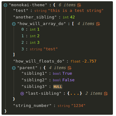
<ReactJson src={my_important_json} theme="monokai" />Check out the list of supported themes here.
Monokai theme example
Solarized theme example

Contributing to the source code:
Standard Workflow
- Clone this repo
- Install npm dependencies
cd react-json-view
npm install- Run webpack to start webpack-dev-server with hot-reloading enabled
npm run dev:hot
- Open port 2000 in your browser
- navigate to localhost:2000
Development within a Docker Container
You can use Docker to run the source code in a local development environment:
- Clone this repo
- Make sure docker is installed
- Build the docker image
docker build -t react-json-view .- note: you may need to use
sudoto run docker commands
- Run the docker container on port 2000. This will run the webpack-dev-server with hot-reloading enabled.
cd react-json-view./docker/dev-server.sh- note: you may need to use
sudoto run the server file
- Open port 2000 in your browser
- navigate to localhost:2000
Your source code will be mounted inside the docker container. The container is built on the standard Node image.
Webpack-dev-server is running in the container and hot-reloading when changes are made locally.
All node modules are installed within the container, so make sure to rebuild your container if you make changes to package.json (see step 3, above).
To-Do's
- Support "delete" capability when
onEditis enabled - Support "add" capability when
onEditis enabled