
Package Exports
- react-multi-date-picker
This package does not declare an exports field, so the exports above have been automatically detected and optimized by JSPM instead. If any package subpath is missing, it is recommended to post an issue to the original package (react-multi-date-picker) to support the "exports" field. If that is not possible, create a JSPM override to customize the exports field for this package.
Readme
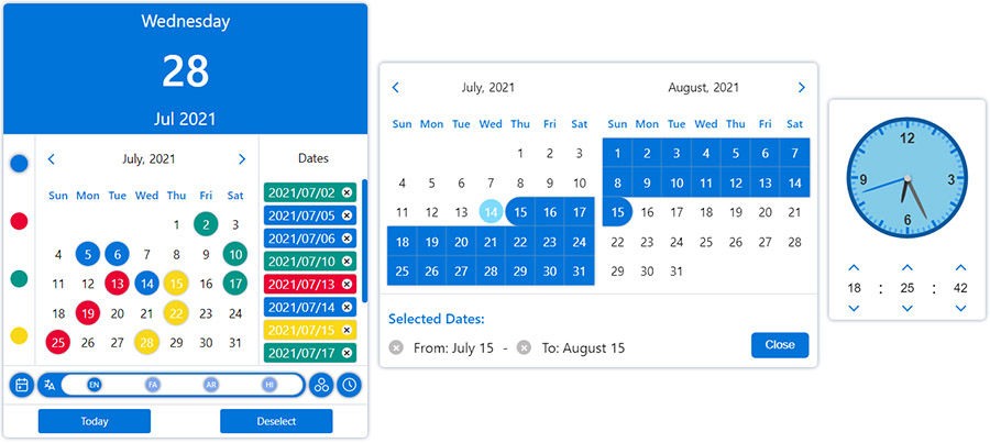
DatePicker
Simple React datepicker component for working with gregorian, persian, arabic and indian calendars
with the ability to select the date in single, multiple and range modes.

Layouts
You can change the appearance of the datepicker to prime or mobile by importing css files from the styles folder.

Plugins
Ability to further customize the calendar and datepicker by adding one or more plugins.
Installation
npm install --save react-multi-date-pickerDemo
Usage
import React, { useState } from "react";
import DatePicker from "react-multi-date-picker";

export default function Example() {
  const [value, setValue] = useState(new Date());

  return <DatePicker value={value} onChange={setValue} />;
}
Browser (none react-app)
<!DOCTYPE html>
<html>
  <head>
    <meta charset="UTF-8" />
    <title>React Multi Date Picker</title>
  </head>
  <body>
    <span>Calendar Example :</span>
    <div id="calendar"></div>

    <span>DatePicker Example :</span>
    <div id="datePicker"></div>

    <span>Plugins Example :</span>
    <div id="datePickerWithPlugin"></div>

    <!-- Ract -->
    <script src="https://unpkg.com/react@17/umd/react.production.min.js"></script>
    <script src="https://unpkg.com/react-dom@17/umd/react-dom.production.min.js"></script>

    <!-- DatePicker and dependencies-->
    <script src="https://cdn.jsdelivr.net/npm/date-object@latest/dist/date-object.min.js"></script>
    <script src="https://cdn.jsdelivr.net/npm/react-element-popper@latest/build/browser.min.js"></script>
    <script src="https://cdn.jsdelivr.net/npm/react-multi-date-picker@latest/build/browser.min.js"></script>

    <!-- Optional Plugin -->
    <script src="https://cdn.jsdelivr.net/npm/react-multi-date-picker@latest/build/date_picker_header.browser.js"></script>

    <script>
      const { DatePicker, Calendar } = ReactMultiDatePicker;

      ReactDOM.render(
        React.createElement(Calendar),
        document.getElementById("calendar")
      );

      ReactDOM.render(
        React.createElement(DatePicker),
        document.getElementById("datePicker")
      );

      ReactDOM.render(
        React.createElement(DatePicker, {
          plugins: [React.createElement(DatePickerHeader)],
        }),
        document.getElementById("datePickerWithPlugin")
      );
    </script>
  </body>
</html>
Availble props
| Name | Type | Default | Availability (DatePicker/ Calendar) |
|---|---|---|---|
| value | Date, DateObject, String, Number or Array | new Date() | both |
| multiple | Boolean | false (true if value is Array) | both |
| range | Boolean | false | both |
| timePicker | Boolean | false | both |
| onlyTimePicker | Boolean | false | both |
| onlyMonthPicker | Boolean | false | both |
| onlyYearPicker | Boolean | false | both |
| format | String | YYYY/MM/DD | both |
| formattingIgnoreList | Array | both | |
| locale | String | en | both |
| calendar | String | gregorian | both |
| mapDays | Function | both | |
| onChange | Function | both | |
| className | String | "" | both |
| weekDays | Array | both | |
| months | Array | both | |
| showOtherDays | Boolean | false | both |
| minDate | Date, DateObject, String or Number | both | |
| maxDate | Date, DateObject, String or Number | both | |
| disableYearPicker | Boolean | false | both |
| disableMonthPicker | Boolean | false | both |
| zIndex | Number | 100 | both |
| plugins | Array | [] | both |
| sort | Boolean | false | both |
| numberOfMonths | Number | 1 | both |
| currentDate | DateObject | both | |
| className | String | "" | both |
| containerClassName | String | DatePicker | |
| arrowClassName | String | 0 | DatePicker |
| style | React.CSSProperties | {} | DatePicker |
| containerStyle | React.CSSProperties | DatePicker | |
| arrowStyle | React.CSSProperties | 0 | DatePicker |
| arrow | Boolean or React.ReactElement | true | DatePicker |
| animation | Boolean | false | DatePicker |
| inputClass | String | "" | DatePicker |
| name | String | DatePicker | |
| id | String | DatePicker | |
| title | String | DatePicker | |
| placeholder | String | DatePicker | |
| type | String | input | DatePicker |
| render | React.ReactElement or Function | DatePicker | |
| disabled | Boolean | false | DatePicker |
| inputMode | String | DatePicker | |
| scrollSensitive | Boolean | true | DatePicker |
| hideOnScroll | Boolean | false | DatePicker |
| calendarPosition | String | "bottom-left" | DatePicker |
| editable | Boolean | true | DatePicker |
| onlyShowInRangeDates | Boolean | true | DatePicker |
| onOpen | Function | DatePicker | |
| onClose | Function | DatePicker | |
| fixMainPosition | Boolean | false | DatePicker |
| fixRelativePosition | Boolean | false | DatePicker |
| offsetY | Number | 0 | DatePicker |
| offsetX | Number | 0 | DatePicker |
| onPositionChange | Function | DatePicker |
Calendars
- gregorian (default)
- persian
- arabic
- indian
locales
- en (default)
- fa
- ar
- hi
Of course, you can customize the names of the months and days of the week
in the both calendar & input using the months and weekDays Props.
Types
- input (default)
- input-icon
- icon
- button
- custom