
Package Exports
- react-native-alert-notification
This package does not declare an exports field, so the exports above have been automatically detected and optimized by JSPM instead. If any package subpath is missing, it is recommended to post an issue to the original package (react-native-alert-notification) to support the "exports" field. If that is not possible, create a JSPM override to customize the exports field for this package.
Readme
react-native-alert-notification
Example Dialog Box
| Theme Light | Theme Dark |
|---|---|
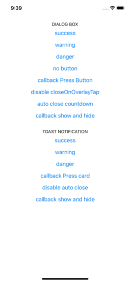 |
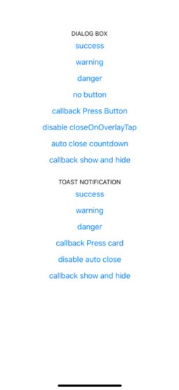 |
Example Toast Notification
| Theme Light | Theme Dark |
|---|---|
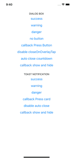 |
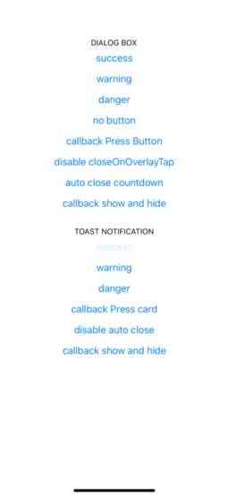 |
Installation
- Installing:
yarn add react-native-alert-notification- Installing dependencies:
- For Native project:
yarn add react-native-safe-area-context

pod install- For Expo project:
expo install react-native-safe-area-contextUsage
import { ALERT_TYPE, Dialog, Root, Toast } from 'react-native-alert-notification';


<Root>
  <View>

    // dialog box
    <Button
      title={'dialog box'}
      onPress={ () => Dialog.show({
        type: ALERT_TYPE.SUCCESS,
        title: 'Success',
        textBody:'Congrats! this is dialog box success',
        button:'close'
      })}
    />

    // toast notification
    <Button
      title={'toast notification'}
      onPress={ () => Toast.show({
        type: ALERT_TYPE.SUCCESS,
        title: 'Success',
        textBody:'Congrats! this is toast notification success',
      })}
    />

  </View>
</Root>
Documentation:
Root Component
A React node that will be most likely wrapping your whole app.
| Name | Description | Require | Default | Type |
|---|---|---|---|---|
| theme | select theme light dark (by default is auto) | auto | 'light','dark' | |
| colors | custom colors | [IColors |
||
| dialogConfig | config dialog box global | {closeOnOverlayTap:bool, autoClose:bool / number} | ||
| toastConfig | config toast global | {autoClose:bool / number} |
type IProps = {
  dialogConfig?: Pick<IConfigDialog, 'closeOnOverlayTap' | 'autoClose'>;
  toastConfig?: Pick<IConfigToast, 'autoClose'>;
  theme?: 'light' | 'dark';
  colors?: [IColors, IColors] /** ['light_colors' , 'dark_colors'] */;
};
type IColors = {
  label: string;
  card: string;
  overlay: string;
  success: string;
  danger: string;
  warning: string;
};
Dialog Box Component
| Name | Description | Require | Default | Type |
|---|---|---|---|---|
| title | The title text | true | String | |
| type | Defines the type ("Success", "Warning" or "Error") | true | "SUCCESS", "DANGER", "WARNING" | |
| textBody | The text body | true | String | |
| button | name button (for hide button: undefined) | String | ||
| autoClose | Defines time auto close dialog box in ms | face | bool / number | |
| closeOnOverlayTap | allow close if click in overlay | true | bool | |
| onPressButton | (if not declared and isset button action is close) | String | () => void | |
| onShow | action after end animation open | () => void | ||
| onHide | action after end animation close | () => void |
type IConfig = {
  type: ALERT_TYPE;
  title: string;
  textBody: string;
  button?: string;
  autoClose?: number | boolean;
  closeOnOverlayTap?: boolean;
  onPressButton?: () => void;
  onShow?: () => void;
  onHide?: () => void;
};
Toast Notification Component
| Name | Description | Require | Default | Type |
|---|---|---|---|---|
| title | The title text | true | String | |
| type | Defines the type ("Success", "Warning" or "Error") | "SUCCESS", "DANGER", "WARNING" | ||
| textBody | The text body | true | String | |
| autoClose | Defines time auto close dialog box in ms | 5000 | bool / number | |
| onPress | action click in card | bool | ||
| onLongPress | action long click in card | () => void | ||
| onShow | event after end animation open | () => void | ||
| onHide | event after end animation close | () => void |
type IConfig = {
  type?: ALERT_TYPE;
  title: string;
  textBody: string;
  autoClose?: number | boolean;
  onPress?: () => void;
  onLongPress?: () => void;
  onShow?: () => void;
  onHide?: () => void;
};
Author
Rodolphe Jerez | https://codingbyjerez.com
See the contributing guide to learn how to contribute to the repository and the development workflow.
License
MIT