

Package Exports
- react-native-border
- react-native-border/package.json
Readme
📦 react-native-border
A lightweight and customizable React Native component for adding stylish, image-based borders to any content. Easily wrap views with repeated icons or decorative images — with full control over size, rotation, spacing, and more.
🖼️ Preview
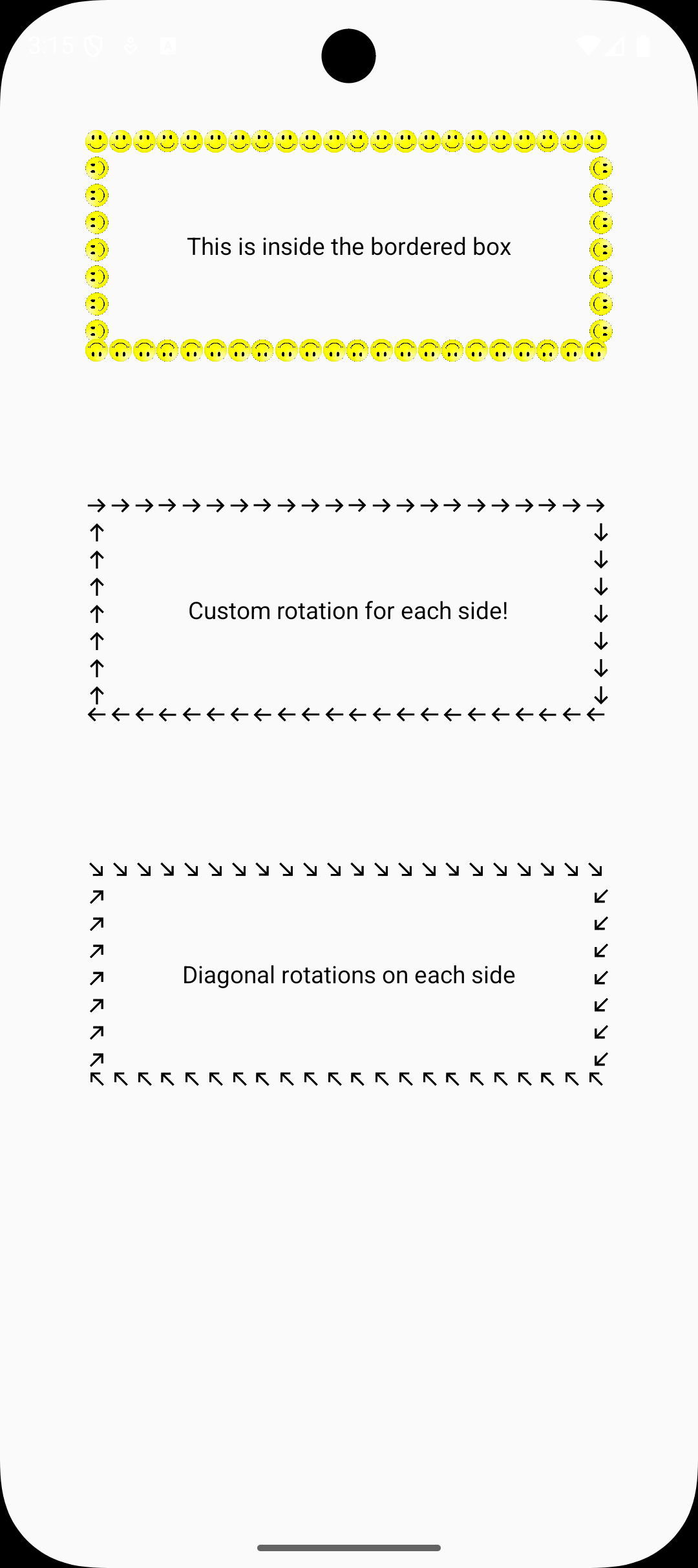
🚀 Features
- 🔁 Repeat any icon/image on all four sides
- 🎛️ Rotate icons independently for top, right, bottom, and left
- 📐 Adjustable icon size, padding, and spacing
- 🧩 Wrap any child components (text, buttons, images, etc.)
- 🌐 Supports both local and remote image sources
📦 Installation
Install via npm or yarn:
# Using npm
npm install react-native-border

# Using yarn
yarn add react-native-border
✨ Usage
import React from 'react';
import { View, Text } from 'react-native';
import BorderBox from 'react-native-border';

export default function App() {
  return (
    <View style={{ flex: 1, justifyContent: 'center', alignItems: 'center' }}>
      <BorderBox
        icon={{
          uri: 'https://upload.wikimedia.org/wikipedia/commons/thumb/8/85/Smiley.svg/600px-Smiley.svg.png',
        }}
      >
        <Text style={{ padding: 20 }}>This is inside the bordered box</Text>
      </BorderBox>
    </View>
  );
}
⚙️ Props
| Prop | Type | Description |
|---|---|---|
icon |
ImageSource (required) | Image to repeat on all sides |
rotationDegrees |
object (optional) | Rotation for top, right, bottom, left |
iconWidth |
number (optional) | Width of each repeated icon |
iconHeight |
number (optional) | Height of each repeated icon |
iconPadding |
number (optional) | Space between each icon |
children |
ReactNode | Content inside the bordered box |
💡 Tips
- Use transparent
.pngor.svgicons for best results. - Works great for cards, banners, modals, and decorative sections.
🧑💻 Contributing
Pull requests are welcome! For major changes, please open an issue first to discuss what you'd like to change.
📄 License
MIT © 2025 Bhavesh Jadhav