
Package Exports
- react-native-common-date-picker
This package does not declare an exports field, so the exports above have been automatically detected and optimized by JSPM instead. If any package subpath is missing, it is recommended to post an issue to the original package (react-native-common-date-picker) to support the "exports" field. If that is not possible, create a JSPM override to customize the exports field for this package.
Readme
react-native-common-date-picker
An awesome and cross-platform React Native date picker and calendar component for iOS and Android.
This package is designed to integrade common date components like calendars, date, date-time, etc. Next, we are gonna provide more optional parameters and styles for developers who like this package. We hope to make it high-performance and high-efficiency in the future.
If you like it, just give stars ⭐️⭐️⭐️. If you come to any problems with this repository, please feel free to submit issues. Any PR is welcome.
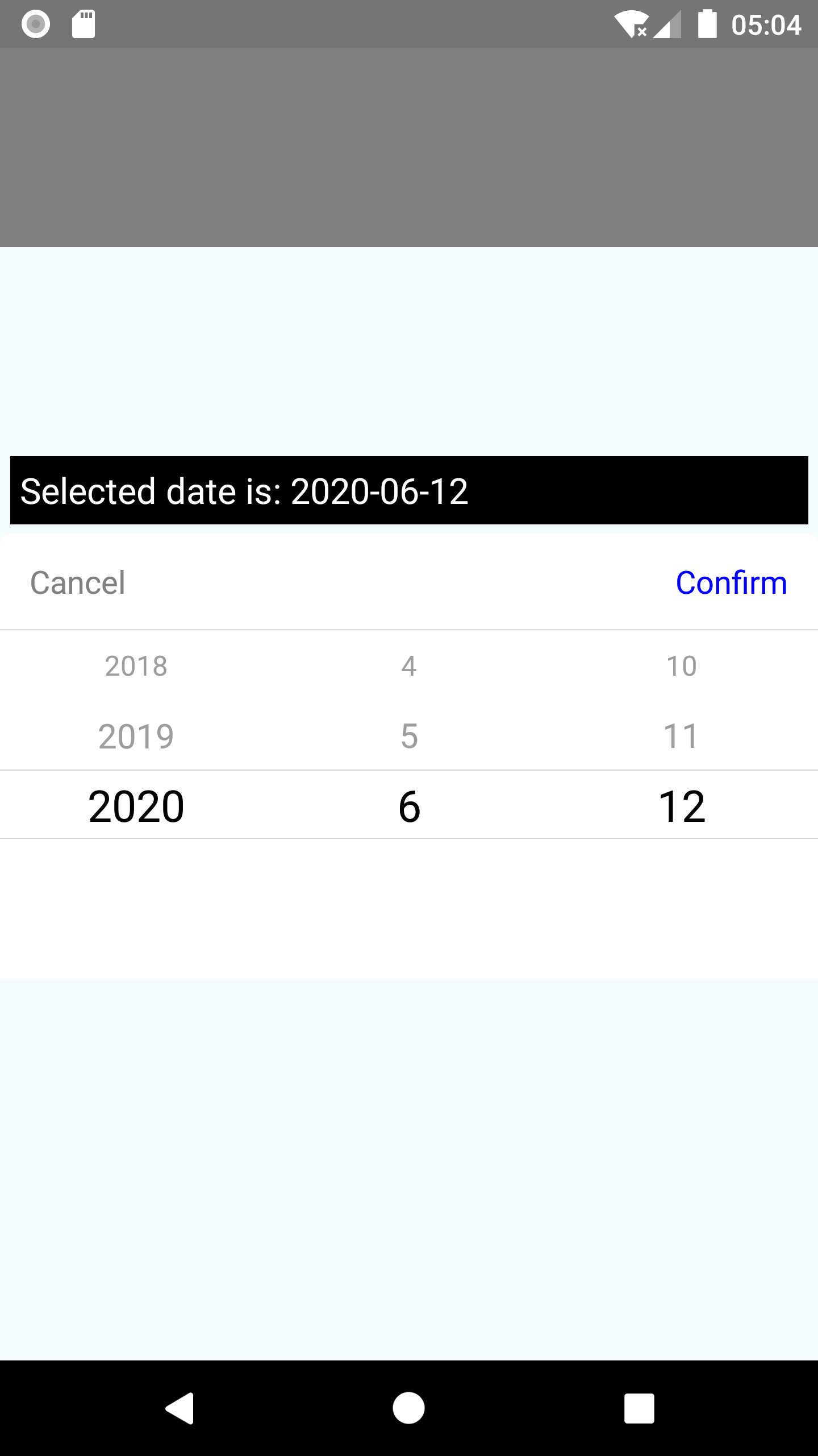
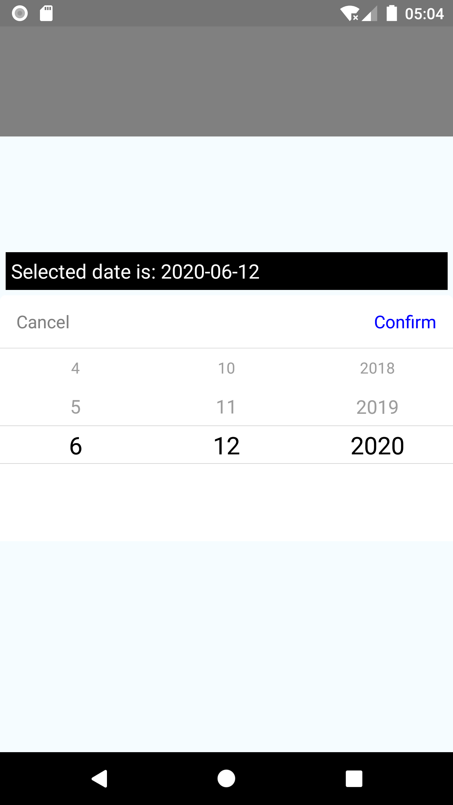
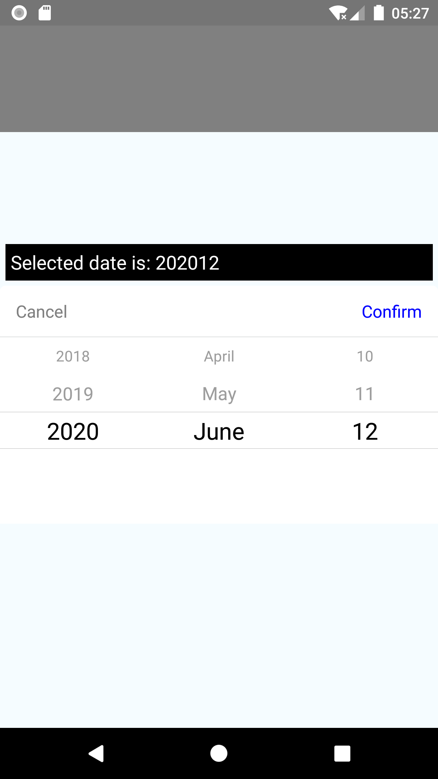
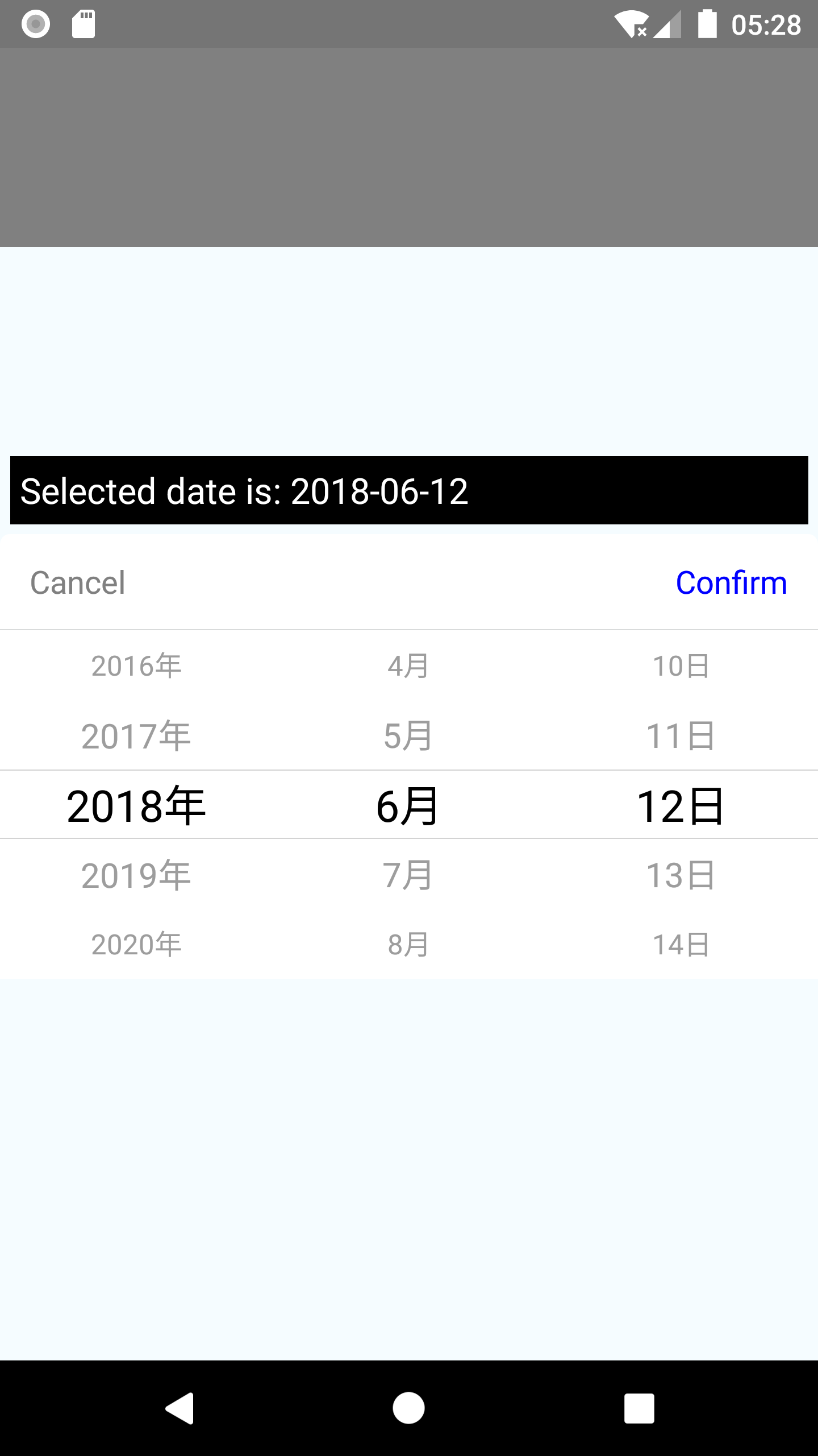
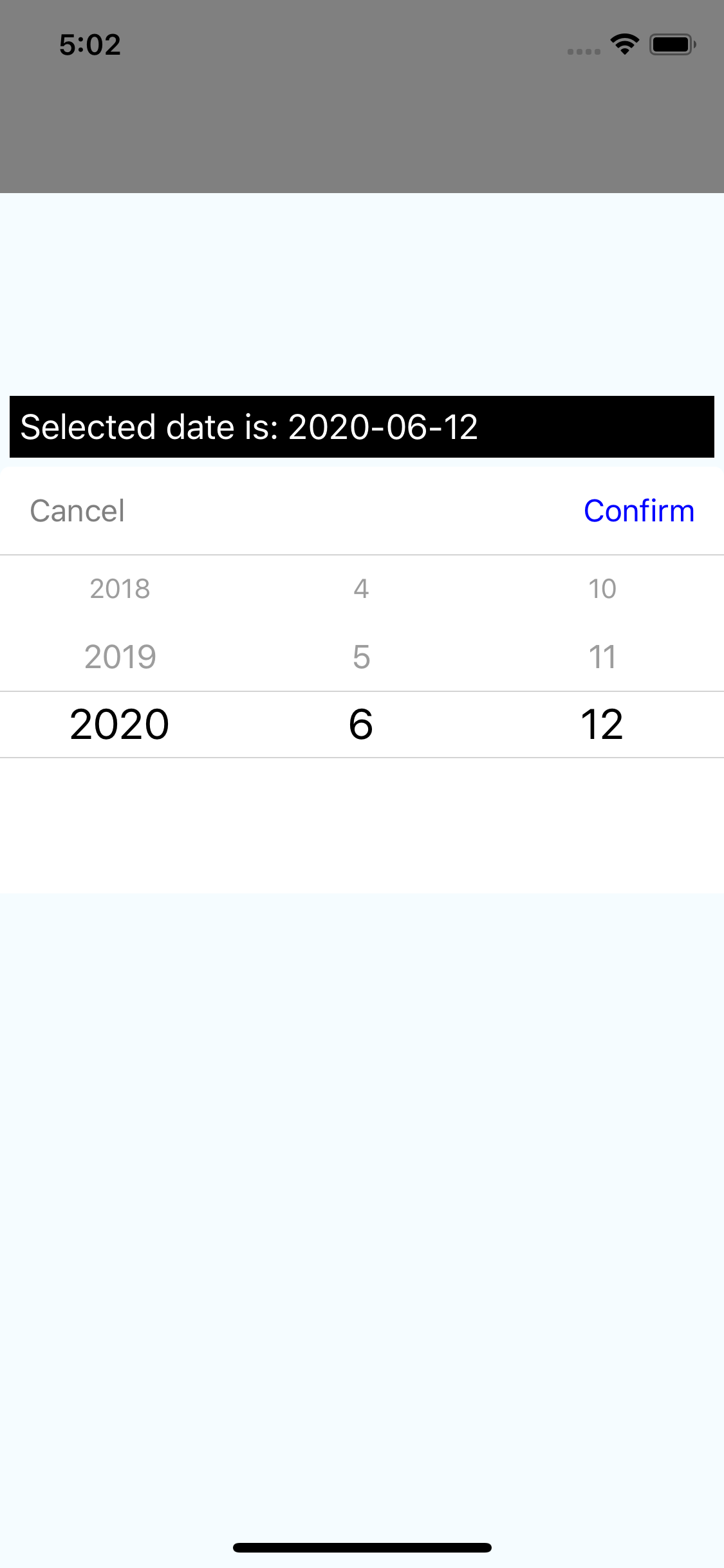
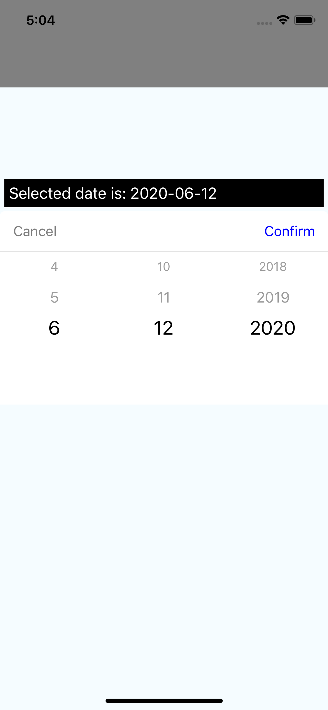
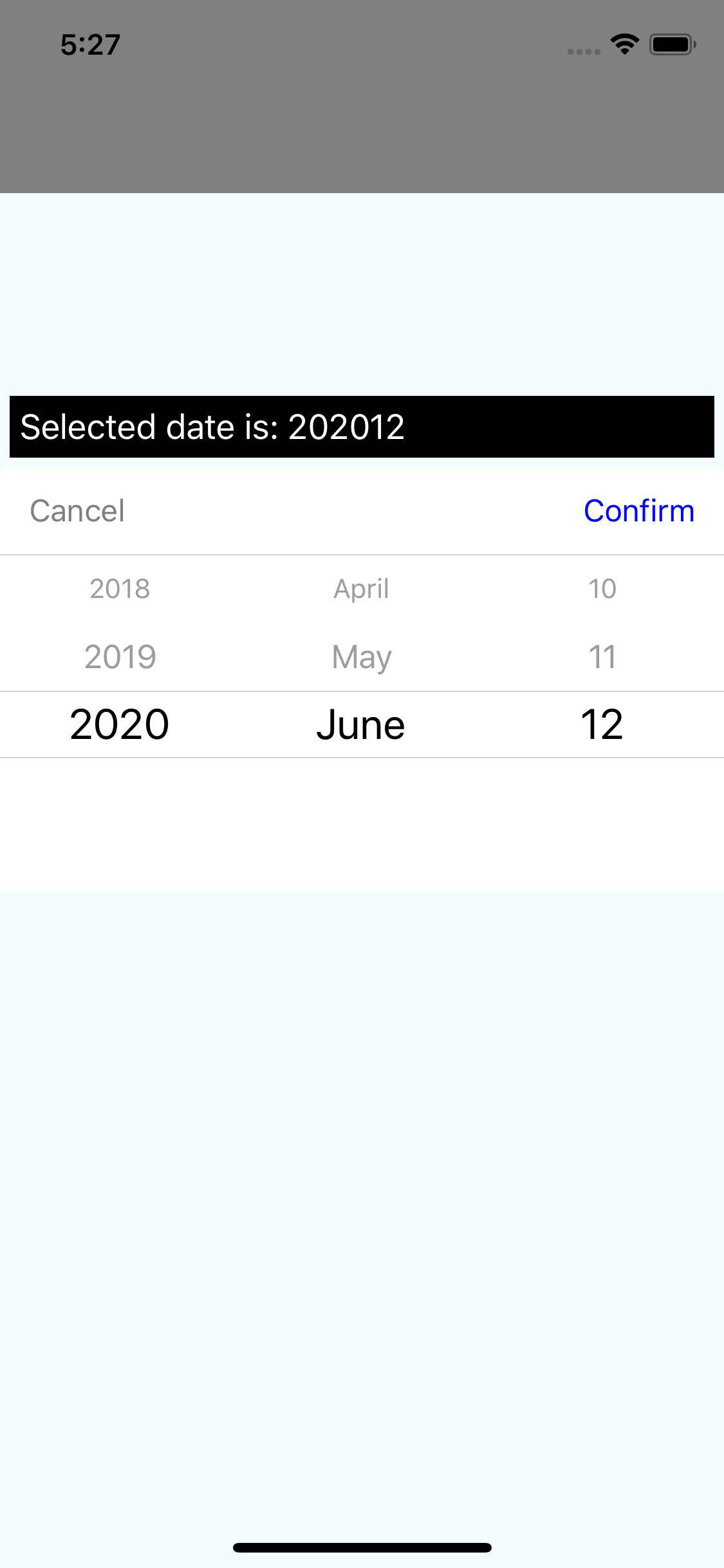
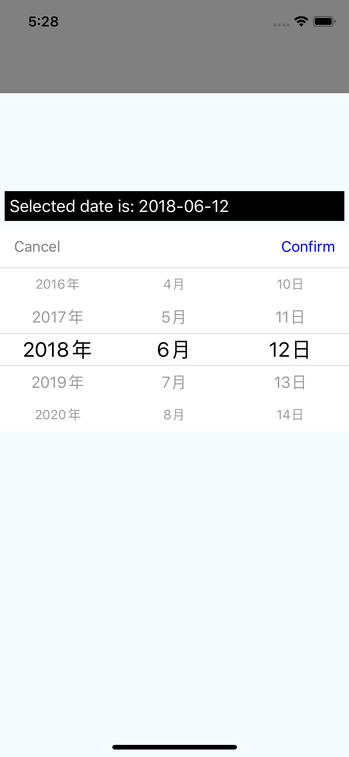
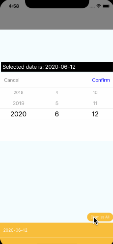
Date Picker Screenshots
| Android 1 | Android 2 | Android 3 | Android 4 |
|---|---|---|---|
 |
 |
 |
 |
| iOS 1 | iOS 2 | iOS 3 | iOS 4 |
|---|---|---|---|
 |
 |
 |
 |
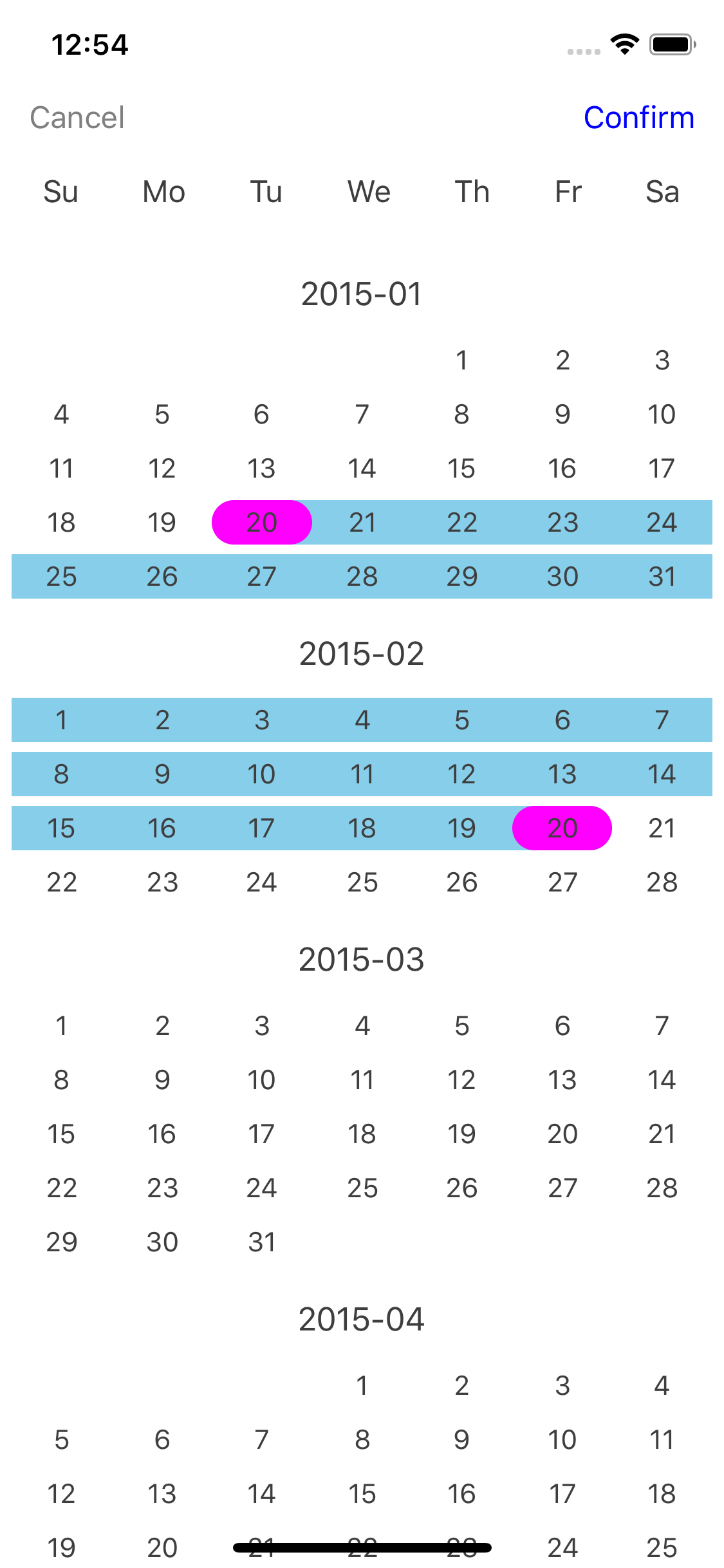
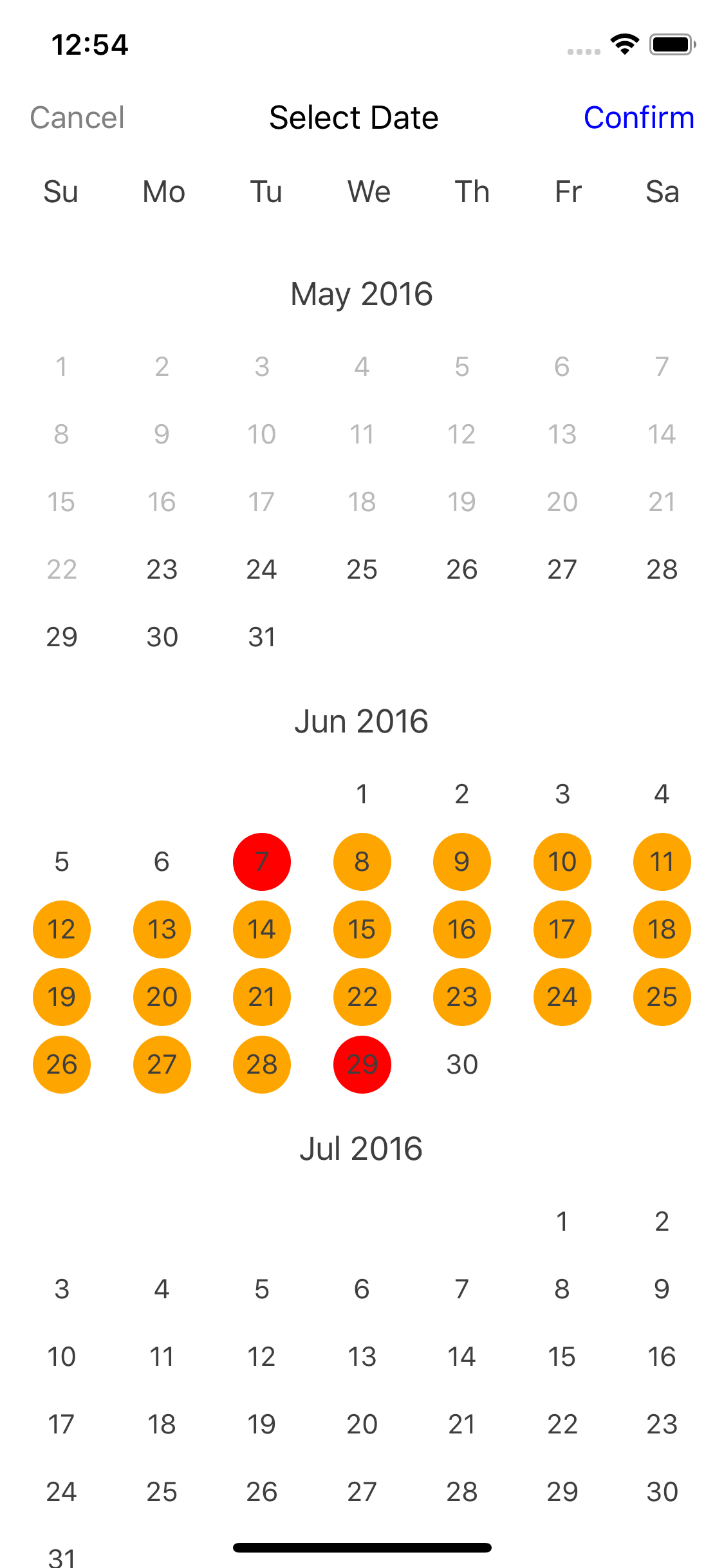
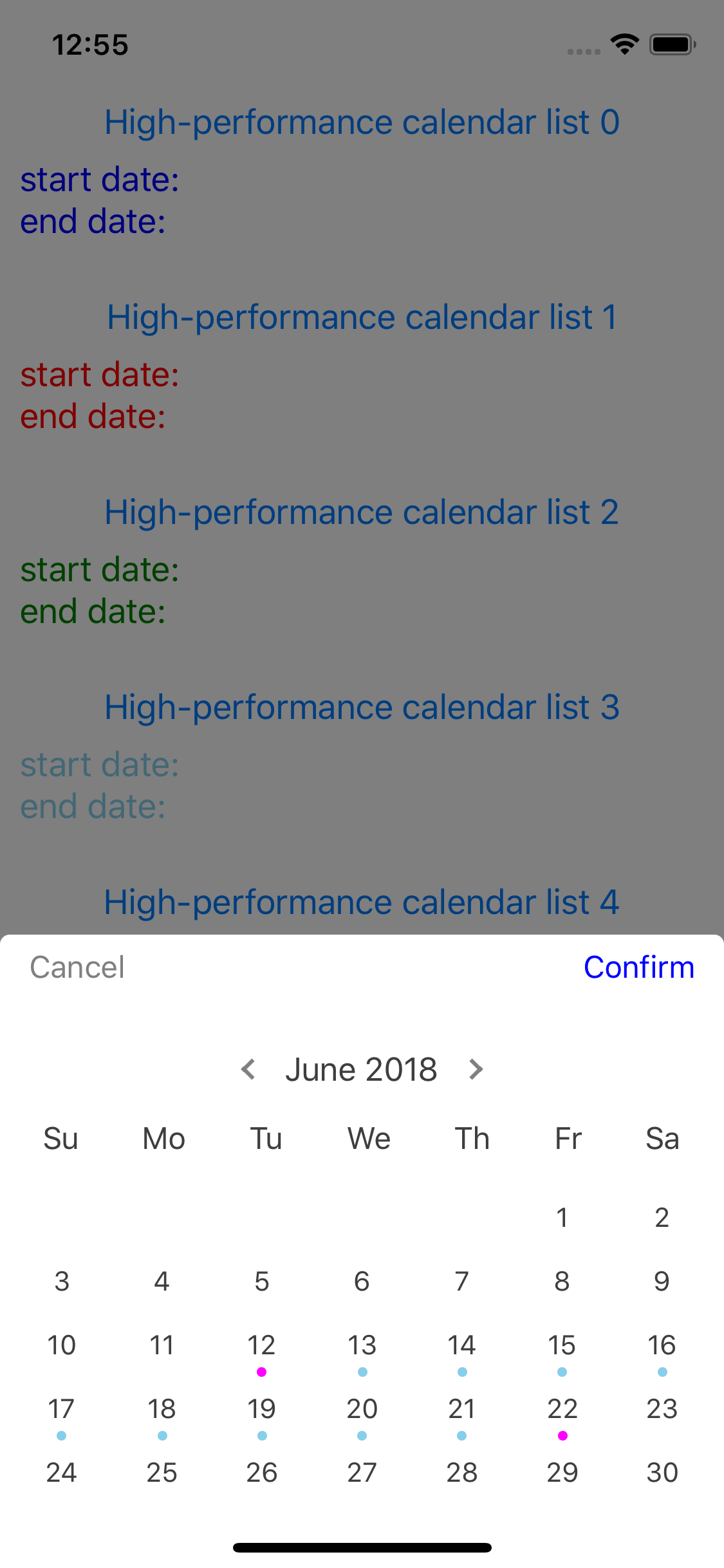
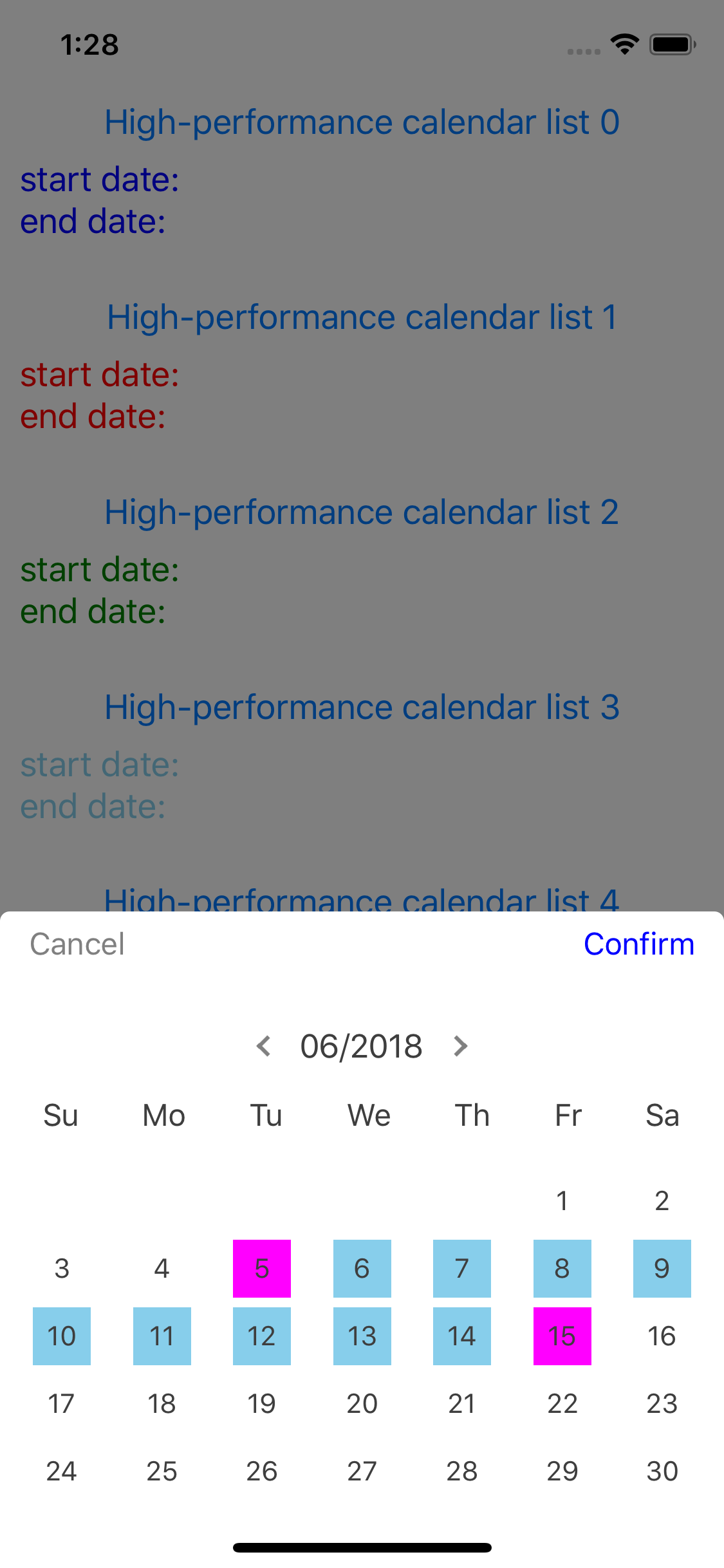
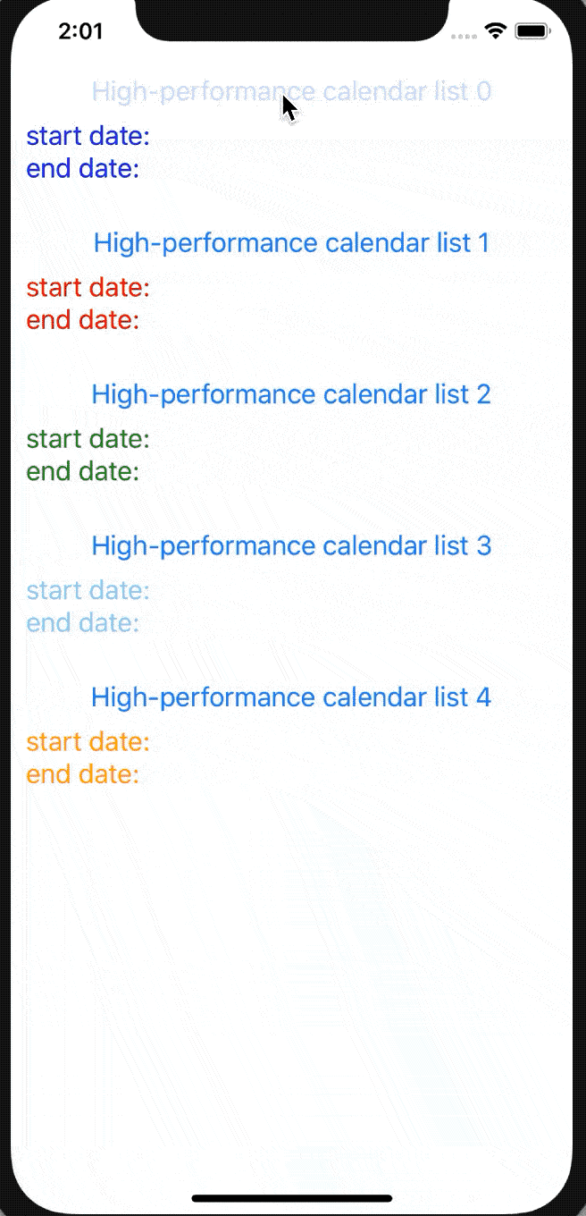
Calendar Screenshots
| Android 1 | Android 2 | Android 3 | Android 4 |
|---|---|---|---|
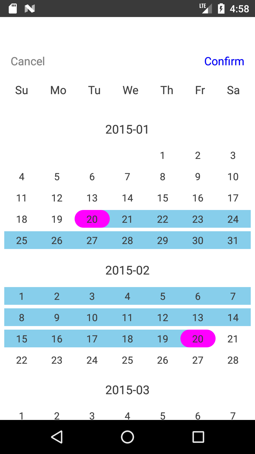 |
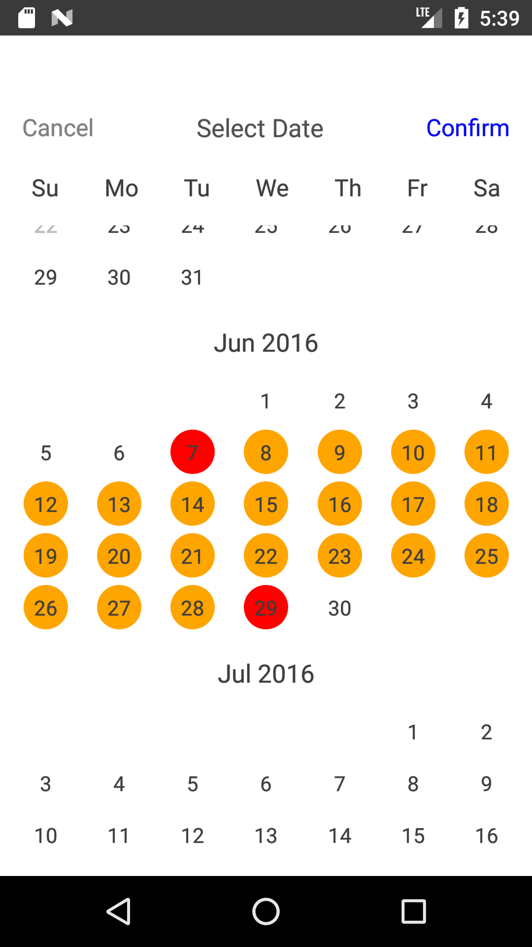 |
 |
 |
| iOS 1 | iOS 2 | iOS 3 | iOS 4 |
|---|---|---|---|
 |
 |
 |
 |
Date Picker GIF
Calendar GIF
Contents
Installation
The installation is very easy. You just install this package via one command. No react-native link is required.
npm install react-native-common-date-pickerUsage
Date Picker
import {DatePicker} from "react-native-common-date-picker";

<DatePicker
    confirm={date => {
        console.warn(date)
    }}
/>
Calendar
import {CalendarList} from "react-native-common-date-picker";

<Modal animationType={'slide'} visible={this.state.visible}>
     <CalendarList
          containerStyle={{flex: 1}}
          cancel={() => this.setState({visible: false})}
          confirm={data => {
              this.setState({
                   selectedDate1: data[0],
                   selectedDate2: data[1],
                   visible: false,
              });
          }}
     />
</Modal>
More examples: example directory
Parameters
| Name | Type | Description |
|---|---|---|
| containerStyle | object | Styles for container, you can set it as any view prop styles such as {backgroundColor: 'red'}. |
| scrollContentStyle | object | Styles for scroll list - FlatList, you can set it as any view prop styles such as {backgroundColor: 'red'}. |
| showToolBar | bool | Whether to show tool bar, default is true. If false, hide tool bar on top. |
| toolBarPosition | string | The position of tool bar, default is 'top' that is at the top of screen. So far, just both 'top' and 'bottom' are supported. |
| toolBarStyle | object | tool bar view styles, passed like {backgroundColor: 'red'} as you like. |
| toolBarCancelStyle | object | tool bar cancel button text styles, passed like {color: 'red', fontSize: 15} as you like. Note that you can control the active opacity of the button through {activeOpacity: 1}. |
| toolBarConfirmStyle | object | tool bar confirm button text styles, passed like {color: 'red', fontSize: 15} as you like. Note that you can control the active opacity of the button through {activeOpacity: 1}. |
| titleStyle | object | tool bar title text style. |
| titleText | string | tool bar title text, default is "". |
| cancelText | string | tool bar cancel button text, default is "Cancel". |
| confirmText | string | tool bar confirm button text, default is "Confirm". |
| cancel | function | tool bar cancel button callback. |
| confirm | function | tool bar confirm button callback with a date array like ["2016-01-09", "2019-09-18"]. "2016-01-09" is the start date(min date) you selected. "2019-09-18" is the end date(max date) you selected. If nothing is selected, the array's elements will be empty string like ["", ""]. |
| cancelDisabled | bool | Whether to disable the cancel button. Default is false. |
| confirmDisabled | bool | Whether to disable the confirm button. Default is false. |
| onPressDate | function | A callback with a date parameter(like "2019-08-09") and row index when the user presses some date item. |
| minDate | string | Min date to limit, default is "2015-01-01". Other supported formats: "2015-1-1", "2015/01/01", "2015/1/1". |
| maxDate | string | Max date to limit, default is today calculated by new Date(). Other supported formats: "2015-1-1", "2015/01/01", "2015/1/1". |
| showWeeks | bool | Whether to show weeks, default is true. |
| weeks | Array | Week days to show, default is from Sunday to Saturday, namely ['Su','Mo','Tu','We','Th','Fr','Sa']. Note that if you want to custom "weeks", then you have to accomplish "firstDayOnWeeks" at the same time. For example, you passed "['Mon', 'Tue', 'Wed', 'Thu', 'Fri', 'Sat', 'Sun']" to "weeks", you must pass 1 to "firstDayOnWeeks" equal to "firstDayOnWeeks={1}". What's more, 1 means Monday, 2 means Tuesday, ..., 0 Means Sunday. |
| weeksChineseType | bool | Weeks type. Default is false, namely ['Su','Mo','Tu','We','Th','Fr','Sa']. If you want to use chinese, such as ['日','一','二','三','四','五','六'], just setting "weeksChineseType={true}" is okay. But the precondition is that "weeks" above uses the default value. Or it will be invalid. |
| firstDayOnWeeks | number | The first day for weeks. Default is 0 equal to Sunday. If you'd like to start with Saturday, "firstDayOnWeeks={6}" will work. The value ranges from 0 to 6. |
| weeksStyle | object | For week days, set the container styles like {backgroundColor: 'red'}. |
| weeksTextStyle | object | For week days, set the week day text styles like {color: 'blue', fontSize: 14}. |
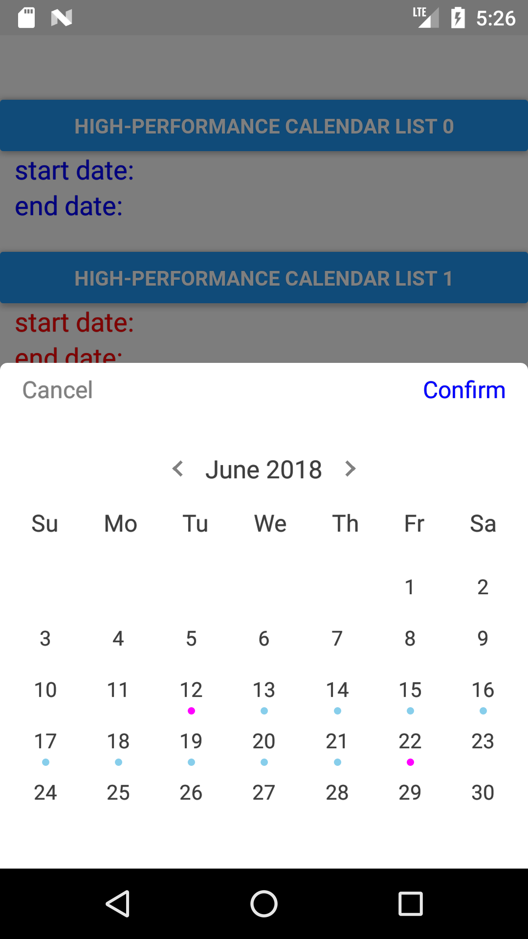
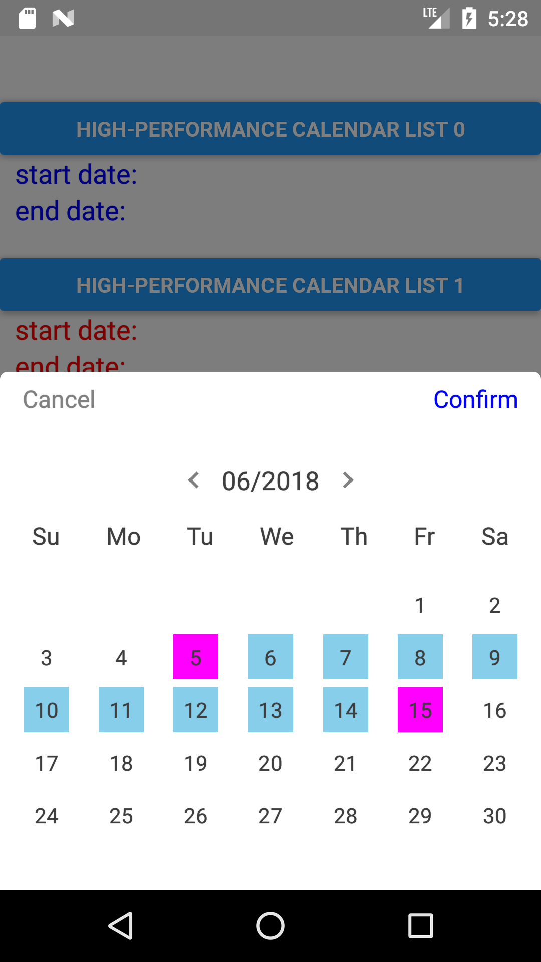
| headerTitleType | number | Display form of the header title. Default is 0. Take "2020-04" date as an example: 0: "2020-04", 1: "2020年4月", 2: "Apr 2020", 3: "April 2020", 4: "2020/04", 5: "04/2020". |
| listItemStyle | object | Content styles containing header title and days content. This is a nesting object style. So if you want to set some specific style such as "headerTitle", you can set it to {headerTitle: {fontSize: 18, color: 'red'}}. |
| selectedDateMarkType | string | Selected date mark type. Default is 'ellipse', other choices: 'semiellipse'、'rectangle'、'circle'、 'square'、'dot'. |
| selectedDateMarkColor | string | Selected date mark background color for start date and end date. Default is 'magenta'. |
| selectedDateMarkRangeColor | string | Selected date mark background color between start date and end date. Default is 'skyblue'. |
| beyondDatesDisabled | bool | When the date is out of minDate or maxDate, whether to disable the button. Default is true. |
| beyondDatesDisabledTextColor | string | When the date is out of minDate or maxDate, the button text color. Default is '#b9b9b9'. |
| leftArrowClick | function | Left arrow click callback with current date index parameter. Only when "horizontal={true}". |
| rightArrowClick | function | Right arrow click callback with current date index parameter. Only when "horizontal={true}". |
| hideArrow | bool | Whether to hide arrow. Default is false. Only when "horizontal={true}". |
| arrowColor | string | Arrow color. Default is 'gray'. Only when "horizontal={true}". |
| arrowSize | bool | Arrow size. Default is 8. Only when "horizontal={true}". |
| arrowAlign | string | Arrow align. Default is 'left'. One of ['left', 'center', 'right']. Only when "horizontal={true}". |
| horizontal | bool | Seen as FlatList component. Default is true. |
| scrollEnabled | bool | Seen as FlatList component. |
| pagingEnabled | bool | Seen as FlatList component. Default is false. |
| -- | -- | Other FlatList's props can be Seen in FlatList docs. |
To do
- Modal is supported by default
- Add: datetime, time