
Package Exports
- react-native-country-picker-modal
This package does not declare an exports field, so the exports above have been automatically detected and optimized by JSPM instead. If any package subpath is missing, it is recommended to post an issue to the original package (react-native-country-picker-modal) to support the "exports" field. If that is not possible, create a JSPM override to customize the exports field for this package.
Readme

The best Country Picker for React Native.
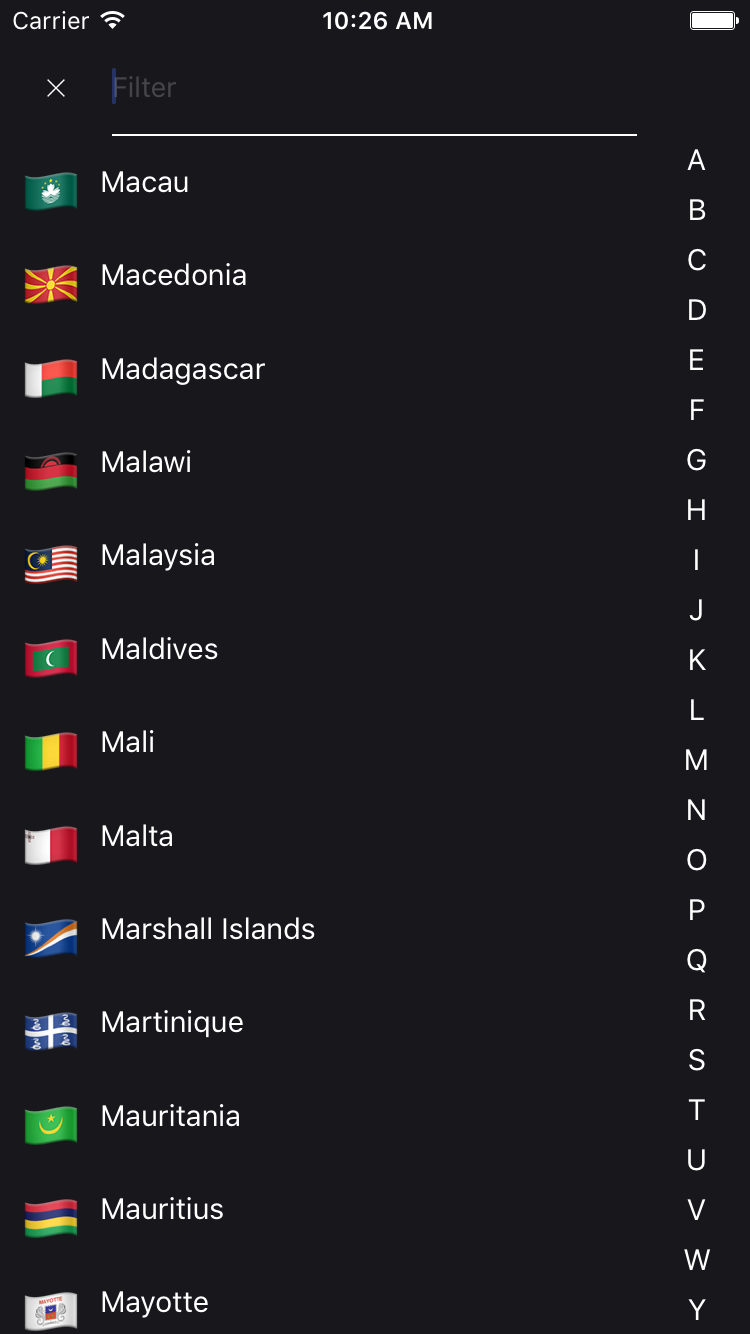


Installation
$ yarn add react-native-country-picker-modalBasic Usage
import DeviceInfo from 'react-native-device-info'

import React, {
  AppRegistry,
  Component,
  StyleSheet,
  Text,
  View,
  StatusBarIOS,
  PixelRatio
} from 'react-native'
import CountryPicker, {
  getAllCountries
} from 'react-native-country-picker-modal'

const NORTH_AMERICA = ['CA', 'MX', 'US']

class Example extends Component {
  constructor(props) {
    StatusBarIOS.setHidden(true)
    super(props)
    let userLocaleCountryCode = DeviceInfo.getDeviceCountry()
    const userCountryData = getAllCountries()
      .filter(country => NORTH_AMERICA.includes(country.cca2))
      .filter(country => country.cca2 === userLocaleCountryCode)
      .pop()
    let callingCode = null
    let cca2 = userLocaleCountryCode
    if (!cca2 || !userCountryData) {
      cca2 = 'US'
      callingCode = '1'
    } else {
      callingCode = userCountryData.callingCode
    }
    this.state = {
      cca2,
      callingCode
    }
  }
  render() {
    return (
      <View style={styles.container}>
        <Text style={styles.welcome}>Welcome to Country Picker !</Text>
        <CountryPicker
          countryList={NORTH_AMERICA}
          onChange={value => {
            this.setState({ cca2: value.cca2, callingCode: value.callingCode })
          }}
          cca2={this.state.cca2}
          translation="eng"
        />
        <Text style={styles.instructions}>press on the flag</Text>
        {this.state.country && (
          <Text style={styles.data}>
            {JSON.stringify(this.state.country, null, 2)}
          </Text>
        )}
      </View>
    )
  }
}

const styles = StyleSheet.create({
  container: {
    flex: 1,
    justifyContent: 'center',
    alignItems: 'center'
  },
  welcome: {
    fontSize: 20,
    textAlign: 'center',
    margin: 10
  },
  instructions: {
    fontSize: 12,
    textAlign: 'center',
    color: '#888',
    marginBottom: 5
  },
  data: {
    padding: 15,
    marginTop: 10,
    backgroundColor: '#ddd',
    borderColor: '#888',
    borderWidth: 1 / PixelRatio.get(),
    color: '#777'
  }
})

AppRegistry.registerComponent('example', () => Example)
Dark theme example
A simple example to display a CountryPicker component with a dark theme. You need to download a light colored image for the close button, for example this one.
import CountryPicker from 'react-native-country-picker-modal'

// change the import path according to your project structure
import closeImgLight from "/asset/iconWhite.png";

const DARK_COLOR = "#18171C";
const PLACEHOLDER_COLOR = "rgba(255,255,255,0.2)";
const LIGHT_COLOR = "#FFF";


export default (props) => (
  <CountryPicker
    filterPlaceholderTextColor={PLACEHOLDER_COLOR}
    closeButtonImage={closeImgLight}
    styles={darkTheme}
    {...props}
  />
);


const darkTheme = StyleSheet.create({
 modalContainer: {
    backgroundColor: DARK_COLOR
  },
  contentContainer: {
    backgroundColor: DARK_COLOR
  },
  header: {
    backgroundColor: DARK_COLOR
  },
  itemCountryName: {
    borderBottomWidth: 0
  },
  countryName: {
    color: LIGHT_COLOR
  },
  letterText: {
    color: LIGHT_COLOR
  },
  input: {
    color: LIGHT_COLOR,
    borderBottomWidth: 1,
    borderColor: LIGHT_COLOR
  }
});
Props
| Key | Type | Default | Description |
|---|---|---|---|
| cca2 | string | *required | code ISO 3166-1 alpha-2 (ie. FR, US, etc.) |
| translation | string | 'eng' | The language display for the name of the country (deu, fra, hrv, ita, jpn, nld, por, rus, spa, svk, fin, zho, cym) |
| onChange | function | *required | The handler when a country is selected |
| onClose | function | *required | The handler when the close button is clicked |
| countryList | array | See cca2.json | List of custom CCA2 countries to render in the list. Use getAllCountries to filter what you need if you want to pass in a custom list |
| excludeCountries | array | [] | List of custom CCA2 countries you don't want to render |
| closeable | bool | false | If true, the CountryPicker will have a close button |
| filterable | bool | false | If true, the CountryPicker will have search bar |
| filterPlaceholder | string | 'Filter' | The search bar placeholder |
| filterPlaceholderTextColor | string | undefined | The search bar placeholder text color |
| autoFocusFilter | bool | true | Whether or not the search bar should be autofocused |
| styles | object | {} | Override any style specified in the component (see source code) |
| disabled | bool | false | Whether or not the Country Picker onPress is disabled |
| transparent | bool | false | If true, the CountryPicker will render the modal over a transparent background |
| animationType | string | 'none' | The handler that controls how the modal animates |
| closeButtonImage | React.element | default close button Image | Custom close button Image |
| flagType | string | 'emoji' on iOS, 'flat' on Android | If set, overwrites the default OS based flag type. |
| hideAlphabetFilter | bool | false | If set to true, prevents the alphabet filter rendering |
| showCallingCode | bool | false | If set to true, Country Picker List will show calling code after country name United States (+1) |
| renderFilter | Function | undefined | If 'filterable={true}' and renderFilter function is provided, render custom filter component.* |
*
renderFilter = ({value, onChange, onClose}) => (
  <CustomFilterComponent
     value={value}
     onChange={onChange}
     onClose={onClose}
   />
)
Dependencies
- world-countries : https://www.npmjs.com/package/world-countries
FAQ
Is it supported and tested both on android and iOS?
YES
Is the data that is populated inside the list saved offline once I install your package?
YES : It used the world-countries package and image is stored into json and base64.
Tiers lib using this lib
See also
Contribution
- @xcapentier The main author.
Questions
Feel free to contact me or create an issue
made with ♥