
Package Exports
- react-native-datepicker
This package does not declare an exports field, so the exports above have been automatically detected and optimized by JSPM instead. If any package subpath is missing, it is recommended to post an issue to the original package (react-native-datepicker) to support the "exports" field. If that is not possible, create a JSPM override to customize the exports field for this package.
Readme
react-native-datepicker 

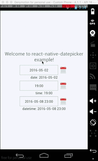
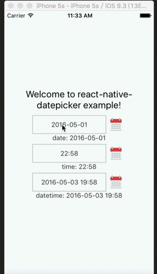
react native datePicker component for both Android and IOS, useing DatePikcerAndroid, TimePickerAndroid and DatePickerIOS
Install
npm install react-native-datepicker --saveExample
Check index.android.js in the Example.
Usage
import React, { Component } from 'react'
import DatePicker from 'react-native-datepicker'

export default class MyDatePicker extends Component {
  constructor(props){
    super(props)
    this.state = {date:"2016-05-15"}
  }

  render(){
    return (
      <DatePicker
        style={{width: 200}}
        date={this.state.date}
        mode="date"
        placeholder="select date"
        format="YYYY-MM-DD"
        minDate="2016-05-01"
        maxDate="2016-06-01"
        confirmBtnText="Confirm"
        cancelBtnText="Cancel"
        customStyles={{
          dateIcon: {
            position: 'absolute',
            left: 0,
            top: 4,
            marginLeft: 0
          },
          dateInput: {
            marginLeft: 36
          }
          // ... You can check the source to find the other keys.
        }}
        onDateChange={(date) => {this.setState({date: date})}}
      />
    )
  }
}
You can check index.js in the Example for detail.
Properties
| Prop | Default | Type | Description |
|---|---|---|---|
| style | - | object |
Specify the style of the DatePicker, eg. width, height... |
| date | - | `string | date` |
| mode | 'date' | enum |
The enum of date, datetime and time |
| format | 'YYYY-MM-DD' | string |
Specify the display format of the date, which using moment.js. The default value change according to the mode. |
| confirmBtnText | '确定' | string |
Specify the text of confirm btn in ios. |
| cancelBtnText | '取消' | string |
Specify the text of cancel btn in ios. |
| iconSource | - | `{uri: string} | number` |
| minDate | - | `string | date` |
| maxDate | - | `string | date` |
| duration | 300 | number |
Specify the animation duration of datepicker. |
| customStyles | - | number |
The hook of customize datepicker style, same as the native style. dateTouchBody, dateInput... |
| showIcon | true | boolean |
Controller whether or not show the icon |
| placeholder | '' | string |
The placeholder show when this.props.date is falsy |
| onDateChange | - | function |
This is called when the user confirm the picked date or time in the UI. The first and only argument is a date or time string representing the new date and time formatted by moment.js with the given format property. |
| modalOnResponderTerminationRequest | - | function |
Set the callback for React Native's Gesture Responder System's call to onResponderTerminationRequest. By default this will reject a termination request, but can be overidden in case the View under the Modal is implementing custom gesture responders, and you wish for those to be overidden in certain cases. |
Instance Methods
| Method | Params | Description |
|---|---|---|
| onPressDate | - | Manually open the date picker panel |
| onPressCancel | - | Manually close the date picker panel like, similarly pressing cancel btn |