
Package Exports
- react-native-modal-dropdown
This package does not declare an exports field, so the exports above have been automatically detected and optimized by JSPM instead. If any package subpath is missing, it is recommended to post an issue to the original package (react-native-modal-dropdown) to support the "exports" field. If that is not possible, create a JSPM override to customize the exports field for this package.
Readme
react-native-modal-dropdown
A react-native dropdown/picker/selector component for both Android & iOS.
Features
- Pure JS.
- Compatible with both iOS and Android.
- Auto position. (Won't be covered or clipped by the edge of screen.)
- Zero configuration. (Options are needed of course or a loading indicator will show.)
- Highly customizable.
- Controllable with API by code. (Show/Hide/Select)
- Change everything into a dropdown list trigger.
Demo
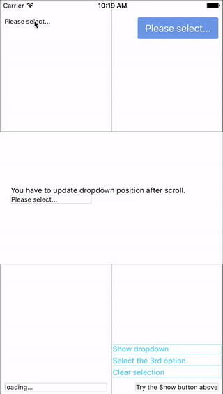
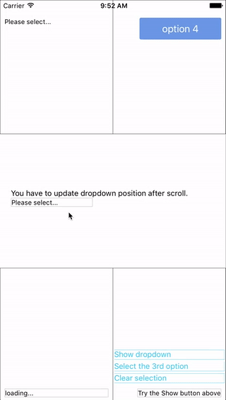
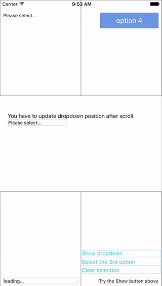
You can find them in the example.
Update History
v3.0.1
- Fix bug: #6 Can not specify
heightstyle fordropdownStyle. - Remove
updatePositionfunction.
v0.3.0
- Auto update position before show.
- Mark
updatePositionfunction as depreciated. (May be removed in next version.)
v0.2.0
- Add wrapper / container support
Now you can use these component as a wrapper / container. Anything wrapped in it can be the trigger of the dropdown.
Installation
npm i react-native-modal-dropdown --saveUsage
Basic
Import this module:
import ModalDropdown from 'react-native-modal-dropdown';Use as a component:
<ModalDropdown options={['option 1', 'option 2']}/>Use as a wrapper / container:
<ModalDropdown options={['option 1', 'option 2']}>
  ...
</ModalDropdown>
Customization
Give the style props as your choice:
style: Change the style of the button (basic mode) / container (wrapper mode).textStyle: Change the style of text of the button. Invalid in wrapper mode.dropdownStyle: Change the style of dropdown container.
You can also render your option row by implement the renderRow function.
API
Props
| Prop | Type | Optional | Default | Description |
|---|---|---|---|---|
disabled |
bool | Yes | false | disable/enable the component. |
defaultIndex |
number | Yes | -1 | Init selected index. -1: None is selected. This only change the highlight of the dropdown row, you have to give a defaultValue to change the init text. |
defaultValue |
string | Yes | Please select... | Init text of the button. Invalid in wrapper mode. |
options |
arrayOf(string) | Yes | Options. The dropdown will show a loading indicator if options is null/undefined. |
|
style |
object | Yes | Style of the button. | |
textStyle |
object | Yes | Style of the button text. Invalid in wrapper mode. | |
dropdownStyle |
object | Yes | Style of the dropdown list. | |
renderRow |
func | Yes | Customize render option rows. Will render a default row if null/undefined. |
|
onDropdownWillShow |
func | Yes | Trigger when dropdown will show by touching the button. Return false can cancel the event. |
|
onDropdownWillHide |
func | Yes | Trigger when dropdown will hide by touching the button. Return false can cancel the event. |
|
onSelect |
func | Yes | Trigger when option row touched with selected index and value. Return false can cancel the event. |
Methods
| Method | Description |
|---|---|
updatePosition() |
Depreciated since v0.3.0. May be removed in next version. Manually update the position of the dropdown. onScroll function of the scrollView. |
show() |
Show the dropdown. Won't trigger onDropdownWillShow. |
hide() |
Hide the dropdown. Won't trigger onDropdownWillHide. |
select(idx) |
Select the specified option of the idx. Won't trigger onSelect. |
Next version
Any suggestion is welcome.
Is this necessary to open renderSeperator function of the dropdown list? Please let me know if you have this request. Thank you.