
Package Exports
- react-native-modals
This package does not declare an exports field, so the exports above have been automatically detected and optimized by JSPM instead. If any package subpath is missing, it is recommended to post an issue to the original package (react-native-modals) to support the "exports" field. If that is not possible, create a JSPM override to customize the exports field for this package.
Readme


React Native Modals
React Native Modals Library for iOS & Android.
How to thank me ?
Just click on ⭐️ button 😘
BREAKING CHANGE
A lot of backward incompatible changes in v0.20.0. Please, Read the Docs before upgrading to v0.20.0
Installation
npm install --save react-native-modals
# OR
yarn add react-native-modals
Exposed Modules
- Modal
- ButtomModal
- ModalPortal
- Backdrop
- ModalButton
- ModalContent
- ModalTitle
- ModalFooter
- Animation
- FadeAnimation
- ScaleAnimation
- SlideAnimation
- DragEvent,
- SwipeDirection,
- ModalProps
- ModalFooterProps
- ModalButtonProps
- ModalTitleProps
- ModalContentProps
- BackdropProps
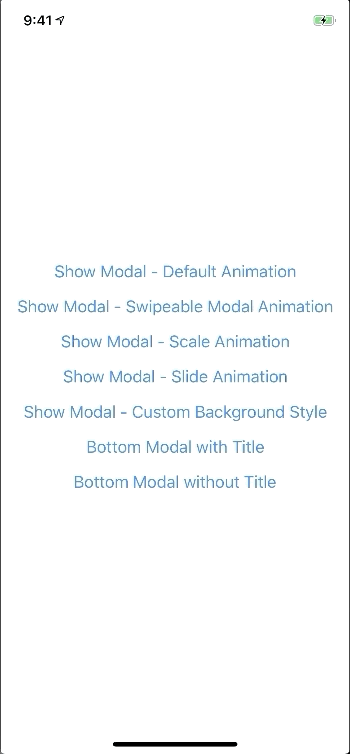
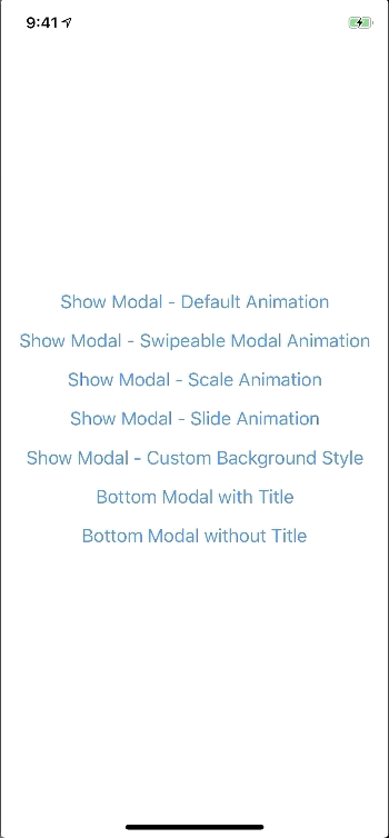
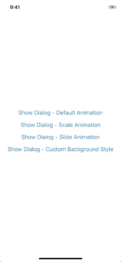
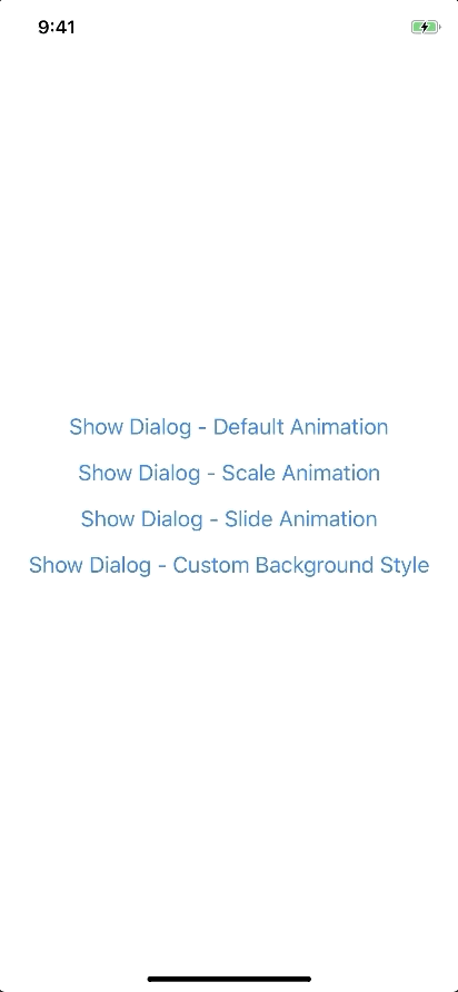
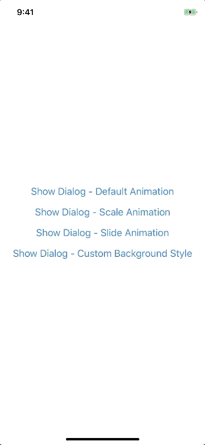
Examples
Basic Usage
import { Modal, ModalContent } from 'react-native-modals';
import { Button } from 'react-native'

<View style={styles.container}>
  <Button
    title="Show Modal"
    onPress={() => {
      this.setState({ visible: true });
    }}
  />
  <Modal
    visible={this.state.visible}
    onTouchOutside={() => {
      this.setState({ visible: false });
    }}
  >
    <ModalContent>
      {...}
    </ModalContent>
  </Modal>
</View>
Usage - Imperative APIs
The api can not be used until ModalPortal is mounted.
You should register in your app root. For example:
import { ModalPortal } from 'react-native-modals';
import { Provider } from 'react-redux';

const Root = () => {
  return (
    <React.Figment>
      <Provider store={store}>
        <App />
        <ModalPortal />
      </Provider>
    </React.Figment>
  )
}
show
import { ModalPortal } from 'react-native-modals';

const id = ModalPortal.show((
  <View>
    {...}
  <View>
));
update
ModalPortal.update(id, {
  children: (
    <View>
      <Text>Updated</Text>
    </View>
  ),
});
dismiss
ModalPortal.dismiss(id);dismissAll
ModalPortal.dismissAll(id);Usage - Animation
import { Modal, SlideAnimation, ModalContent } from 'react-native-modals';

<View style={styles.container}>
  <Modal
    visible={this.state.visible}
    modalAnimation={new SlideAnimation({
      slideFrom: 'bottom',
    })}
  >
    <ModalContent>
      {...}
    </ModalContent>
  </Modal>
</View>
Usage - Swipe
import { Modal, ModalContent } from 'react-native-modals';
import { Button } from 'react-native'

<View style={styles.container}>
  <Modal
    visible={this.state.visible}
    swipeDirection={['up', 'down']} // can be string or an array
    swipeThreshold={200} // default 100
    onSwipeOut={(event) => {
      this.setState({ visible: false });
    }}
  >
    <ModalContent>
      {...}
    </ModalContent>
  </Modal>
</View>
Usage - Modal Title
import { Modal, ModalTitle, ModalContent } from 'react-native-modals';

<View style={styles.container}>
  <Modal
    visible={this.state.visible}
    modalTitle={<ModalTitle title="Modal Title" />}
  >
    <ModalContent>
      {...}
    </ModalContent>
  </Modal>
</View>
Usage - Modal Action
import { Modal, ModalFooter, ModalButton, ModalContent } from 'react-native-modals';

<View style={styles.container}>
  <Modal
    visible={this.state.visible}
    footer={
      <ModalFooter>
        <ModalButton
          text="CANCEL"
          onPress={() => {}}
        />
        <ModalButton
          text="OK"
          onPress={() => {}}
        />
      </ModalFooter>
    }
  >
    <ModalContent>
      {...}
    </ModalContent>
  </Modal>
</View>
Props
Modal
| Prop | Type | Default | Note |
|---|---|---|---|
visible |
boolean |
false |
|
rounded |
boolean |
true |
|
useNativeDriver |
boolean |
true |
|
children |
any |
||
modalTitle? |
React Element |
You can pass a modalTitle component or pass a View for customizing titlebar |
|
width? |
Number |
Your device width | The Width of modal, you can use fixed width or use percentage. For example 0.5 it means 50% |
height? |
Number |
300 | The Height of modal, you can use fixed height or use percentage. For example 0.5 it means 50% |
modalAnimation? |
FadeAnimation |
animation for modal | |
modalStyle? |
any |
||
containerStyle? |
any |
null |
For example: { zIndex: 10, elevation: 10 } |
animationDuration? |
Number |
200 |
|
overlayPointerEvents? |
String |
Available option: auto, none |
|
overlayBackgroundColor? |
String |
#000 |
|
overlayOpacity? |
Number |
0.5 |
|
hasOverlay? |
Boolean |
true |
|
onShow? |
Function |
You can pass shown function as a callback function, will call the function when modal shown | |
onDismiss? |
Function |
You can pass onDismiss function as a callback function, will call the function when modal dismissed | |
onTouchOutside? |
Function |
() => {} |
|
onHardwareBackPress? |
Function |
() => true |
Handle hardware button presses |
onMove? |
Function |
() => {} |
|
onSwiping? |
Function |
() => {} |
|
onSwipeRelease? |
Function |
() => {} |
|
onSwipingOut? |
Function |
() => {} |
|
onSwipeOut? |
Function |
||
swipeDirection? |
string or Array<string> |
[] | Available option: up, down, left, right |
swipeThreshold? |
number |
100 |
|
footer? |
React Element |
null |
for example: <View><Button text="DISMISS" align="center" onPress={() => {}}/></View> |
ModalTitle
| Prop | Type | Default | Note |
|---|---|---|---|
title |
String |
||
style? |
any |
null |
|
textStyle? |
any |
null |
|
align? |
String |
center |
Available option: left, center, right |
hasTitleBar? |
Bool |
true |
ModalContent
| Prop | Type | Default | Note |
|---|---|---|---|
children |
any |
||
style? |
any |
null |
ModalFooter
| Prop | Type | Default | Note |
|---|---|---|---|
children |
ModalButton |
||
bordered? |
Boolean |
true |
|
style? |
any |
null |
ModalButton
| Prop | Type | Default | Note |
|---|---|---|---|
text |
String |
||
onPress |
Function |
||
align? |
String |
center |
Available option: left, center, right |
style? |
any |
null |
|
textStyle? |
any |
null |
|
activeOpacity? |
Number |
0.6 |
|
disabled? |
Boolean |
false |
|
bordered? |
Boolean |
false |
Backdrop
| Prop | Type | Default | Note |
|---|---|---|---|
visible |
Boolean |
||
opacity |
Number |
0.5 |
|
onPress? |
Function |
||
backgroundColor? |
string |
#000 |
|
animationDuration? |
Number |
200 |
|
pointerEvents? |
String |
null |
Available option: auto, none |
useNativeDriver? |
Boolean |
true |
Animation
Params for (*)Animation
FadeAnimation
Preview:
Example:
new FadeAnimation({
  initialValue: 0, // optional
  animationDuration: 150, // optional
  useNativeDriver: true, // optional
})| Param | Type | Default | Note |
|---|---|---|---|
initialValue |
Number | 0 | |
animationDuration? |
Number | 150 | |
useNativeDriver? |
Boolean | true |
ScaleAnimation
Preview:
Example:
new ScaleAnimation({
  initialValue: 0, // optional
  useNativeDriver: true, // optional
})| Param | Type | Default | Note |
|---|---|---|---|
initialValue |
Number | 0 | |
useNativeDriver |
Boolean | true |
SlideAnimation
Preview:
Example:
new SlideAnimation({
  initialValue: 0, // optional
  slideFrom: 'bottom', // optional
  useNativeDriver: true, // optional
})| Param | Type | Default | Note |
|---|---|---|---|
initialValue |
Number | 0 | |
slideFrom |
String | bottom |
Available option: top, bottom, left, right |
useNativeDriver |
Boolean | true |
Create your custom animation
Example:
import { Animated } from 'react-native';
import { Animation } from 'react-native-modals';

class CustomAnimation extends Animation {
  in(onFinished) {
    Animated.spring(this.animate, {
      toValue: 1,
      useNativeDriver: this.useNativeDriver,
    }).start(onFinished);
  }

  out(onFinished) {
    Animated.spring(this.animate, {
      toValue: 0,
      useNativeDriver: this.useNativeDriver,
    }).start(onFinished);
  }

  getAnimations() {
    return {
      transform: [{
        translateY: this.animate.interpolate({
          inputRange: [0, 1],
          outputRange: [800, 1],
        }),
      }],
    };
  }
}
Development
yarn
yarn run build
yarn test