
Package Exports
- react-native-numeric-input
This package does not declare an exports field, so the exports above have been automatically detected and optimized by JSPM instead. If any package subpath is missing, it is recommended to post an issue to the original package (react-native-numeric-input) to support the "exports" field. If that is not possible, create a JSPM override to customize the exports field for this package.
Readme
react-native-numeric-input
a cross platform stylish numeric input for react native
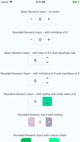
Visual Demo
Working example
you can check out the very simple react native example app just click here and follow the instructions enjoy!
Installation
if you have react-native-vector-icons installed in your project
yarn add react-native-numeric-inputor with npm
npm install react-native-numeric-input --saveif you don't have react-native-vector-icons installed in your project
yarn add react-native-numeric-input react-native-vector-icons
react-native link
or with npm
npm install react-native-numeric-input react-native-vector-icons --save
react-native link
if you're experiencing issues with react-native link which is used to install react-native-vector-icons
please refer to react-native-vector-icons to see manual installation steps
Usage
import Component
import NumericInput from 'react-native-numeric-input'import Component and responsive size function
import NumericInput,{ calcSize } from 'react-native-numeric-input'Basic Usage
<NumericInput onChange={value => console.log(value)} />or basic up-down
<NumericInput type='up-down' onChange={value => console.log(value)} />Keep State Value
<NumericInput value={this.state.value} onChange={value => this.setState({value})} />Advanced Usage
        <NumericInput
            value={this.state.value}
            onChange={value => this.setState({value})}
            totalWidth={240}
            totalHeight={50}
            iconSize={25}
            step={1.5}
            valueType='real'
            rounded
            textColor='#B0228C'
            iconStyle={{ color: 'white' }}
            rightButtonBackgroundColor='#EA3788'
            leftButtonBackgroundColor='#E56B70'/>
or using calcSize function for responsive sizes
        <NumericInput
            value={this.state.value}
            onChange={value => this.setState({value})}
            totalWidth={calcSize(240)}
            totalHeight={calcSize(50)}
            iconSize={calcSize(25)}
            step={1.5}
            valueType='real'
            rounded
            textColor='#B0228C'
            iconStyle={{ color: 'white' }}
            rightButtonBackgroundColor='#EA3788'
            leftButtonBackgroundColor='#E56B70'/>
Props
| Name | Type | Default |
|---|---|---|
| value | number |
none |
| minValue | number |
none |
| maxValue | number |
none |
| step | number |
1 |
| valueType | 'integer' or 'real' |
'integer' |
| initValue | number |
0 |
| iconSize | number |
calcSize(30) |
| borderColor | string |
'#d4d4d4' |
| iconStyle | object |
none |
| totalWidth | number |
calcSize(220) |
| sepratorWidth | number |
1 |
| type | 'plus-minus' or 'up-down' |
'plus-minus' |
| rounded | boolean |
false |
| textColor | string |
'black' |
| containerStyle | object |
none |
| inputStyle | object |
none |
| upDownButtonsBackgroundColor | string |
'white' |
| rightButtonBackgroundColor | string |
'white' |
| leftButtonBackgroundColor | string |
'white' |
| totalHeight | number |
none |
| onChange | function |
none - required prop |
| editable | boolean |
true |
notes about props
- value prop - this component uses it's own state to hold value if value is not given as a prop
- style props - this component has a default style and the styles props are to override the default style or add more fields
- totalWidth prop - this prop is for the entire component width, and all other sizes are derived from it , unless given other size props
- initValue prop - if using value prop, this is not needed and the initial value can be given by the value prop
calcSize function
this is a function that receives a number and returns a number and it keeps a responsive size for all devices, based on the iphone 7 resolution
calcSize(num)Versioning
We use SemVer for versioning. For the versions available, see the tags on this repository.
License
This project is licensed under the MIT License