
Package Exports
- react-native-progress-bar-multi-step
This package does not declare an exports field, so the exports above have been automatically detected and optimized by JSPM instead. If any package subpath is missing, it is recommended to post an issue to the original package (react-native-progress-bar-multi-step) to support the "exports" field. If that is not possible, create a JSPM override to customize the exports field for this package.
Readme
 # react-native-progress-bar-multi-step
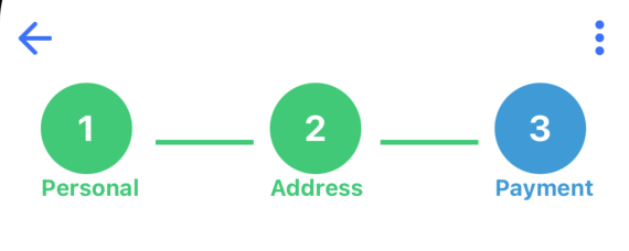
Customizable multi step progress bar
Installation
npm install react-native-progress-bar-multi-stepUsage
import ProgressBarMultiStep from "react-native-progress-bar-multi-step";

// ...

const tabs = [
    {
      title: 'Personal',
      pageNo: 1
      // onPress: e => console.log(e)
    },
    {title: 'Address', pageNo: 2},
    {title: 'Payment', pageNo: 3}
  ];

Keys must be same with the example of tab array. onPress is a callback function which has parameter of selected pageNo.

const [page, setPage] = useState(1);

<ProgressBarMultiStep
    progressive={true}
    page={page}
    setPage={setPage}
    tabs={tabs}
/>
Properties
| Prop | Description | Default | Type | Required |
|---|---|---|---|---|
page |
Current page number. | 1 |
number | yes |
setPage |
Function to set state | function | no | |
tabs |
array of tabs object that has properties of title | array | Tab | yes |
progressive |
if progressive is set to false only current page tab color will be active | true | boolean | no |
finishedBackgroundColor |
Background color of the finished steps and line. | 'rgb(57,202,116)' | string | no |
inProgressBackgroundColor |
Background color of the in progress steps and line. | 'rgb(58,153,216)' | string | no |
circleStyle |
Object of width and height keys to style step circle | width:56, height:56 | object | no |
stepNumberStyle |
Object of fontSize, fontWeight and color keys | default:color:'white',fontWeight:'bold',fontSize: 22 | object | no |
stepTitleStyle |
Object of fontSize and fontWeight keys | default: fontWeight: 'bold', fontSize: 22. | object | no |
lineStyle |
Object of width, height and marginHorizontal keys | default:height: 3,width: 60,marginHorizontal: 10 | object | no |
containerStyle |
Object of width, height and marginTop keys | default:height: '10%',width: '100%',marginHorizontal: 10 | object | no |
Contributing
See the contributing guide to learn how to contribute to the repository and the development workflow.
License
MIT