
Package Exports
- react-native-responsive-fontsize
This package does not declare an exports field, so the exports above have been automatically detected and optimized by JSPM instead. If any package subpath is missing, it is recommended to post an issue to the original package (react-native-responsive-fontsize) to support the "exports" field. If that is not possible, create a JSPM override to customize the exports field for this package.
Readme
react-native-responsive-fontsize
Use this library if you have a small problem with the font size 🎉

How to install
yarn add react-native-responsive-fontsize
# or
npm install react-native-responsive-fontsize --save
How it looks on different device sizes
| iPhone SE | iPhone X |
|---|---|
 |
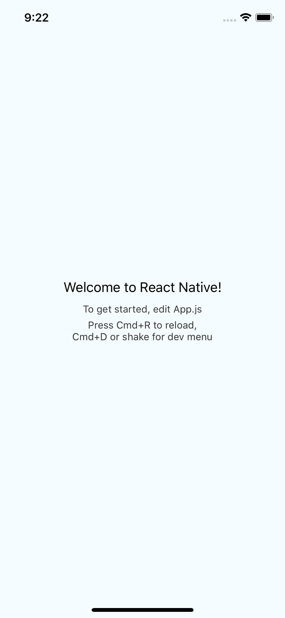 |
Usage
import { RFPercentage, RFValue } from "react-native-responsive-fontsize";

const styles = StyleSheet.create({
  welcome: {
    fontSize: RFValue(24),
    textAlign: "center",
    margin: 10,
  },
  instructions: {
    textAlign: "center",
    color: "#333333",
    marginBottom: 5,
    fontSize: RFPercentage(5),
  },
});
Load map (I'm waiting for your help)
- support landscape mode
- make
test code