
Package Exports
- react-native-responsive-image
This package does not declare an exports field, so the exports above have been automatically detected and optimized by JSPM instead. If any package subpath is missing, it is recommended to post an issue to the original package (react-native-responsive-image) to support the "exports" field. If that is not possible, create a JSPM override to customize the exports field for this package.
Readme
React Native Responsive Image


React Native <Image> component, that rescales itselfs correctly on iOS and Android devices.
##Why?
React Native's Image size is rendered the same regardless of device size and resolution. Desired behaviour in is to have a component, that scales appropriately.
##Installation
npm install react-native-responsive-image --save
##Usage
Use the <ResponsiveImage> component and set it's initWidth and initHeight props.
These values are used as they are for iPhone6 Plus, and they are scaled down on any smaller iOS/Android device.
##Example
Three images in one full-width row:
import React, { Component } from 'react';
import { AppRegistry, StyleSheet, View } from 'react-native';
import ResponsiveImage from 'react-native-responsive-image';

class App extends Component {
  render() {
    return (
      <View style={{flex: 1, justifyContent: 'center',}}>
                <View style={{flexDirection: 'row',}}>
                    <ResponsiveImage source={{uri: 'https://facebook.github.io/react/img/logo_og.png'}} initWidth="138" initHeight="138"/>
                    <ResponsiveImage source={{uri: 'https://facebook.github.io/react/img/logo_og.png'}} initWidth="138" initHeight="138"/>
                    <ResponsiveImage source={{uri: 'https://facebook.github.io/react/img/logo_og.png'}} initWidth="138" initHeight="138"/>
                </View>
            </View>
    );
  }
}

AppRegistry.registerComponent('ResponsiveImageExample', () => App);
##One image size?
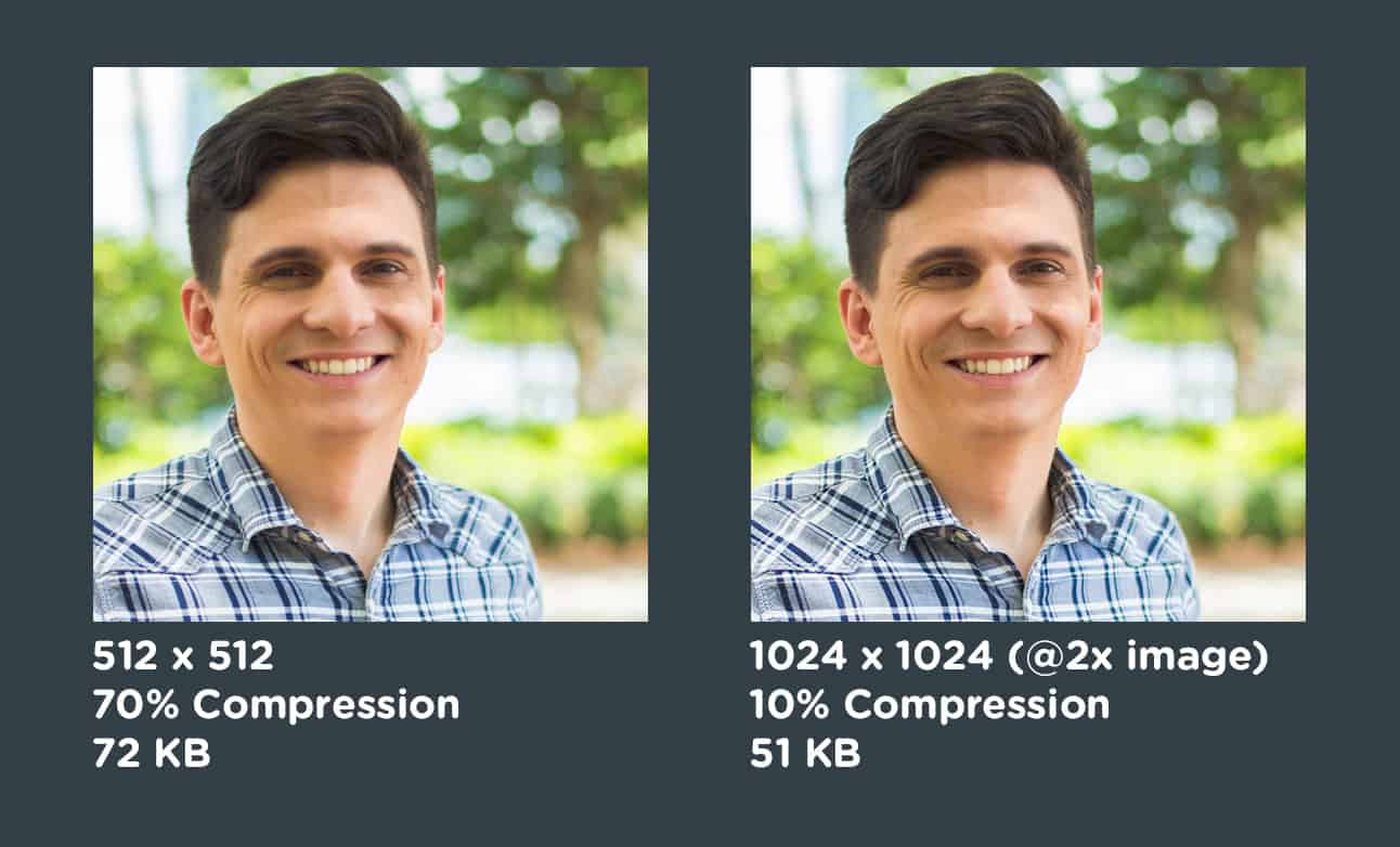
We could have added support for multiple image sources, like https://github.com/exponentjs/react-native-responsive-image has. It sounds like you would save some bytes by delivering less-resolution images to devices with lower resolution.
But solution that worked the best for me was different. Actually you need to serve just one high-resolution compressed, and it will even save more bytes. Though @2x or @3x images have more pixels, it’s surprising how much they can be compressed.
##Example project
###Create project
react-native init ResponsiveImageExample
cp ./example/index.android.js ./ResponsiveImageExample/index.android.js
cp ./example/index.ios.js ./ResponsiveImageExample/index.ios.js
cd ResponsiveImageExample
npm i react-native-responsive-image
###Run on iOS
Open ResponsiveImageExample/ios/ResponsiveImageExample.xcodeproj
Run the project inside iOS Simulator simulator
###Run on Android
Go to ResponsiveImageExample
react-native run-android
##Development
Modify react-native-responsive-image.js in the root directory
Propagate changes
cp ./react-native-responsive-image.js ./ResponsiveImageExample/node_modules/react-native-responsive-image/react-native-responsive-image.js