
Package Exports
- react-native-tree-multi-select
- react-native-tree-multi-select/lib/commonjs/index.js
- react-native-tree-multi-select/lib/module/index.js
This package does not declare an exports field, so the exports above have been automatically detected and optimized by JSPM instead. If any package subpath is missing, it is recommended to post an issue to the original package (react-native-tree-multi-select) to support the "exports" field. If that is not possible, create a JSPM override to customize the exports field for this package.
Readme
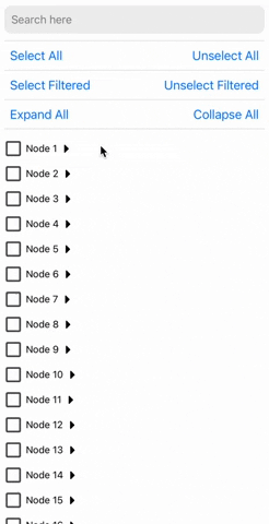
react-native-tree-multi-select
Super-fast Tree view with multi-selection capabilities, using checkboxes and search filtering.


Installation
Using yarn
yarn add react-native-tree-multi-selectusing npm:
npm install react-native-tree-multi-selectDependencies that need to be installed for this library to work:
Make sure to follow the native-related installation instructions for these dependencies.
Usage
import {
  TreeView,
  type TreeNode,
  type TreeViewRef
} from 'react-native-tree-multi-select';

// Refer to the Properties table below or the example app for the TreeNode type
const myData: TreeNode[] = [...];

export function TreeViewUsageExample(){
  const treeViewRef = React.useRef<TreeViewRef | null>(null);

  // It's recommended to use debounce for the search function (refer to the example app)
  function triggerSearch(text: string){
    // Pass search text to the tree along with the keys on which search is to be done(optional)
    treeViewRef.current?.setSearchText(text, ["name"]);
  }

  // Callback functions for check and expand state changes:
  const handleSelectionChange = (checkedIds: string[]) => {
    // NOTE: Do something with updated checkedIds here
  };
  const handleExpanded = (expandedIds: string[]) => {
    // NOTE: Do something with updated expandedIds here
  };

  // Expand collapse calls using ref
  const expandAllPress = () => treeViewRef.current?.expandAll?.();
  const collapseAllPress = () => treeViewRef.current?.collapseAll?.();

  // Multi-selection function calls using ref
  const onSelectAllPress = () => treeViewRef.current?.selectAll?.();
  const onUnselectAllPress = () => treeViewRef.current?.unselectAll?.();
  const onSelectAllFilteredPress = () => treeViewRef.current?.selectAllFiltered?.();
  const onUnselectAllFilteredPress = () => treeViewRef.current?.unselectAllFiltered?.();

  return(
    // ... Remember to keep a fixed height for the parent. Read Flash List docs to know why
    <TreeView
      ref={treeViewRef}
      data={myData}
      onCheck={handleSelectionChange}
      onExpand={handleExpanded}
    />
  );
}
Properties
| Property | Type | Required | Description |
|---|---|---|---|
data |
TreeNode[] |
Yes | An array of TreeNode objects |
onCheck |
(checkedIds: string[]) => void |
No | Callback when a checkbox is checked |
onExpand |
(expandedIds: string[]) => void |
No | Callback when a node is expanded |
preselectedIds |
string[] |
No | An array of ids that should be preselected |
indentationMultiplier |
number |
No | Indentation (marginStart) per level (defaults to 15) |
treeFlashListProps |
TreeFlatListProps |
No | Props for the flash list |
checkBoxViewStyleProps |
CheckBoxViewStyleProps |
No | Props for the checkbox view |
CheckboxComponent |
ComponentType<CheckBoxViewProps> |
No | A custom checkbox component. Defaults to React Native Paper's Checkbox |
ExpandCollapseIconComponent |
ComponentType<ExpandIconProps> |
No | A custom expand/collapse icon component |
ExpandCollapseTouchableComponent |
ComponentType<TouchableOpacityProps>(React Native's TouchableOpacityProps) |
No | A custom expand/collapse touchable component |
TreeNode
| Property | Type | Required | Description |
|---|---|---|---|
id |
string |
Yes | Unique identifier for the node |
name |
string |
Yes | The display name of the node |
children |
TreeNode[] |
No | An array of child TreeNode objects |
[key: string] |
any |
No | Any additional properties for the node (May be useful to perform search on) |
TreeViewRef
| Property | Type | Description |
|---|---|---|
selectAll |
() => void |
Selects all nodes |
unselectAll |
() => void |
Unselects all nodes |
selectAllFiltered |
() => void |
Selects all filtered nodes |
unselectAllFiltered |
() => void |
Unselects all filtered nodes |
expandAll |
() => void |
Expands all nodes |
collapseAll |
() => void |
Collapses all nodes |
setSearchText |
(searchText: string, searchKeys?: string[]) => void |
Set the search text and optionally the search keys. Default search key is "name" Recommended to call this inside a debounced function if you find any performance issue otherwise. |
CheckBoxViewStyleProps
| Property | Type | Required | Description |
|---|---|---|---|
outermostParentViewStyle |
StyleProp<ViewStyle> |
No | Optional style modifier for the outermost parent view. |
checkboxParentViewStyle |
StyleProp<ViewStyle> |
No | Optional style modifier for the checkbox parent view. |
textTouchableStyle |
StyleProp<ViewStyle> |
No | Optional style modifier for the text touchable style. |
checkboxProps |
CheckboxProps |
No | Optional props for the checkbox component. |
textProps |
TextProps (React Native) |
No | Optional props for the text component. |
CheckboxProps
All properties of RNPaperCheckboxAndroidProps(from react-native-paper) except for onPress and status
TreeFlatListProps
All properties of FlashListProps(from @shopify/flash-list) except for data and renderItem
ExpandIconProps
| Property | Type | Required | Description |
|---|---|---|---|
| isExpanded | boolean | Yes | Indicates if the icon is expanded |
More customization options are on the way 🙌
Contributing
See the contributing guide to learn how to contribute to the repository and the development workflow.
License
MIT
Support the project


Made with create-react-native-library