
Package Exports
- react-native-walkthrough-carousel
This package does not declare an exports field, so the exports above have been automatically detected and optimized by JSPM instead. If any package subpath is missing, it is recommended to post an issue to the original package (react-native-walkthrough-carousel) to support the "exports" field. If that is not possible, create a JSPM override to customize the exports field for this package.
Readme
💬 React Native Walkthrough Carousel
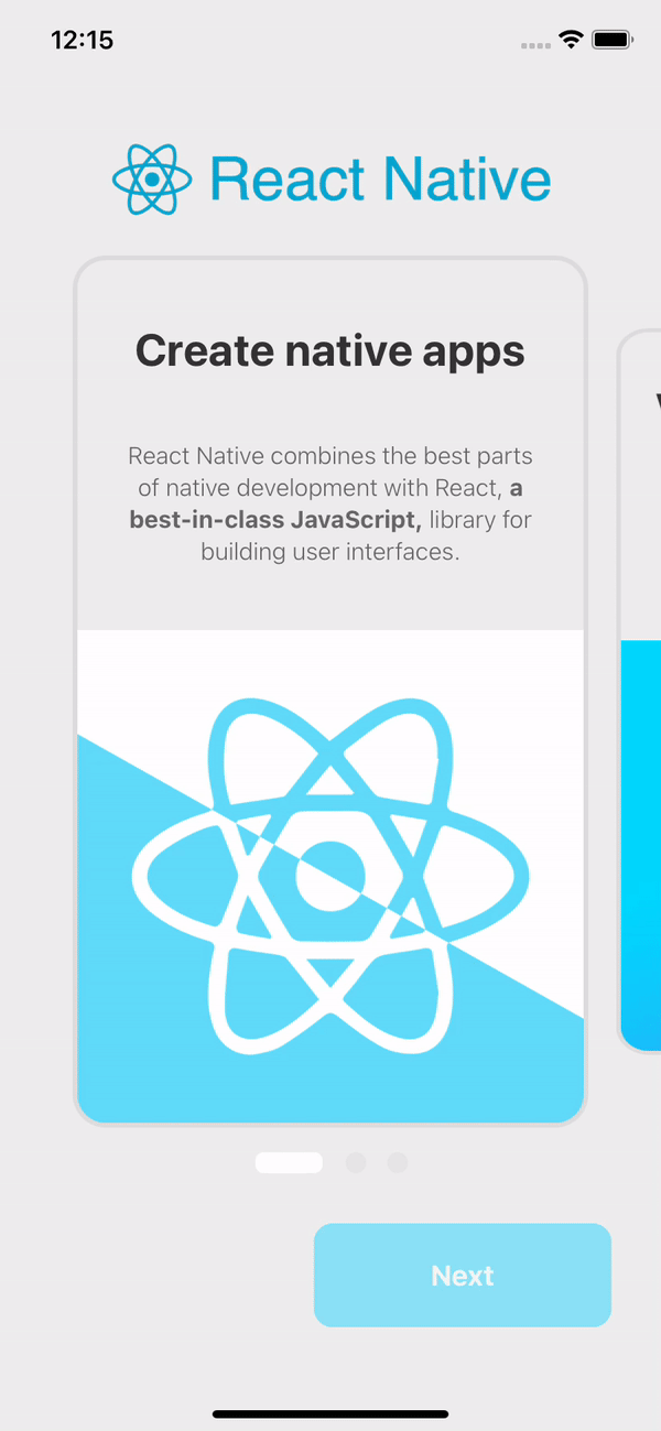
A simple and practical component for creating a Walkthrough with Carousel for React Native applications

Installation
Using npm:
npm install react-native-walkthrough-carouselUsing Yarn:
yarn add react-native-walkthrough-carousel
Example
import React from 'react';
import Walkthrough from 'react-native-walkthrough-carousel';

import logo from '../assets/logo.png';

import carousel from './carousel';
import buttons from './buttons';

const styles = {
    backgroundColor: '#eee',
    card: {
        borderColor: '#ddd',
    },
    dotStyle: {
        backgroundColor: 'rgba(255, 255, 255, 0.92)',
    },
    inactiveDotStyle: {
        backgroundColor: '#ddd',
    },
};

export default function App() {
    return (
        <>
            <Walkthrough
                logo={logo}
                carousel={carousel}
                buttons={buttons}
                styles={styles}
            />
        </>
    );
}
/*
* carousel.js
*/
import React from 'react';
import { Text, Image, StyleSheet } from 'react-native';
const styles = StyleSheet.create({
title: {
fontSize: 28,
color: '#333',
fontWeight: 'bold',
textAlign: 'center',
paddingHorizontal: 10,
},
text: {
fontWeight: '300',
fontSize: 15,
color: '#666',
textAlign: 'center',
lineHeight: 20,
paddingHorizontal: 25,
},
bannerImage: {
resizeMode: 'contain',
flex: 2,
justifyContent: 'center',
alignContent: 'center',
alignItems: 'center',
alignSelf: 'center',
},
bold: { fontWeight: 'bold' },
});
export default [
{
key: 1,
title: <Text style={styles.title}>Create native apps</Text>,
text: (
<Text style={styles.text}>
React Native combines the best parts of native development with React,{' '}
<Text style={styles.bold}>a best-in-class JavaScript,</Text> library for building user interfaces.
</Text>
),
banner: (
<Image
source={require('../../example/assets/1.png')}
style={styles.bannerImage}
/>
),
},
...
];/*
* buttons.js
*/
const previousButton = {
text: 'Previous',
styles: {
color: '#61DBFB',
borderColor: '#61DBFB',
borderWidth: 1,
},
};
const nextButton = {
text: 'Next',
styles: {
backgroundColor: '#61DBFB',
borderColor: '#61DBFB',
borderWidth: 2,
},
};
const doneButton = {
text: 'Continue',
styles: {
borderColor: '#61DBFB',
backgroundColor: '#61DBFB',
borderWidth: 1,
},
onPress: async function handleDone() {
console.log('Continue button was clicked');
},
};
export default { previousButton, nextButton, doneButton };Advanced example
See example for a working demo!
Props
| Prop | Type | Description |
|---|---|---|
| logo | string | Importing an image to be displayed at the top of the page. |
| carousel | array of objects | - Key (Number): unique key to identify the position within the array - Title (Text Component): Text component, styled input is supported - React Native <Text/> recommended- Text (Text Component): Text component, styled input is supported - React Native <Text/> recommended- Banner (Image Component):Image component, stylized input is supported - React Native <Image/> recommended |
| buttons | object | - previousButton (Object): Includes text attribute that expects a string and styles that expects a stylized object - nextButton (Object): Includes text attribute that expects a string and styles that expects a stylized object - doneButton (Object): Includes text attribute that expects a string, styles that expects an object with stylization and onPress that expects a function to be executed at the click of a button - strongly recommended to change the global display state of the Walkthrough |
| styles | object | Wait for a stylized object where at the root of the object will impact the component as a whole, the card attribute will only impact the cards, the dotStyle attribute will only impact the active dot, and finally, the inactiveDotStyle will have impact only on the idle dot. |
Observations
This component does not manage the global state of the application for implementing Walkthrough behavior - displaying a single one the first time the application is opened.
This responsibility rests with the consumer application of that library. Below is an example of application routing:
const App = createStackNavigator();

export default function AuthRoutes() {
    const { isFirstAccess } = useAuth(); // Variable extracted from the global state containing the (Boolean) value if the Walkthrough is to be displayed

    return (
        <App.Navigator
            initialRouteName={isFirstAccess ? 'WalkThrough' : 'Home'}
        >
            <App.Screen name="WalkThrough" component={WalkThrough} />
            <App.Screen name="Home" component={Home} />
        </App.Navigator>
    );
}
How to contribute
- Make a fork;
- Create a branck with your feature:
git checkout -b my-feature; - Commit changes:
git commit -m 'feat: My new feature'; - Make a push to your branch:
git push origin my-feature.
After merging your receipt request to done, you can delete a branch from yours.
License
This project is under the MIT license. See the LICENSE for more information.