
Package Exports
- react-otp-input
This package does not declare an exports field, so the exports above have been automatically detected and optimized by JSPM instead. If any package subpath is missing, it is recommended to post an issue to the original package (react-otp-input) to support the "exports" field. If that is not possible, create a JSPM override to customize the exports field for this package.
Readme
react-otp-input

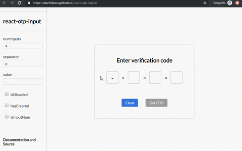
A fully customizable, one-time password input component for the web built with React.
Installation
To install the latest stable version:
npm install --save react-otp-inputBasic usage:
import React, { Component } from 'react';
import OtpInput from 'react-otp-input';

export default class App extends Component {
  state = {
    otp: '',
  };

  handleChange = otp => this.setState({ otp });

  render() {
    return (
      <div>
        <OtpInput
          onChange={this.handleChange}
          numInputs={6}
          separator={<span>-</span>}
        />
      </div>
    );
  }
}
API
| Name |
Type | Required | Default | Description |
|---|---|---|---|---|
| numInputs | number | true | 4 | Number of OTP inputs to be rendered. |
| onChange | function | true | console.log | Returns OTP code typed in inputs. |
| value | string / number | true | '' | The value of the OTP passed into the component. |
| separator | component |
false | none | Provide a custom separator between inputs by passing a component. For instance, <span>-</span> would add - between each input |
| containerStyle | style (object) / className (string) | false | none | Style applied or class passed to container of inputs. |
| inputStyle | style (object) / className (string) | false | none | Style applied or class passed to each input. |
| focusStyle | style (object) / className (string) | false | none | Style applied or class passed to inputs on focus. |
| isDisabled | boolean | false | false | Disables all the inputs. |
| disabledStyle | style (object) / className (string) | false | none | Style applied or class passed to each input when disabled. |
| hasErrored | boolean | false | false | Indicates there is an error in the inputs. |
| errorStyle | style (object) / className (string) | false | none | Style applied or class passed to each input when errored. |
| shouldAutoFocus | boolean | false | false | Auto focuses input on initial page load. |
| isInputNum | boolean | false | false | Restrict input to only numbers. |
Breaking changes when porting to v1.0.0
react-otp-input is now a controlled component to facilitate functionalities that weren't possible before from the application using it, such as clearing or pre-assigning values. For v1.0.0 and above, a value prop needs to be passed in the component for it to function as expected.
Development
To run the development server:
npm run devTo run the development server for example:
npm run docsTo make a production build of the example:
npm run docs:prodChecklist

- Add flowtypes
- Add ESLint, Prettier for code quality
- Add styling support for states including focus/disabled
- Travis CI, Codecov
- Write tests
Contributing


Feel free to open issues and pull requests!
License

MIT