Package Exports
- react-simple-color-picker-design
- react-simple-color-picker-design/dist/cjs/index.js
- react-simple-color-picker-design/dist/index.js
This package does not declare an exports field, so the exports above have been automatically detected and optimized by JSPM instead. If any package subpath is missing, it is recommended to post an issue to the original package (react-simple-color-picker-design) to support the "exports" field. If that is not possible, create a JSPM override to customize the exports field for this package.
Readme
react-simple-color-picker
React Simple Color Picker is a lightweight picker compatible with Tailwind and daisyUI, but it can still be used without Tailwind and daisyUI, and it gives the ability to add a predefined list of colors. If used with daisyUI, the picker will automatically adapt to the themes.
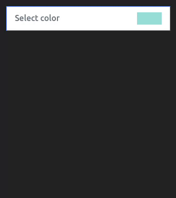
Light
Dark with nativePicker option true

Install
npm i react-simple-color-picker-designSimple usage
Styles !
If the picker does not look like what is on the documentation, it is likely that there is a CSS conflict with the picker.
// Base styles of picker
import 'react-simple-color-picker-design/styles/base.css'
// import if not using Tailwind /!\
import 'react-simple-color-picker-design/styles/withoutTailwind.css'
// import one theme if not using daisyUI /!\
import 'react-simple-color-picker-design/styles/light.css'
import 'react-simple-color-picker-design/styles/dark.css'
Component usage !
import { useEffect, useState } from "react";
import SimpleColorPicker from "react-simple-color-picker-design";

export default function Demo() {
  const [color, setColor] = useState("#9adedb");

  useEffect(() => {
    console.log("🚀 value changed ! :", color);
  }, [color]);

  return <SimpleColorPicker defaultColor={color} setColor={setColor} />
With Options
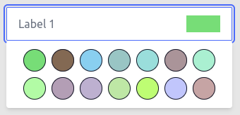
Example 1
<SimpleColorPicker
  labelOne="Label 1"
  labelTwo="Label 2"
  noCustomColor={true} // Disable custom color input
  nativePicker={true} // Swith to native html color picker
  defaultColor={color} // Base selected color
  setColor={setColor} // Update state
/>
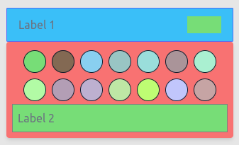
Example 2
<SimpleColorPicker
  labelOne="Label 1"
  labelTwo="Label 2"
  inputClasses="bg-info" // Custom class for input
  boxClasses="bg-error" // Custom class for popUp box
  noCustomColor={false} // Disable custom color input
  nativePicker={true} // Swith to native html color picker
  defaultColor={color} // Base selected color
  setColor={setColor} // Update state
/>
Example 3
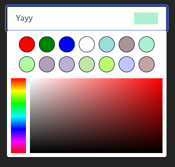
<SimpleColorPicker
  labelOne="Yayy"
  colorList={[
    "red",
    "green",
    "blue",
    "white",
    "#9adedb",
    "#aa9499",
    "#aaf0d1",
    "#b2fba5",
    "#b39eb5",
    "#bdb0d0",
    "#bee7a5",
    "#befd73",
    "#c1c6fc",
    "#c6a4a4",
    "#ff9899",
    "#ffb7ce",
    "#ca9bf7",
  ]}
  nativePicker={false} // Swith to native html color picker
  labelTwo="Custom List !"
  defaultColor="#aaf0d1" // Base selected color
  setColor={setColor} // Update state
/>