Package Exports
- react-simple-toasts
- react-simple-toasts/dist/index.es.js
- react-simple-toasts/dist/index.js
This package does not declare an exports field, so the exports above have been automatically detected and optimized by JSPM instead. If any package subpath is missing, it is recommended to post an issue to the original package (react-simple-toasts) to support the "exports" field. If that is not possible, create a JSPM override to customize the exports field for this package.
Readme
React Simple Toasts
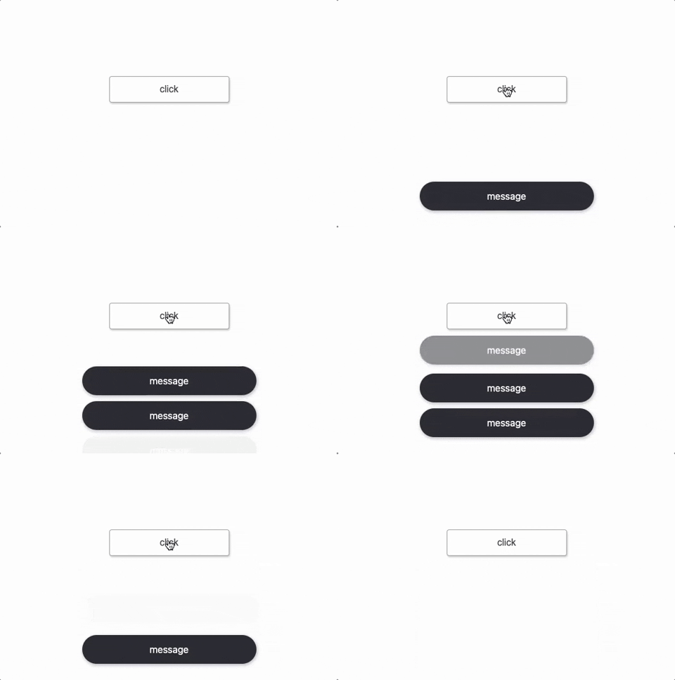
React Simple Toasts is a simple and easy-to-use toast message popup for React.

Installation
Install the package via npm:
npm install react-simple-toastsUsage
To use React Simple Toasts, call the toast function with a message to display:
import toast from 'react-simple-toasts';

function MyComponent() {
  return (
    <div>
      <button onClick={() => toast('Hello, world!')}>
        Show Toast
      </button>
    </div>
  );
}
By default, the toast message will be displayed for 3 seconds. Customize this duration by passing a second argument to the toast function:
toast('Hello, world!', 5000);Customize the appearance and behavior of the toast message by passing an options object to the toast function:
toast('Hello, world!', {
  time: 5000,
  position: 'top-right',
  clickable: true,
  clickClosable: true,
  className: 'custom-toast',
  render: message => <CustomToast message={message} />,
  onClick: event => console.log('Toast clicked!'),
});
Set default options for all toast messages by calling the toastConfig function:
import { toastConfig } from 'react-simple-toasts';

toastConfig({
  time: 5000,
  position: 'bottom-right',
  clickClosable: true,
  className: 'custom-toast',
  render: message => <CustomToast message={message} />,
});
Live Demo
Try React Simple Toasts in action with live demo.
API
toast(message, options)
Displays a toast message with the given message and options.
| Parameter | Type | Description |
|---|---|---|
message |
string, ReactNode |
The message to display in the toast. |
options |
object |
An optional object containing options to customize the appearance and behavior of the toast message. The following options are available: |
options.time |
number |
The duration (in milliseconds) that the toast message will be displayed. Default is 3000. |
options.className |
string |
A string of classes to apply to the toast container. |
options.clickable |
boolean |
A boolean value that determines whether the toast message is clickable. Default is false. |
options.clickClosable |
boolean |
A boolean value that determines whether the toast message can be closed by clicking on it. Default is false. |
options.position |
string |
A string that sets the position of the toast message. Available options are 'bottom-left', 'bottom-center', 'bottom-right', 'top-left', 'top-center', and 'top-right'. Default is 'bottom-center'. |
options.maxVisibleToasts |
number |
The maximum number of toast messages that can be displayed at the same time. Default is null, which allows an unlimited number of toasts. |
options.render |
function |
A function that returns a ReactNode to render as the toast message. The function takes a message argument, which is the message to display in the toast. Default is null. |
options.onClick |
function |
A function to be called when the toast message is clicked. This function takes an event argument, which is the click event. Must be used with clickable: true. |
Toast Return Object
When the toast function is called, it returns an object with a single method, close(), which allows you to manually close the toast message that is currently being displayed.
| Method | Description |
|---|---|
close() |
Closes the currently displayed toast message. |
You can call this method at any time to close the toast message before its duration has ended. For example, you might call it in response to a user interaction such as a button click.
This functionality is available from version 3.3.0 of the library.
const myToast = toast('Hello, world!');
// ...
<button onClick={() => myToast.close()}>
  Close Toast Message
</button>
toastConfig(options)
Sets default options for all toast messages.
| Parameter | Type | Description |
|---|---|---|
options |
object |
An object containing options to customize the appearance and behavior of all toast messages. The following options are available: |
options.time |
number |
The duration (in milliseconds) that the toast message will be displayed. Default is 3000. |
options.className |
string |
A string of classes to apply to the toast container. |
options.clickClosable |
boolean |
A boolean value that determines whether the toast message can be closed by clicking on it. Default is false. |
options.position |
string |
A string that sets the position of the toast message. Available options are 'bottom-left', 'bottom-center', 'bottom-right', 'top-left', 'top-center', and 'top-right'. Default is 'bottom-center'. |
options.maxVisibleToasts |
number |
The maximum number of toast messages that can be displayed at the same time. Default is null, which allows an unlimited number of toasts. |
options.render |
function |
A function that returns a ReactNode to render as the toast message. The function takes a message argument, which is the message to display in the toast. Default is null. |
Contributing
Contributions are always welcome! If you want to contribute to this project.
License
This project is licensed under the MIT License.

