
Package Exports
- react-stepper-component-with-svg
This package does not declare an exports field, so the exports above have been automatically detected and optimized by JSPM instead. If any package subpath is missing, it is recommended to post an issue to the original package (react-stepper-component-with-svg) to support the "exports" field. If that is not possible, create a JSPM override to customize the exports field for this package.
Readme
React Stepper Component
React Stepper Component is a simple yet customizable component using SVG that will help you to make you application more intutive and appealing. This will help you make you stepper more responsive.
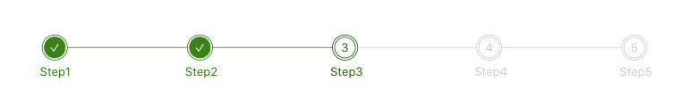
Screenshot
Features!
- Highly customizable
- Easy to manage
- Can set color for outer circle, inner circle & counter
- Can set custom label
- Can set color for label
- Can set custom color for completed steps, Connector, Completed Label and active Step
- Have a callback function for click
- Works completely based on an Object
Installation
npm install --save react-stepper-component-with-svgUsage
import  Stepper  from 'react-stepper-component-with-svg';

<Stepper onClickCallback={callbackFunctionName} stepperData={stepperData}/>
Props for Stepper
| Props | Option | Default | Description |
|---|---|---|---|
| onClickCallback | function | none | Callback function for click on step item |
| stepperData | StepperDTO | none | Object that manages the stepper |
Sample Data Object
  const stepperData = {
    currentStep: 2,
    outerCircleBorderColor: "#ccc",
    innerCircleBorderColor: "#ccc",
    counterTextColor: "#ccc",
    labelTextColor: "#ccc",
    completedIndicatorColor: "green",
    completedTextColor: "#fff",
    connectorColor: "#ccc",
    completedLabelColor: "green",
    activeIndicator: "#006400",
    steps: [
        {
            title: 'Step1'
        },
        {
            title: 'Step2'
        },
        {
            title: 'Step3'
        },
        {
            title: 'Step4'
        },
        {
          title: 'Step5'
        }
    ]
};
stepperDTO
| Props | Option | Default | Description |
|---|---|---|---|
| currentStep | number | none | Value for active step |
| outerCircleBorderColor | string | Color code for the outer circle | |
| innerCircleBorderColor | string | Color code for the inner circle | |
| counterTextColor | string | Color code for counter text | |
| labelTextColor | string | Color code for label | |
| completedIndicatorColor | string | Color code for completion indicator | |
| completedTextColor | string | Color code for completed text | |
| connectorColor | string | Color code for connector line | |
| completedLabelColor | string | Color code for completed label | |
| activeIndicator | string | Color code for active step indicator | |
| steps | [StepsDTO] | none | Array of objects with label for step |
StepsDTO
| Props | Option | Default | Description |
|---|---|---|---|
| title | string | none | Label for the stepper |