
Package Exports
- react-style-editor
This package does not declare an exports field, so the exports above have been automatically detected and optimized by JSPM instead. If any package subpath is missing, it is recommended to post an issue to the original package (react-style-editor) to support the "exports" field. If that is not possible, create a JSPM override to customize the exports field for this package.
Readme
React Style Editor


A React component that displays and edits CSS, similar to the browser's DevTools.
Live demo
Features
- Parses any CSS string and formats it in a familiar fashion
- Validates each rule and each declaration using the browsers's own engine
- Facilitates commenting the CSS code through checkbox toggling
- Allows easy additions by clicking next to the desired location
- Has no dependencies (other than React)
- Is tiny (< 10 KB minified)
- Is customizable through classes
- Offers 3 output formats:
- the code with preserved formatting
- a machine-friendly model of the code (recursive array of objects)
- the prettified code
Installation
npm i react-style-editorUsage
import React from 'react'
import StyleEditor from 'react-style-editor'
class Component extends React.Component {
render() {
return (
<StyleEditor
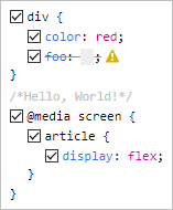
defaultValue={`
div {color:red;}
/* Hello, World! */
@media screen {
article {
display: flex;
}
}
`}
/>
)
}
}Props
| prop | type | default | description |
|---|---|---|---|
defaultValue |
string | '' |
The initial CSS code |
value |
string | undefined |
The controlled CSS code |
onChange |
function | null |
A closure that receives a single argument, string or array, depending on the value of outputFormats |
outputFormats |
string | 'pretty' |
Comma-separated values of: 'preserved', 'machine', 'pretty' |
readOnly |
boolean | false |
All interactions with the component are blocked |
All parameters are optional, but some are inter-related. For example, due to the nature of React, you should use StyleEditor either fully controlled or fully uncontrolled (see this article).
A short summary:
defaultValue=> uncontrolled, the component is on its ownvalue=> controlled => you must also use theonChangeorreadOnlyproperties.
The above behavior is identical to that of normal React form elements, e.g. <textarea/>.
Any other props are spread to the internal root.
Ideas for the future
- Color swatches (similar to the browser)
- Dropdown suggestions for properties/values (similar to the browser)
- Ability to copy/delete fragments of code
- Keyboard support for
TAB,:andUP/DOWNincrements of numeric values - Prop for automatically mutating the code after validation
- Theme support (similar to the browser)
- Toggle view mode: tree/original
- Undo/redo
- Better code quality through
propTypes - Better comment rendering (some comments look better inline rather than block)
- Filters (similar to the browser)
- Error messages displayed in the warning-sign's tooltip