
Package Exports
- react-tabs-redux
This package does not declare an exports field, so the exports above have been automatically detected and optimized by JSPM instead. If any package subpath is missing, it is recommended to post an issue to the original package (react-tabs-redux) to support the "exports" field. If that is not possible, create a JSPM override to customize the exports field for this package.
Readme
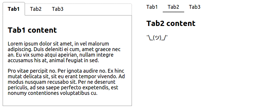
React tabs (Redux compatible)


Simple, fully customizable React tabs component that can be used in plain React application or with any Flux-like architecture with external application state, e.g. Redux.
Installation
Using npm:
$ npm install react-tabs-reduxUMD build is also available:
<script src="https://npmcdn.com/react-tabs-redux/dist/react-tabs.min.js"></script>with components accessible via window.ReactTabs object.
NOTE: This component requires React to be installed separately.
Usage
- with plain React (using component's internal state) - see example
<Tabs>
    <TabLink to="tab1">Tab1</TabLink>
    <TabLink to="tab2">Tab2</TabLink>
    <TabLink to="tab3">Tab3</TabLink>

    <TabContent for="tab1">/* content for tab #1 */</TabContent>
    <TabContent for="tab2">/* content for tab #2 */</TabContent>
    <TabContent for="tab3">/* content for tab #3 */</TabContent>
</Tabs>- with Redux (or any other external state management library) - see example
The only change needed from plain React example is to provide handleSelect and selectedTab (name as well if you want to have multiple <Tabs /> instances in your app) props to <Tabs /> component so that you are able to save and retrieve information about which tab is currently active from your external application state.
<Tabs
    /* namespace for this <Tabs /> instance so you can keep track of
       multiple <Tabs /> instances in your external state */
    name="tabs1"
    handleSelect={(selectedTab, namespace) => {
        // fire Redux action here
    }}
    /* selected tab name retrieved from external state */
    selectedTab="tab2"
>
    <TabLink to="tab1">Tab1</TabLink>
    <TabLink to="tab2">Tab2</TabLink>
    <TabLink to="tab3">Tab3</TabLink>

    <TabContent for="tab1">...</TabContent>
    <TabContent for="tab2">...</TabContent>
    <TabContent for="tab3">...</TabContent>
</Tabs>
By default, the first <TabLink /> component is set to active. You can change this by specifying default in props of the <TabLink /> component you want to become active instead.
<Tabs>
    <TabLink to="tab1">Tab1</TabLink>
    <TabLink to="tab2" default>Tab2</TabLink>
    <TabLink to="tab3">Tab3</TabLink>

    <TabContent for="tab1">...</TabContent>
    <TabContent for="tab2">...</TabContent> // this gets visible
    <TabContent for="tab3">...</TabContent>
</Tabs>
<TabLink /> and <TabContent /> don't need to be first level children of <Tabs /> component. You can put them as deep in your markup as you need to (e.g. because of styling) making <Tabs /> component fully customizable.
This will work then:
<Tabs>
    <ul>
        <li><TabLink to="tab1">Tab1</TabLink></li>
        <li><TabLink to="tab2">Tab2</TabLink></li>
        <li><TabLink to="tab3">Tab3</TabLink></li>
    </ul>

    <div>
        <TabContent for="tab1">...</TabContent>
        <TabContent for="tab2">...</TabContent>
        <TabContent for="tab3">...</TabContent>
    </div>
</Tabs>
See more in examples
Styling components
Class names
There is couple of class names dynamically added to the components.
<TabLink /> will receive tab-link class name with tab-link-active added when tab is active.
/* will receive `className="tab-link"` in props */
<TabLink to="tab1">Tab1</TabLink>

/* will receive `className="tab-link tab-link-active"` in props */
<TabLink to="tab2" default>Tab1</TabLink>
<TabContent /> will receive tab-content class name with tab-content-visible added when the content is visible (its corresponding <TabLink /> is active).
NOTE: As this library is supposed to work out of the box without any custom styles applied, display: block is applied to the visible <TabContent> component. If you want to override display value using tab-content-visible class name, you have to use !important flag to do so.
/* will receive `className="tab-content"` or `className="tab-content tab-content-visible"` in props */
<TabContent for="tab1">...</TabContent>
Inline styles
If you prefer to use inline styles, you can set style in props of each of <Tabs />, <TabLink /> and <TabContent /> components.
To apply style for an active tab link, set the style as activeLinkStyle in props of <Tabs /> component.
To apply style for a visible tab content, set the style as visibleTabStyle in props of <Tabs /> component.
<Tabs
    style={/* styles for tabs wrapper */}
    activeLinkStyle={/* style that will be applied on the active `<TabLink />` */}
    visibleTabStyle={/* style that will be applied on the visible `<TabContent />` */}
>
    <TabLink to="tab1" style={/* styles for inactive tab link */}> Tab1 </TabLink>
    <TabLink to="tab2" style={/* styles for inactive tab link */}> Tab2 </TabLink>

    <TabContent for="tab1" style={/* styles for tab content */}>...</TabContent>
    <TabContent for="tab2" style={/* styles for tab content */}>...</TabContent>
</Tabs>
In each example there is one <Tabs /> components styled using class names and the other one styled using inline styles.
License
MIT