
Package Exports
- react-teeth-selector
- react-teeth-selector/dist/react-teeth-selector.js
This package does not declare an exports field, so the exports above have been automatically detected and optimized by JSPM instead. If any package subpath is missing, it is recommended to post an issue to the original package (react-teeth-selector) to support the "exports" field. If that is not possible, create a JSPM override to customize the exports field for this package.
Readme
react-teeth-selector
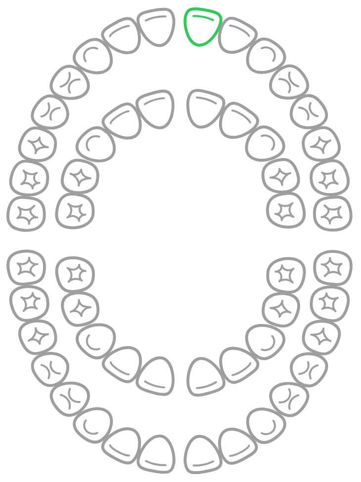
A lightweight, SVG-based interactive teeth diagram selector for React.
Perfect for dental applications, medical software, EHR/EMR systems, clinical dashboards, or any UI that needs tooth selection.
Features
✔ Select teeth by clicking
✔ Hover highlight & tooltip
✔ Supports controlled & uncontrolled states
✔ Callback gives selected map + popup position
✔ Works with any UI library
✔ No dependencies (only React)
✔ SVG-based, pixel-perfect diagram
✔ Customizable size & styling
✔ Lightweight and fast
Installation
npm install react-teeth-selector
or
yarn add react-teeth-selector
Quick Usage
import { useState } from "react";
import { TeethDiagram } from "react-teeth-selector";

function App() {
  const [selectedTeeth, setSelectedTeeth] = useState({});

  const handleTeethChange = (map, info) => {
    setSelectedTeeth({ ...map, [info.id]: true });
  };

  return (
    <TeethDiagram selectedTeeth={selectedTeeth} onChange={handleTeethChange} />
  );
}

export default App;
Props
| Prop | Type | Default | Description |
|---|---|---|---|
| selectedTeeth | {[id]: true} |
— | Controlled mode |
| defaultSelected | {[id]: true} |
{} |
Initial selected teeth |
| onChange | function | — | Tooth click callback |
| width | number/string | 350 |
Component width |
| height | number/string | "auto" |
Component height |
Local Development
npm install
npm run dev
Build library
npm run buildContributing
PRs, issues, and suggestions are welcome!