
Package Exports
- react-tooltip
- react-tooltip/dist/react-tooltip.cjs.min.js
- react-tooltip/dist/react-tooltip.css
- react-tooltip/dist/react-tooltip.esm.js
- react-tooltip/dist/react-tooltip.esm.min.js
This package does not declare an exports field, so the exports above have been automatically detected and optimized by JSPM instead. If any package subpath is missing, it is recommended to post an issue to the original package (react-tooltip) to support the "exports" field. If that is not possible, create a JSPM override to customize the exports field for this package.
Readme
react-tooltip


If you like the project, please give the project a GitHub 🌟
Demo

Documentation for V4 - Github Page.
Documentation for V5 - ReactTooltip.
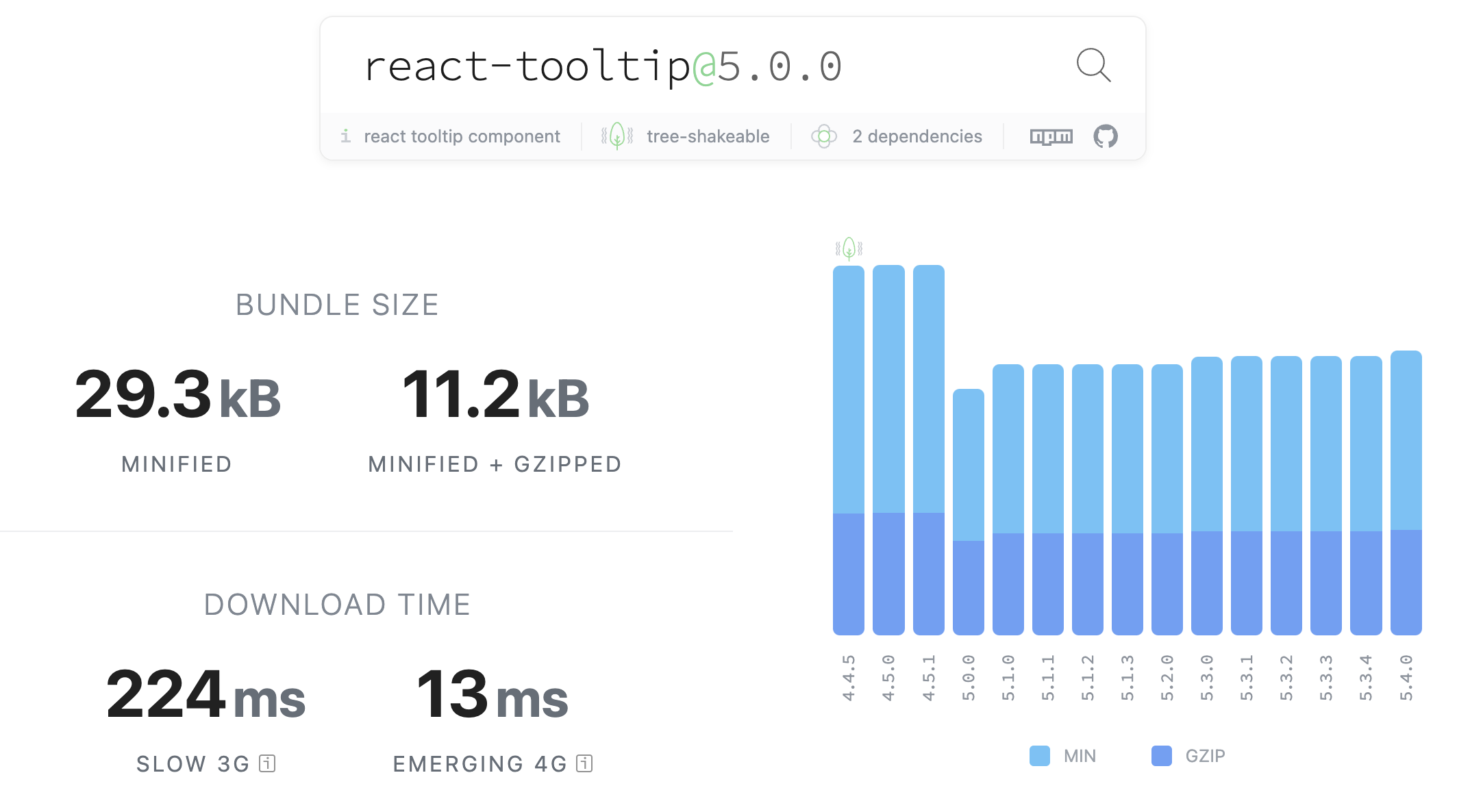
Bundle size timeline comparation from V4 -> V5
Installation
npm install react-tooltipor
yarn add react-tooltipUsage
Using NPM
1 . Import the CSS file to set default styling
import 'react-tooltip/dist/react-tooltip.css'This needs to be done only once. We suggest you do it on your src/index.js or equivalent file.
2 . Import react-tooltip after installation
import { Tooltip } from 'react-tooltip'or if you want to still use the name ReactTooltip as V4:
import { Tooltip as ReactTooltip } from 'react-tooltip'3 . Add data-tooltip-content="your placeholder" to your element
<p id="my-element" data-tooltip-content="hello world">
  Tooltip
</p>
4 . Include react-tooltip component
<ReactTooltip anchorId="my-element" />Standalone
You can import node_modules/react-tooltip/dist/react-tooltip.[mode].js into your page. Please make sure that you have already imported react and react-dom into your page.
mode: esm cjs umd
Don't forget to import the CSS file from node_modules/react-tooltip/dist/react-tooltip.css to set default styling. This needs to be done only once in your application.
PS: all the files have a minified version and a non-minified version.

Options
For all available options, please check React Tooltip Options
Security Note
The html option allows a tooltip to directly display raw HTML. This is a security risk if any of that content is supplied by the user. Any user-supplied content must be sanitized, using a package like sanitize-html. We chose not to include sanitization after discovering it increased our package size too much - we don't want to penalize people who don't use the html option.
JSX Note
You can use React's renderToStaticMarkup-function to use JSX instead of HTML.
Example:
import ReactDOMServer from 'react-dom/server';
[...]
<p id="my-element" data-tooltip-html={ReactDOMServer.renderToString(<div>I am <b>JSX</b> content</div>)}>
  Hover me
</p>
Note
- id is necessary, because
<ReactTooltip anchorId="my-element" />finds the tooltip via this attribute
Article
How I insert sass into react component
Maintainers
danielbarion Maintainer - Creator of React Tooltip >= V5.
gabrieljablonski Maintainer.
aronhelser (inactive).
alexgurr (inactive).
pdeszynski (inactive).
roggervalf (inactive).
huumanoid (inactive)
wwayne (inactive) - Creator of the original React Tooltip (V1.x ~ V4.x.)
We would gladly accept a new maintainer to help out!
Contributing
We welcome your contribution! Fork the repo, make some changes, submit a pull-request! Our contributing doc has some details.
License
MIT