
Package Exports
- rmc-dialog
- rmc-dialog/es/Modal
- rmc-dialog/lib/Modal
This package does not declare an exports field, so the exports above have been automatically detected and optimized by JSPM instead. If any package subpath is missing, it is recommended to post an issue to the original package (rmc-dialog) to support the "exports" field. If that is not possible, create a JSPM override to customize the exports field for this package.
Readme
m-dialog
react dialog component for mobile


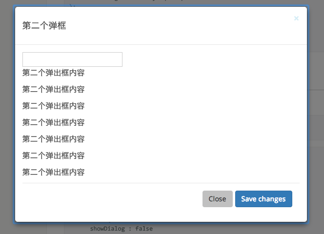
Screenshot
Install

Usage
var Dialog = require('rmc-dialog');

ReactDOM.render(
  <Dialog title={title} onClose={callback1} visible>
      <p>first dialog</p>
  </Dialog>
), document.getElementById('t1'));

// use dialog
API
rmc-dialog(web)
| name | type | default | description |
|---|---|---|---|
| prefixCls | String | rmc-dialog | The dialog dom node's prefixCls |
| className | String | additional className for dialog | |
| wrapClassName | String | additional className for dialog wrap | |
| style | Object | {} | Root style for dialog element.Such as width, height |
| zIndex | Number | ||
| bodyStyle | Object | {} | body style for dialog body element.Such as height |
| maskStyle | Object | {} | style for mask element. |
| visible | Boolean | false | current dialog's visible status |
| animation | String | part of dialog animation css class name | |
| maskAnimation | String | part of dialog's mask animation css class name | |
| transitionName | String | dialog animation css class name | |
| maskTransitionName | String | mask animation css class name | |
| title | String|React.Element | Title of the dialog | |
| footer | React.Element | footer of the dialog | |
| closable | Boolean | true | whether show close button |
| mask | Boolean | true | whether show mask |
| maskClosable | Boolean | true | whether click mask to close |
| onClose | function() | called when click close button or mask |
rmc-dialog/lib/Dialog (react-native)
| name | type | default | description |
|---|---|---|---|
| wrapStyle | {} | style for modal wrap | |
| maskStyle | {} | style for modal mask | |
| style | {} | style for modal | |
| animationType | none|fade|slide-up|slide-down | slide-up | animation type for modal content |
| animationDuration | number | 300(ms) | |
| visible | boolean | ||
| animateAppear | false | whether animation on first show | |
| onClose | ()=>void | called when close | |
| onAnimationEnd | (visible:boolean)=>void (animationType !== 'none') | called when animation end |
Development
npm install
npm start
Example
http://localhost:8007/examples/
online example: http://react-component.github.io/m-dialog/
react-native
./node_modules/rc-tools run react-native-init
react-native start
react-native run-ios
Test Case
npm test
npm run chrome-test
Coverage
npm run coverageopen coverage/ dir
License
rmc-dialog is released under the MIT license.