Package Exports
- sdk-datagrid
- sdk-datagrid/package.json
Readme
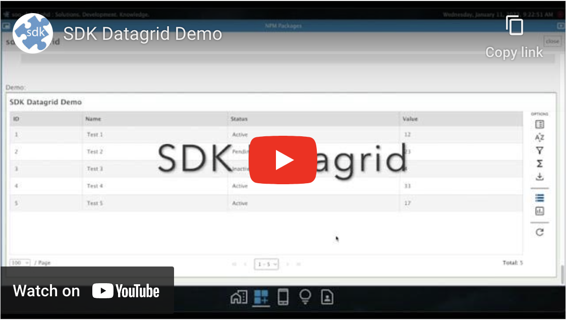
Description:
Mobile-friendly customizable (Angular) datagrid with data options for manipulation, and charts for visualization.
INSTALLATION:
Using NPM:
npm install --save sdk-datagridCONFIGURATION:
To configure the sdk-datagrid for your application, add the following lines to your app.module.ts file:
import { SDKDatagridModule } from 'sdk-datagrid';

@NgModule({
    imports: [
        SDKDatagridModule
    ]
})
export class AppModule { }
USAGE:
To use the sdk-datagrid, follow the code options below. It can be embedded as a component on any page, or used as the ONLY component on any page.
HTML for partially loading large datasets
<sdk-datagrid
    [datasets]="datasets"
    [name]="activeView"
    [data]="data"
    [fullData]="fullData"
    [dbPage]="dbPage"
    [dbTotal]="dbTotal"
    [dbMAXRECORDS]="MAXRECORDS"
    [isLoading]="isLoading"
    [error]="error"
    (loadDataEvent)="loadData($event)">
</sdk-datagrid>
HTML for fully loading small datasets
<sdk-datagrid
    [datasets]="datasets"
    [name]="activeView"
    [data]="data"
    [isLoading]="isLoading"
    [error]="error"
    (loadDataEvent)="loadData($event)">
</sdk-datagrid>
.ts file
public isLoading: boolean = true;
public MAXRECORDS: number = 1000;
public activeView: string = "vwMyData";
public datasets: SDKDataGridDataset[] = [
    {
        Title: "My Data",
        DbName: "vwMyData"
    },
    {
        Title: "My Other Data",
        DbName: "vwMyOtherData"
    }
];
public data: string = "";
public fullData: string = "";
public dbPage: number = 0;
public dbTotal: number = 0;
public error: string = "";

// Dynamically load datasets (optional).
private async loadDatasets() {
    this.isLoading = true;

    await this.httpService.Get("api/path/for/dynamic/datasets").then((data: any) => {
        if (data) {
            if (this.activeView === "" || !data.find((d: any) => d.DbName === this.activeView)) {
                this.activeView = data[0].DbName;
            }

            this.datasets = data;
        }
    });
}

// Callback function for loading data (required).
public async loadData(event: any = null) {
    this.isLoading = true;

    let body: string = this.buildBody(event);
    let fullLoad: boolean = false;

    if (event && (event.chart !== undefined || event.export !== undefined)) {
        fullLoad = true;
    }

    try {
        await this.httpService.Post("api/path/for/data/based/on/" + this.activeView, body).then((data: any) => {
            this.resetVariables();

            if (data) {
                if (fullLoad) {
                    this.fullData = data["Data"];
                } else {
                    this.data = data["Data"];
                    this.dbPage = parseInt(data["Page"]);
                    this.dbTotal = parseInt(data["Total"]);
                    this.error = data["Error"];
                }
            }
        });
    } catch (error: any) {
        this.error = error.message;
    }

    this.isLoading = false;
}

// Change the body parameters to fit your API call.
private buildBody(event: any = null): string {
    let page: number = 1;
    let rows: number = this.MAXRECORDS;
    let sorts: any = [];
    let filters: any = [];

    if (event) {
        if (event.name && event.name !== "") {
            this.activeView = event.name;
        }

        if (event.page) {
            page = parseInt(event.page);
        }

        if (event.sorts) {
            event.sorts.forEach((element: any) => {
                sorts.push({ ColumnName: element.Name, Direction: element.Sort });
            });
        }

        if (event.filters) {
            event.filters.forEach((element: any) => {
                filters.push({ ColumnName: element.Name, Operation: element.Operation, Value: element.Value });
            });
        }

        if (event.chart || event.export) {
            page = 0;
            rows = 999999999;
        }

        if (event.addon) {
            // do addon stuff here
        }
    }

    let parameters: any = {
        page: page,
        rows: rows,
        filters: filters,
        sorts: sorts
    };

    return JSON.stringify(parameters);
}

private resetVariables() {
    this.data = "";
    this.fullData = "";
    this.dbPage = 0;
    this.dbTotal = 0;
    this.error = "";
}
NOTES:
The loadData() method is NOT directly called from your component. The
sdk-datagridwill handle calling the method - including the initial load.SDKDataGridDataset object is defined as:
[
    {
        Title: "My Dataset", <-- Display name for UI (Text, Dropdown, Tab)
        DbName: "myDataset", <-- The name of the view/table
    }
]
In order for the
sdk-datagridto handle data defined in the above example, your APIs should return the following object:{ Data: {}, <-- The actual data in JSON form Page: 1, <-- Current page it is returning Total: 33, <-- Total records for entire query Error: "" <-- Any errors from API call }However, you can change the parameters in the API body to fit your specific needs.
- If you are displaying a simple grid with data ONLY (no options/functionality), you can simply return and set the "this.data" parameter ONLY, and turn off the Header and Footer areas:
<sdk-datagrid
    [datasets]="datasets"
    [name]="activeView"
    [data]="data"
    [showHeader]=false
    [showFooter]=false
    [isLoading]="isLoading"
    [error]="error"
    (loadDataEvent)="loadData($event)">
</sdk-datagrid>
To use sorting, your APIs SHOULD be able to accept/handle an array of objects defining the columns/direction for sorting:
sorts: [
    {
        ColumnName: "column",
        Direction: "asc" <-- See list below
    }
]
Sort Direction List:
- asc
- desc
To use filtering, your APIs SHOULD be able to accept/handle an array of objects defining the columns/operators/values for filtering:
filters: [
    {
        ColumnName: "column",
        Operation: "Equals", <-- See list below
        Value: "column_value"
    }
]
Filter Operation List:
- Equals
- NotEquals
- Empty (value is null)
- NotEmpty (value is NOT null)
- Contains
- NotContains
- GreaterThan
- GreaterThanOrEqual
- LessThan
- LessThanOrEqual
- InList
List of properties:
/**************************************************************************
* Required Input Parameters
**************************************************************************/
datasets: SDKDataGridDataset[] = []; // Once provided, the loadDataEvent will be triggered.

/**************************************************************************
* Required Output Parameters
**************************************************************************/
loadDataEvent = new EventEmitter<any>(); // This is a callback to load data.

/**************************************************************************
* Optional Input Parameters
**************************************************************************/
name: string = ""; // This value will be set by the loadDataEvent callback and will be the active dataset (view).
data: string = ""; // This value will be set by the loadDataEvent callback and contain the actual data.
fullData: string = ""; // This value will be set by the loadDataEvent callback when chart or export options are selected.

title: string = ""; // Add a title to the page if only 1 dataset (view) is being used.
footnote: string = ""; // Add a footnote to the bottom of the page.
uniqueIdentifier: string = ""; // This value is ONLY used for creating the storage (saved session) name.
options: SDKDataGridOptions | null = null; // You can turn on/off data options.
columns: SDKDataGridColumn[] = []; // You can specify certain columns to be set.
columnFilters: SDKDataGridColumn[] = []; // You can specify which columns are available for filtering.
formulas: any[] = []; // You can specify default formulas.
includeAllColumns: boolean = false; // You can specify whether or not to include all columns in dataset.
isDataWrapped: boolean = false; // You can specify whether or not to wrap data within a column.
forceReload: boolean = false; // You can reload the current data.

loadingStyle: string = ""; // Adjust the loading style when the datagrid is embedded on the page with other components.
error: string = ""; // Any errors that occur during processing.

useTabs: boolean = false; // This option shows the list of datasets in a tabular format (instead of the default dropdown).
isLoading: boolean = false; // Parent controlled variable for the entire grid.
showLoadingTimer: boolean = false; // Shows a timer while the loading component is running.

/**************************************************************************
* Addon Parameters (Option Icon/Modal Window)
**************************************************************************/
optionAddons: Type<any>[] = [];
windowAddons: Type<any>[] = [];

/**************************************************************************
* Database Parameters
**************************************************************************/
dbMAXRECORDS: number = 1000; // Total records to retrieve from db on any given pull (skip/take).
dbPage: number | undefined; // Current db page (for partial loads).
dbTotal: number | undefined; // Total db records (based on filters).

/**************************************************************************
* UI Section Parameters
**************************************************************************/
showHeader: boolean = true; // Enable/disable the header section of the grid.
showOptions: boolean = true; // Enable/disable options section of the grid.
showFooter: boolean = true; // Enable/disable the footer section of the grid.
showPaging: boolean = true; // Enable/disable the paging section (within the footer) of the grid.
showPanelOverlay: boolean = false; // Enable/disable the overlay of the options panel.
autoClosePanel: boolean = false; // Enable/disable automatically closing panel after action.

detailTemplate!: TemplateRef<any> | undefined; // Embedded component for row detail.

/**************************************************************************
* Optional Output Parameters
**************************************************************************/
columnSettingsChangedEvent: EventEmitter<SDKDataGridColumn[]> = new EventEmitter();
selectedRowsChangedEvent: EventEmitter<any[]> = new EventEmitter();
selectedRowActionEvent: EventEmitter<any> = new EventEmitter();