Package Exports
- sty-loader
- sty-loader/dist/index.js
This package does not declare an exports field, so the exports above have been automatically detected and optimized by JSPM instead. If any package subpath is missing, it is recommended to post an issue to the original package (sty-loader) to support the "exports" field. If that is not possible, create a JSPM override to customize the exports field for this package.
Readme
sty-loader 🚀
Lightweight, animated React loader components built with Tailwind CSS.
Simple, fast, customizable, and production-ready.


✨ Features
- ⚡ Lightweight & fast (tiny bundle size)
- 🎨 Customizable size and color
- 💨 Smooth CSS-based animations
- 🌈 Tailwind CSS friendly
- 📦 Zero runtime dependencies
- 🧩 Fully typed with TypeScript
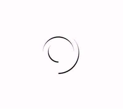
📸 Preview
📦 Installation
npm install sty-loader
or
yarn add sty-loader
🚀 Usage
import { Spinner } from "sty-loader";

export default function Example() {
  return (
    <div className="flex items-center justify-center h-screen">
      <Spinner size={24} color="#22c55e" />
    </div>
  );
}
🎛️ Props
| Prop | Type | Default | Description |
|---|---|---|---|
size |
number | 16 |
Size of the loader in pixels |
color |
string | "white" |
Color of the spinner |
className |
string | "" |
Additional Tailwind classes |
⚠️ Requirements
React >= 17
Tailwind CSS must be installed and configured
Tailwind animation utilities (animate-spin) should be enabled (default)
🎨 Example with Button Loader
<button className="flex items-center gap-2 px-4 py-2 bg-blue-600 text-white rounded">
  <Spinner size={14} color="white" />
  Loading
</button>
📁 Included Loaders
✅ Spinner – Nested circular spinner
More loaders coming soon 🚧
📄 License MIT © Raman Patil
⭐ Support & Contribution If you find this useful:
⭐ Star the project
🐛 Report issues
💡 Suggest new loaders