
Package Exports
This package does not declare an exports field, so the exports above have been automatically detected and optimized by JSPM instead. If any package subpath is missing, it is recommended to post an issue to the original package (tailwindcss-react-datepicker) to support the "exports" field. If that is not possible, create a JSPM override to customize the exports field for this package.
Readme
Tailwindcss React Datepicker


This is extended version of react-tailwindcss-datepicker
Added features:
isStaticPosition- disable position absolute for Calendar (can be usefulul when you want to build in your calendar in your own popup);renderHeader- render custom component on the top of a calender popover;renderFooter- render custom component on the bottom of a calender popover; -disableAutoHide- disable autohide for calendar when user select date or date range. can be usefule when you want to control popup closin inrenderHeaderorrenderFooterfunction. It will not work with isStaticPosition.
Example:
import React, { useState } from "react";
import Datepicker from "tailwindcss-react-datepicker";

const App = () => {
    const [value, setValue] = useState({
        startDate: new Date(),
        endDate: new Date().setMonth(11)
    });

    const handleValueChange = newValue => {
        console.log("newValue:", newValue);
        setValue(newValue);
    };

    return (
        <div>
            <Datepicker
                renderFooter={context => <button onClick={context.hideDatepicker()}>Ok</button>}
                value={value}
                onChange={handleValueChange}
            />
        </div>
    );
};

export default App;
if you dont need this extra features feel free to use original datepicker from onesite
Contents
-Tailwindcss React Datepicker -Contents -Features -Documentation -Installation -Install via npm -Install via yarn -Simple Usage -Tailwindcss Configuration -Theming options -PlayGround -Contributing -Thanks to -Like it? -License
Features
-✅ Theming options -✅ Dark mode -✅ Single Date -✅ Single date use Range -✅ Shortcuts -✅ TypeScript support -✅ Localization(i18n) -✅ Date formatting -✅ Disable specific dates -✅ Minimum Date and Maximum Date -✅ Custom shortcuts
Documentation
Go to full documentation
Installation
⚠️ React Tailwindcss Datepicker uses Tailwind CSS 3 (with the @tailwindcss/forms plugin) & Dayjs under the hood to work.
Install via npm
npm install tailwindcss-react-datepickerInstall via yarn
yarn add tailwindcss-react-datepickerMake sure you have installed the peer dependencies as well with the below versions.
"dayjs": "^1.11.6",
"react": "^17.0.2 || ^18.2.0"
Simple Usage
Tailwindcss Configuration
Add the datepicker to your tailwind configuration using this code
// in your tailwind.config.js
module.exports = {
    // ...
    content: [
        "./src/**/*.{js,jsx,ts,tsx}",
        "./node_modules/tailwindcss-react-datepicker/dist/index.esm.js"
    ]
    // ...
};
Then use tailwindcss-react-datepicker in your app:
import React, { useState } from "react";
import Datepicker from "tailwindcss-react-datepicker";

const App = () => {
    const [value, setValue] = useState({
        startDate: new Date(),
        endDate: new Date().setMonth(11)
    });

    const handleValueChange = newValue => {
        console.log("newValue:", newValue);
        setValue(newValue);
    };

    return (
        <div>
            <Datepicker value={value} onChange={handleValueChange} />
        </div>
    );
};

export default App;
Theming options
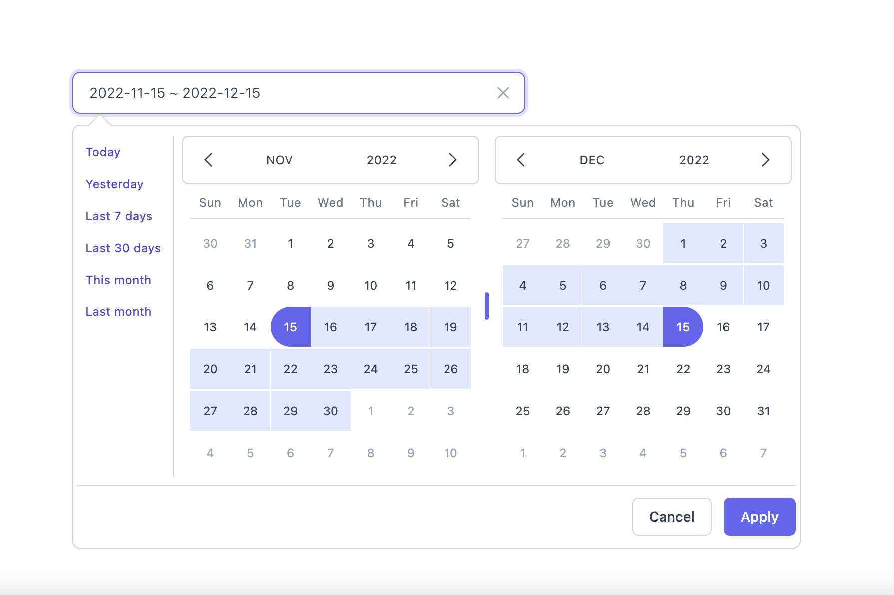
Light Mode
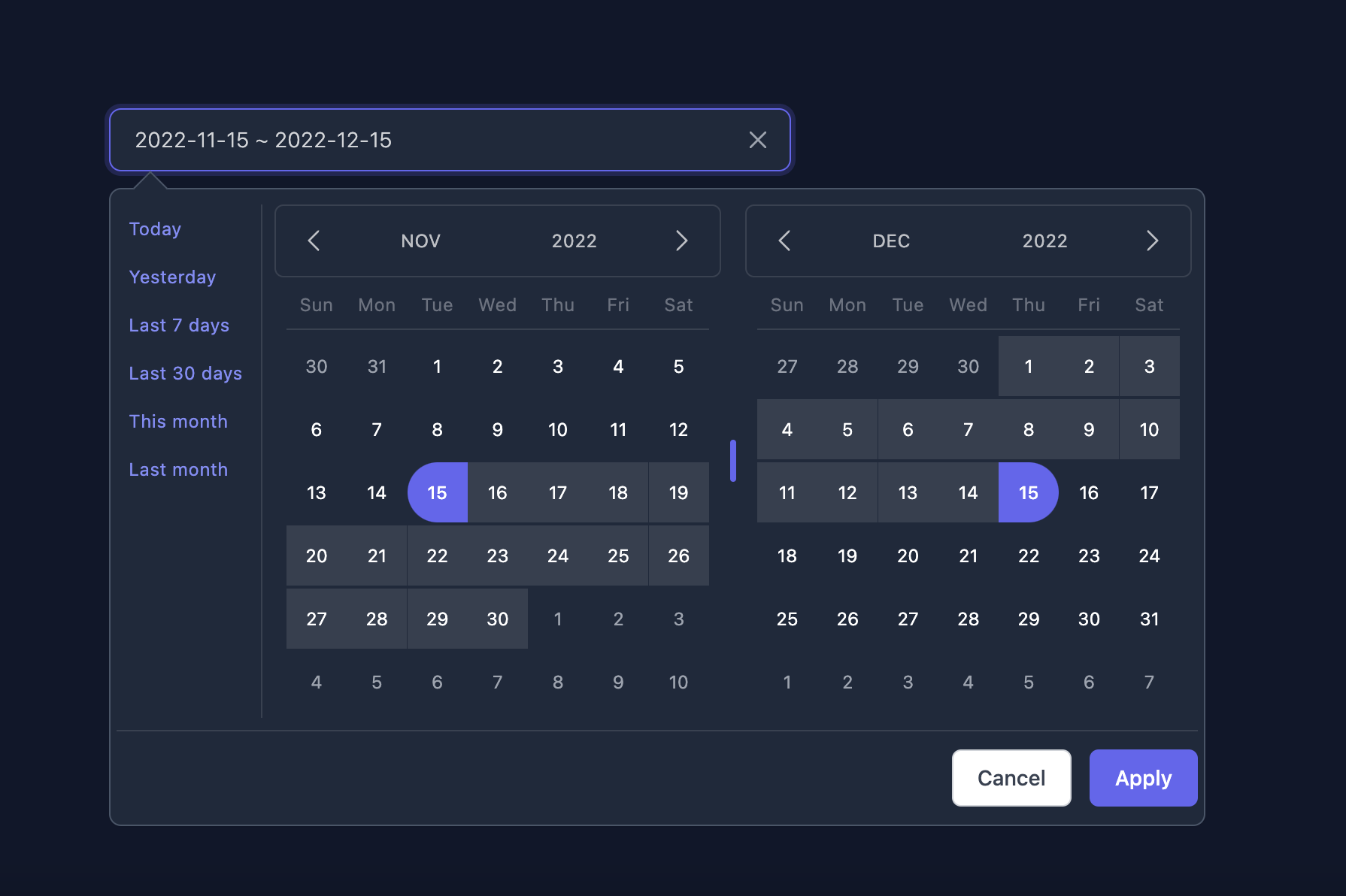
Dark Mode
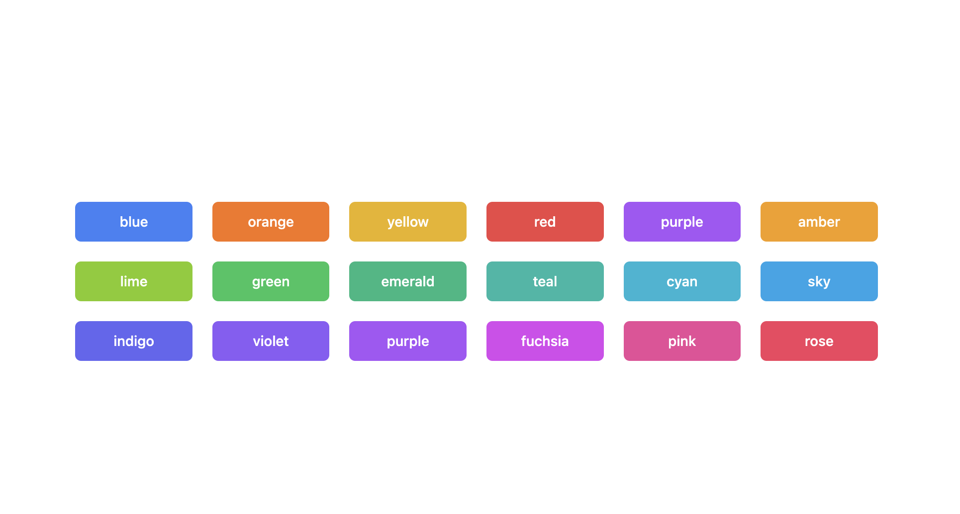
Supported themes
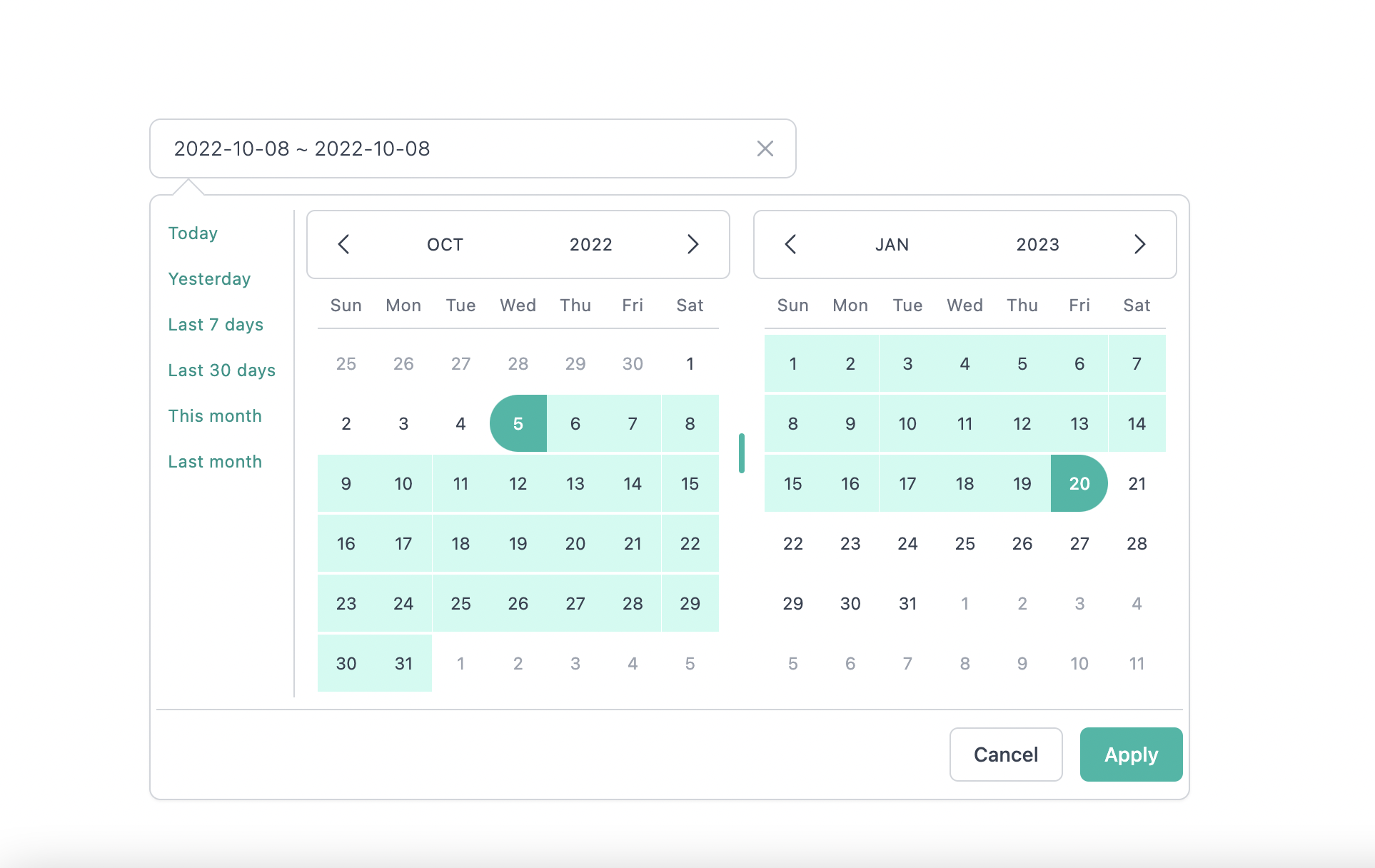
Teal themes example
You can find the demo at here
Info
👉 To discover the other possibilities offered by this library, you can consult the full documentation.
PlayGround
Clone the master branch and run commands:
# Using npm
npm install && npm dev

# Using yarn
yarn install && yarn dev
Open a browser and navigate to http://localhost:8888
Contributing
See CONTRIBUTING.md
Thanks to
-Lewhe Onesine -Vue Tailwind Datepicker -React -Tailwind CSS -dayjs
Like it?
- ⭐ this repo
- Buy me a ☕ ☕ ☕ or
- become a sponsor on Github Sponsors
License
MIT Licensed.