
Package Exports
- tss-react
- tss-react/cache
- tss-react/cache.js
- tss-react/compat
- tss-react/compat.js
- tss-react/index.js
- tss-react/makeStyles.js
- tss-react/nextJs
- tss-react/nextJs.js
This package does not declare an exports field, so the exports above have been automatically detected and optimized by JSPM instead. If any package subpath is missing, it is recommended to post an issue to the original package (tss-react) to support the "exports" field. If that is not possible, create a JSPM override to customize the exports field for this package.
Readme

✨ makeStyles is dead, long live makeStyles! ✨


'tss-react' is intended to be the replacement for 'react-jss' and for
@material-ui v4 makeStyles.
- ✅ Seamless integration with mui v5 and v4.
- ✅ Build on top of
@emotion/react, it has virtually no impact on the bundle size alongside mui. - ✅ Maintained for the foreseeable future, issues are dealt with within good delays.
- ✅ Offers a type-safe equivalent of the JSS
$syntax. - ✅ Server side rendering support (e.g: Next.js).
- ✅ As fast as
emotion(see the difference with mui'smakeStyles) - ✅
@emotioncache support.
$ yarn add tss-react @emotion/react
Breaking changes in v3:
- New API for nested selectors. We no longer use
createRef(). labelhave been renamednamefor helping the migration from the old mui API.- It is now required to provide some polyfills to support IE. (for the sake of the bundle size)
JavaScript support: Although tss-react have been designed with TypeScript in mind
it can of course be used in vanilla JS projects.
- Quick start
- API documentation
- Cache
- Nested selectors (
$syntax ) - Server Side Rendering (SSR)
- IE Support
- Development
- FAQ
Quick start
Minimal setup
./makeStyles.ts
import { createMakeStyles } from "tss-react";

function useTheme() {
    return {
        "primaryColor": "#32CD32",
    };
}

export const { makeStyles } = createMakeStyles({ useTheme });
./MyComponent.tsx
import { makeStyles } from "./makeStyles";

export function MyComponent(props: Props) {
    const { className } = props;

    const [color, setColor] = useState<"red" | "blue">("red");

    const { classes, cx } = useStyles({ color });

    return <span className={cx(classes.root, className)}>hello world</span>;
}

const useStyles = makeStyles<{ color: "red" | "blue" }>()(
    (theme, { color }) => ({
        "root": {
            color,
            "&:hover": {
                "backgroundColor": theme.primaryColor,
            },
        },
    }),
);
Mui integration
Don't use <StyledEngineProvider injectFirst/> but do this instead:
import { render } from "react-dom";
import { CacheProvider } from "@emotion/react";
import createCache from "@emotion/cache";
import { ThemeProvider } from "@mui/material/styles";

export const muiCache = createCache({
    "key": "mui",
    "prepend": true,
});

render(
    <CacheProvider value={muiCache}>
        <ThemeProvider theme={myTheme}>
            <Root />
        </ThemeProvider>
    </CacheProvider>,
    document.getElementById("root"),
);
./makeStyles.ts
import { useTheme } from "@mui/material/styles";
//WARNING: tss-react require TypeScript v4.4 or newer. If you can't update use:
//import { createMakeAndWithStyles } from "tss-react/compat";
import { createMakeAndWithStyles } from "tss-react";

export const { makeStyles, withStyles } = createMakeAndWithStyles({
    useTheme,
    /*
    OR, if you have extended the default mui theme adding your own custom properties:
    Let's assume the myTheme object that you provide to the <ThemeProvider /> is of
    type MyTheme then you'll write:
    */
    //"useTheme": useTheme as (()=> MyTheme)
});
WARNING: Keep @emotion/styled as a dependency of your project. Even if you never use it explicitly,
it's a peer dependency of @mui/material.
WARNING for Storybook: As of writing this lines storybook still uses by default emotion 10.
Material-ui and TSS runs emotion 11 so there is some changes
to be made to your .storybook/main.js to make it uses emotion 11.
Avoiding import { makeStyles } from "../../../makeStyles"
If you don't want to end up writing things like:
import { makeStyles } from "../../../../../../makeStyles";You can put "baseUrl": "src" in
your tsconfig.json and import things relative to your src/ directory.
Playground
Try it now:

API documentation
Exposed APIs
import {
    createMakeAndWithStyles, //<- Create an instance of makeStyles() and withStyles() for your theme.
    keyframes, //<- The function as defined in @emotion/react and @emotion/css
    GlobalStyles, //<- A component to define global styles.
    TssCacheProvider, //<- Provider to specify the emotion cache tss should use.
    useCssAndCx, //<- Access css and cx directly.
    //   (Usually you'll use useStyles returned by makeStyles or createMakeStyles for that purpose
    //    but if you have no theme in your project, it can come in handy.)
} from "tss-react";
makeStyles()
Your component style may depend on the props and state of the components:
const useStyles = makeStyles<{ color: string }>()((_theme, { color }) => ({
    "root": {
        "backgroundColor": color,
    },
}));

//...

const { classes } = useStyles({ "color": "grey" });
...Or it may not:
const useStyles = makeStyles()({
    //If you don't need neither the theme nor any state or
    //props to describe your component style you can pass-in
    //an object instead of a callback.
    "root": {
        "backgroundColor": "pink",
    },
});

//...

const { classes } = useStyles();
Naming the stylesheets (useful for debugging)
To ease debugging you can specify a label that will appear in every class names.
It is like the option.name in material-ui v4's makeStyles
const useStyles = makeStyles({ "name": "MyComponent" })({
    "root": {
        /*...*/
    },
});

//...

const { classes } = useStyles();

//classes.root will be a string like: "tss-xxxxxx-MyComponent-root"
Usually, you want the label to match the name of the component you are styling. You can pass the label as the first key of a wrapper object like so:
export function MyComponent() {
    const { classes } = useStyles();
    return <h1 className={classes.root}>Hello World</h1>;
}

const useStyles = makeStyles({ "label": { MyComponent } })({
    "root": {
        /*...*/
    },
});

//...

const { classes } = useStyles();

//classes.root will be a string like: "tss-xxxxxx-MyComponent-root"
This prevent you from having to remember to update the label when you rename the component.
You can also explicitly provide labels on a case by case basis if you do, your label will overwrite the one generated by tss-react.
useStyles()
Beside the classes, useStyles also returns cx, css and your theme.
css is the function as defined in @emotion/css
cx is the function as defined in @emotion/css
const { classes, cx, css, theme } = useStyles(/*...*/);In some components you may need cx, css or theme without defining
custom classes.
For that purpose you can use the useStyles hook returned
by createMakeStyles.
makeStyles.ts
import { createMakeAndWithStyles } from "tss-react";

function useTheme() {
    return {
        "primaryColor": "#32CD32",
    };
}

export const {
    makeStyles,
    useStyles, //<- This useStyles is like the useStyles you get when you
    //   call makeStyles but it doesn't return a classes object.
} = createMakeAndWithStyles({ useTheme });
./MyComponent.tsx
//Here we ca import useStyles directly instead of generating it from makeStyles.
import { useStyles } from "./makeStyles";

export function MyComponent(props: Props) {
    const { className } = props;

    const { cx, css, theme } = useStyles();

    return (
        <span className={cx(css({ "color": theme.primaryColor }), className)}>
            hello world
        </span>
    );
}
withStyles()
It's like the material-ui v4 higher-order component API but type safe by design.

IMPORTANT NOTICE: Don't be afraid to use as const
when you get red squiggly lines.
You can pass as first argument any component that accept a className props:
function MyComponent(props: { className?: string; colorSmall: string }) {
    return (
        <div className={props.className}>
            The background color should be different when the screen is small.
        </div>
    );
}

const MyComponentStyled = withStyles(MyComponent, (theme, props) => ({
    "root": {
        "backgroundColor": theme.palette.primary.main,
        "height": 100,
    },
    "@media (max-width: 960px)": {
        "root": {
            "backgroundColor": props.colorSmall,
        },
    },
}));
You can also pass a mui component like for example <Button /> and you'll be able
to overwrite every rule name of the component (it uses the
classes prop).
import Button from "@mui/material/Button";

const MyStyledButton = withStyles(Button, {
    "root": {
        "backgroundColor": "grey",
    },
    "text": {
        "color": "red",
    },
    "@media (max-width: 960px)": {
        "text": {
            "color": "blue",
        },
    },
});
It's also possible to start from a builtin HTML component:
const MyAnchorStyled = withStyles("a", (theme, { href }) => ({
    "root": {
        "border": "1px solid black",
        "backgroundColor": href?.startsWith("https")
            ? theme.palette.primary.main
            : "red",
    },
}));
You can experiment with those examples here
live here, you can also run it locally with yarn start_spa.
<GlobalStyles />
Sometimes you might want to insert global css.
You can use the <GlobalStyles /> component to do this.
It's styles (with an s) prop should be of same type as the css() function
argument.
import { GlobalStyles } from "tss-react";

function MyComponent() {
    return (
        <>
            <GlobalStyles
                styles={{
                    "body": {
                        "backgroundColor": "pink",
                    },
                    ".foo": {
                        "color": "cyan",
                    },
                }}
            />
            <h1 className="foo">This text will be cyan</h1>
        </>
    );
}
keyframes
// Reexport from @emotion/react
import { keyframes } from "tss-react";
import { makeStyles } from "./makeStyles";

export const useStyles = makeStyles()({
    "svg": {
        "& g": {
            "opacity": 0,
            "animation": `${keyframes`
            60%, 100% {
                opacity: 0;
            }
            0% {
                opacity: 0;
            }
            40% {
                opacity: 1;
            }
            `} 3.5s infinite ease-in-out`,
        },
    },
});
Cache
By default, tss-react uses an emotion cache that you can access with
import { getTssDefaultEmotionCache } from "tss-react".
If you want tss-react to use a specific emotion cache you can provide it using
import { TssCacheProvider } from "tss-react".
If you are using tss-react with mui v5, be aware that mui and tss can't share
the same cache. The caches used by mui should have be instancies with "prepend": true.
import createCache from "@emotion/cache";
import { TssCacheProvider } from "tss-react";
import { CacheProvider } from "@emotion/react";

const muiCache = createMuiCache({
    "key": "my-custom-prefix-for-mui",
    "prepend": true,
});

const tssCache = createMuiCache({
    "key": "my-custom-prefix-for-tss",
});

<CacheProvider value={muiCache}>
    <TssCacheProvider value={tssCache}>{/* ... */}</TssCacheProvider>
</CacheProvider>;
Nested selectors ( $ syntax )
tss-react unlike jss-react doesn't support the $ syntax but there's type safe alternatives that
achieve the same results.
In JSS you can do:
{
  "parent": {
      "padding": 30,
      "&:hover $child": {
          "backgroundColor": "red"
      },
  },
  "child": {
      "backgroundColor": "blue"
  }
}
//...
<div className={classes.parent}>
    <div className={classes.children}>
        Background turns red when the mouse is hover the parent
    </div>
</div>

This is how you would achieve the same result with tss-react
export function App() {
    const { classes } = useStyles();

    return (
        <div className={classes.parent}>
            <div className={classes.child}>
                Background turns red when mouse is hover the parent.
            </div>
        </div>
    );
}

const useStyles = makeStyles<void, "child">()((_theme, _params, classes) => ({
    "parent": {
        "padding": 30,
        [`&:hover .${classes.child}`]: {
            "backgroundColor": "red",
        },
    },
    "child": {
        "backgroundColor": "blue",
    },
}));
An other example:
export function App() {
    const { classes, cx } = useStyles({ "color": "primary" });

    return (
        <div className={classes.root}>
            <div className={classes.child}>
                The Background take the primary theme color when the mouse is
                hover the parent.
            </div>
            <div className={cx(classes.child, classes.small)}>
                The Background take the primary theme color when the mouse is
                hover the parent. I am smaller than the other child.
            </div>
        </div>
    );
}

const useStyles = makeStyles<
    { color: "primary" | "secondary" },
    "child" | "small"
>()((theme, { color }, classes) => ({
    "root": {
        "padding": 30,
        [`&:hover .${classes.child}`]: {
            "backgroundColor": theme.palette[color].main,
        },
    },
    "small": {},
    "child": {
        "border": "1px solid black",
        "height": 50,
        [`&.${classes.small}`]: {
            "height": 30,
        },
    },
}));
https://user-images.githubusercontent.com/6702424/144655154-51d0d294-e392-4af5-8802-f3df9aa1b905.mov
Nested selector with the withStyles API
https://user-images.githubusercontent.com/6702424/143791304-7705816a-4d25-4df7-9d45-470c5c9ec1bf.mp4
Server Side Rendering (SSR)
There are some minimal configuration required to make tss-react
work with SSR.
The following instructions are assuming you are using tss-react standalone
or alongside @material-ui v5. You can find here
a Next.js setup with @material-ui v4.
With Next.js
yarn add @emotion/serverpages/_document.tsx
import BaseDocument from "next/document";
import { withEmotionCache } from "tss-react/nextJs";
import { createMuiCache  } from "./index";

export default withEmotionCache({
    /** If you have a custom document pass it instead */,
    "Document": BaseDocument,
    /**
     * Every emotion cache used in the app should be provided.
     * Caches for MUI should use "prepend": true.
     * */
    "getCaches": ()=> [ createMuiCache() ]
});
page/index.tsx
import type { EmotionCache } from "@emotion/cache";
import createCache from "@emotion/cache";

let muiCache: EmotionCache | undefined = undefined;

export const createMuiCache = () =>
    (muiCache = createCache({
        "key": "mui",
        "prepend": true,
    }));

export default function Index() {
    return (
        <CacheProvider value={muiCache ?? createMuiCache()}>
            {/* Your app  */}
        </CacheProvider>
    );
}
You can find a working example here.
NOTE: This setup is merely a suggestion. Feel free, for example, to move the <CacheProvider /> into pages/_app.tsx.
What's important to remember however is that new instances of the caches should be created for each render.
With any other framework
yarn add @emotion/serverimport { renderToString } from "react-dom/server";
import createEmotionServer from "@emotion/server/create-instance";
import { getTssDefaultEmotionCache } from "tss-react";
let muiCache: EmotionCache | undefined = undefined;
export const createMuiCache = () =>
(muiCache = createCache({ "key": "mui", "prepend": true }));
function functionInChargeOfRenderingTheHtml(res) {
const emotionServers = [
/**
* Every emotion cache used in the app should be provided.
* Caches for MUI should use "prepend": true.
* */
getTssDefaultEmotionCache({ "doReset": true }),
createMuiCache(),
].map(createEmotionServer);
const html = renderToString(
<CacheProvider value={muiCache ?? createMuiCache()}>
<App />
</CacheProvider>,
);
res.status(200).header("Content-Type", "text/html").send(`<!DOCTYPE html>
<html lang="en">
<head>
<meta charset="UTF-8">
<meta name="viewport" content="width=device-width, initial-scale=1.0">
<meta http-equiv="X-UA-Compatible" content="ie=edge">
<title>My site</title>
${emotionServers
.map(({ extractCriticalToChunks, constructStyleTagsFromChunks }) =>
constructStyleTagsFromChunks(extractCriticalToChunks(html)),
)
.join("")}
</head>
<body>
<div id="root">${html}</div>
<script src="./bundle.js"></script>
</body>
</html>`);
}IE Support
Polyfill required:
Array.prototype.findProxy, find a polyfill here
Development
yarn
yarn build
#For automatically recompiling when file change
#npx tsc -w

# To start the Single Page Application test app (create react app)
# This app is live here: https://garronej.github.io/tss-react/
yarn start_spa

# To start the Server Side Rendering app (next.js)
yarn start_ssr

# To start the Server Side Rendering app that test the mui v4 integration.
yarn start_muiV4
In SSR everything should work with JavaScript disabled
FAQ
Click to expand
Why this instead of the hook API of Material UI v4?
First of all because makeStyle is deprecated in @material-ui v5 but also
because it has some major flaws. Let's consider this example:
import { makeStyles, createStyles } from "@material-ui/core/styles";

type Props = {
    color: "red" | "blue";
};

const useStyles = makeStyles(theme =>
    createStyles<"root" | "label", { color: "red" | "blue" }>({
        "root": {
            "backgroundColor": theme.palette.primary.main,
        },
        "label": ({ color }) => ({
            color,
        }),
    }),
);

function MyComponent(props: Props) {
    const classes = useStyles(props);

    return (
        <div className={classes.root}>
            <span className={classes.label}>Hello World</span>
        </div>
    );
}
Two pain points:
- Because TypeScript doesn't support partial argument inference,
we have to explicitly enumerate the classes name as an union type
"root" | "label". - We shouldn't have to import
createStylesto get correct typings.
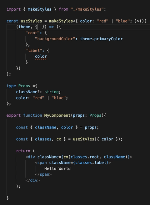
Let's now compare with tss-react
import { makeStyles } from "./makeStyles";

type Props = {
    color: "red" | "blue";
};

const { useStyles } = makeStyles<{ color: "red" | "blue" }>()(
    (theme, { color }) => ({
        "root": {
            "backgroundColor": theme.palette.primary.main,
        },
        "label": { color },
    }),
);

function MyComponent(props: Props) {
    const { classes } = useStyles(props);

    return (
        <div className={classes.root}>
            <span className={classes.label}>Hello World</span>
        </div>
    );
}
Benefits:
- Less verbose, same type safety.
- You don't need to remember how things are supposed to be named, just let intellisense guide you.
Besides, the hook api of material-ui, have other problems:
Why this instead of Styled component ?
See this issue
Compile error TS1023
If you get this error:
node_modules/tss-react/index.d.ts:18:10 - error TS1023: An index signature parameter type must be either 'string' or 'number'.

18         [mediaQuery: `@media${string}`]: { [RuleName_1 in keyof ClassNameByRuleName]?: import("./types").CSSObject | undefined; };
            ~~~~~~~~~~
it means that you need to update TypeScript to a version >= 4.4.
If you can't use import { } from "tss-react/compat"; instead of import { } from "tss-react".
Only withStyles() will have slightly inferior type inference.