Package Exports
- vue-images-grid
- vue-images-grid/dist/style.css
Readme
Vue Images Grid
Library for easy gallery creation.
Works with Vue 3 only!
###Usage:
<script setup>
import ImagesGrid from "vue-images-grid";
import "vue-images-grid/dist/style.css";
let images = ref([
{
// Used as key
id: 0,
// Image src
src: "https://artemdev.com/c/wf",
// You can define your custom props.
// You will get these image objects from events.
},
...
</script>
<template>
<ImagesGrid
:cols="3"
:images="images"
:image-style="{ width: '300px', marginBottom: '10px' }"
:is-responsive="true"
col-spaces="20px"
object-fit="cover"
@onImageClick="onImageClick"
@onImageMouseover="onImageMouseover"
@onImageMouseout="onImageMouseout"
/>
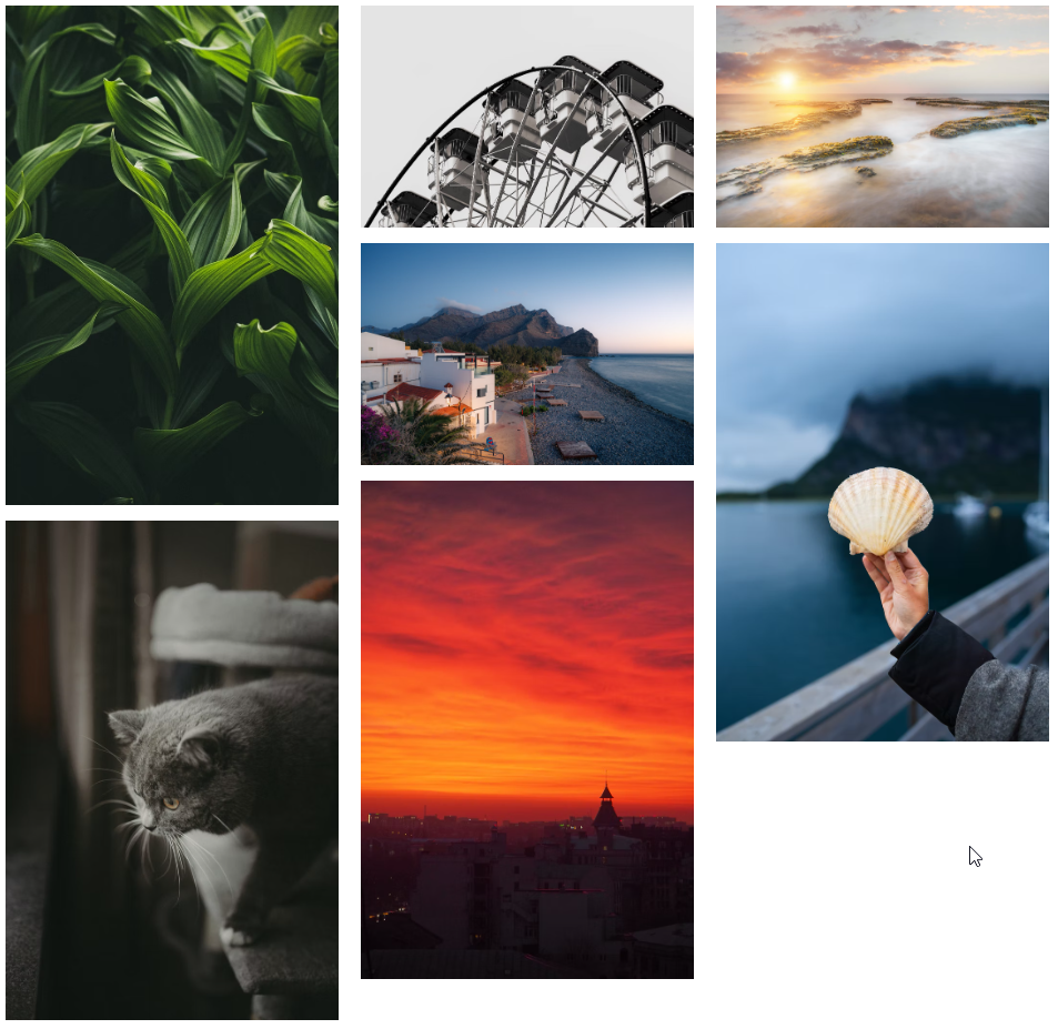
</template>In this example, the library decides which column to put pictures in. You can do it manually:
<template>
    <ImagesGrid
        :cols=[
        [
            {id: 0, src: "https://artemdev.com/c/wf"}
        ],
        [
            {id: 1, src: "https://artemdev.com/c/eU"}
        ]
        ]
    />
</template>
The library creates responsive grid. It means, that if the width of the parent container becomes less than the width of the picture grid, the number of columns is reduced. If you don't want it, set the attribute "isResponsive" to false (default: true).
<template>
<ImagesGrid
:is-responsive="false"
/>
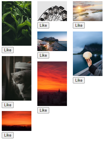
</template>Custom image component
If you want to add some functionality to image component, you can use your custom component!
<template>
    <ImagesGrid
        :cols="3"
        :images="images"
        :image-style="{ width: '300px', marginBottom: '10px' }"
        col-spaces="20px"
    >
    <!-- image props are passed into the component -->
        <template v-slot:image="{ image }">
          <div style="margin-bottom: 10px" @onImageClick="onImageClick">
            <img :src="image.src" style="width: 100px" />
            <div><button>Like</button></div>
          </div>
        </template>
  </ImagesGrid>
</template>