
Package Exports
- vue-js-modal
- vue-js-modal/dist/ssr.index
This package does not declare an exports field, so the exports above have been automatically detected and optimized by JSPM instead. If any package subpath is missing, it is recommended to post an issue to the original package (vue-js-modal) to support the "exports" field. If that is not possible, create a JSPM override to customize the exports field for this package.
Readme
Vue.js modal
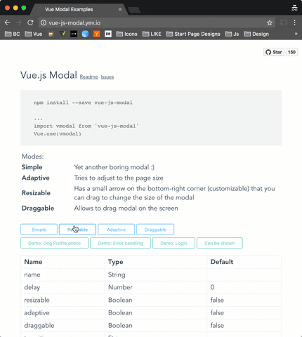
Simple to use, highly customizable, mobile friendly Vue.js 2.0+ modal. http://vue-js-modal.yev.io/
(now works with SSR)
Demo: http://vue-js-modal.yev.io/
Install
npm install vue-js-modal --saveHow to use
Include plugin in your main.js file.
import vmodal from 'vue-js-modal'

Vue.use(vmodal)
Create modal:
<modal name="hello-world">
  hello, world!
</modal>
Call it from anywhere in the app:
methods: {
  show () {
    this.$modal.show('hello-world');
  },
  hide () {
    this.$modal.hide('hello-world');
  }
}
SSR
Include plugin in your nuxt.config.js file:
module.exports = {
  plugins: ['~plugins/vue-js-modal']
}
And your plugins/vue-js-modal.js will look like:
import Vue from 'vue'
import VModal from 'vue-js-modal/dist/ssr.index'

Vue.use(VModal)
For full demo please look at demo/server_side_rendering
Properties
| Name | Required | Type | Default | Description |
|---|---|---|---|---|
| name | true | [String, Number] | Name of the modal | |
| delay | false | Number | 0 | Delay between showing overlay and actual modal box |
| resizable | false | Boolean | false | If true, allows to resize modal window, keeping it in the center of the screen. |
| adaptive | false | Boolean | false | If true, modal box will try to adapt to the window size |
| draggable | false | [Boolean, String] | false | If true, modal box will be draggable. |
| transition | false | String | Transition name | |
| classes | false | [String, Array] | 'vue--modal' | Classes that will be applied to the actual modal box, if not specified, the default 'vue--modal' class will be applied |
| width | false | Number | 600 | Width |
| height | false | Number | 300 | Height |
| minWidth | false | Number | 0 | The minimum width to which modal can be resized |
| minHeight | false | Number | 0 | The minimum height to which modal can be resized |
| pivotX | false | Number (0 - 1.0) | 0.5 | Horizontal position in %, default is 0.5 (meaning that modal box will be in the middle (50% from top) of the window |
| pivotY | false | Number (0 - 1.0) | 0.5 | Vertical position in %, default is 0.5 (meaning that modal box will be in the middle (50% from left) of the window |
Events
| Name | Description |
|---|---|
| before-open | Emits while modal is still invisible, but was added to the DOM |
| opened | Emits after modal became visible or started transition |
| before-close | Emits before modal is going to be closed. Can be stopped from the event listener calling event.stop() (example: you are creating a text editor, and want to stop closisng and ask user to correct mistakes if text is not valid) |
| closed | Emits right before modal is destoyed |
Example:
<template>
  <modal name="example"
         :width="300"
         :height="300"
         @before-open="beforeOpen"
         @before-close="beforeClose">
    <b>{{time}}</b>
  </modal>
</template>
<script>
export default {
  name: 'ExampleModal',
  data () {
    return {
      time: 0,
      duration: 5000
    }
  },
  methods: {
    beforeOpen (event) {
      console.log(event)
      // Set the opening time of the modal
      this.time = Date.now()
    },
    beforeClose (event) {
      console.log(event)
      // If modal was open less then 5000 ms - prevent closing it
      if (this.time + this.duration < Date.now()) {
        event.stop()
      }
    }
  }
}
</script>
This example, initializes time variable every time the modal is being opened.
And then forbits closing it for the next 5000 ms
Other
Close button
If you want to have a Close (x) button in the top-right corner, you can use "top-right" slot for it. There is deliberately no predefined Close button style - you will have to implement/use your own button.
Example:
<template>
  <modal name="foo">

    <div slot="top-right">
      <button @click="$modal.hide('foo')">
        ❌
      </button>
    </div>

    Hello, ☀️!

  </modal>
</template>
Draggable handler
Draggable property can accept not only Boolean but also String paramenters. With String value, you can specify a CSS selector to the element which will be a "handler" for dragging.
Example:
<modal name="bar" draggable=".window-header">
  <div class="window-header">DRAG ME HERE</div>
  <div>
     Hello, 🌎!
  </div>
</modal>
Developers
To run an example:
# Clone repo

git clone https://github.com/euvl/vue-js-modal.git

# Build main library

cd vue-js-modal
npm install
npm run build

# Build and run demo

cd demo
npm install
npm run dev