
Package Exports
- vue-notification
This package does not declare an exports field, so the exports above have been automatically detected and optimized by JSPM instead. If any package subpath is missing, it is recommended to post an issue to the original package (vue-notification) to support the "exports" field. If that is not possible, create a JSPM override to customize the exports field for this package.
Readme


Vue.js notifications
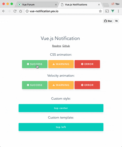
Demo: http://vue-notification.yev.io/
Install
npm install --save vue-notificationHow to
In main.js:
import Vue           from 'vue'
import Notifications from 'vue-notification'

/*
or for SSR:
import Notifications from 'vue-notification/dist/ssr.js'
*/

Vue.use(Notifications)
In App.vue:
<notifications group="foo" />In any of your vue files:
this.$notify({
  group: 'foo',
  title: 'Important message',
  text: 'Hello user! This is a notification!'
});
Anywhere else:
import Vue from 'vue'

Vue.notify({
  group: 'foo',
  title: 'Important message',
  text: 'Hello user! This is a notification!'
})
Custom instance configuration
All configurations are optional.
| Name | Type | Default | Description |
|---|---|---|---|
| name | String | notify | Defines the instance name. It's prefixed with the dollar sign. E.g. $notify |
| componentName | String | notifications | The component's name |
Props
All props are optional.
| Name | Type | Default | Description |
|---|---|---|---|
| group | String | null | Name of the notification holder, if specified |
| type | String | null | Class that will be assigned to the notification |
| width | Number/String | 300 | Width of notification holder, can be %, px string or number.Valid values: '100%', '200px', 200 |
| classes | String/Array | 'vue-notification' | List of classes that will be applied to notification element |
| position | String/Array | 'top right' | Part of the screen where notifications will pop out |
| animation-type | String | 'css' | Type of animation, currently supported types are css and velocity |
| animation-name | String | null | Animation name required for css animation |
| animation | Object | $* |
Animation configuration for Velocity animation |
| duration | Number | 3000 | Time (ms) animation stays visible (if negative - notification will stay forever or until clicked) |
| speed | Number | 300 | Speed of animation showing/hiding |
| max | Number | Infinity | Maximum number of notifications that can be shown in notification holder |
| reverse | Boolean | false | Show notifications in reverse order |
| ignoreDuplicates | Boolean | false | Ignore repeated instances of the same notification |
| closeOnClick | Boolean | true | Close notification when clicked |
$ = {enter: {opacity: [1, 0]}, leave: {opacity: [0, 1]}}
API
  this.$notify({
    // (optional)
    // Name of the notification holder
    group: 'foo',

    // (optional)
    // Class that will be assigned to the notification
    type: 'warn',

    // (optional)
    // Title (will be wrapped in div.notification-title)
    title: 'This is title',

    // Content (will be wrapped in div.notification-content)
    text: 'This is <b> content </b>',

    // (optional)
    // Overrides default/provided duration
    duration: 10000,

    // (optional)
    // Overrides default/provided animation speed
    speed: 1000

    // (optional)
    // Data object that can be used in your template
    data: {}
  })
Title and Text can be HTML strings.
Also you can use simplified version:
this.$notify('text')Groups
If you are planning to use notification component for 2 or more completely different types of notifications (for example, authentication error messages in top center and generic app notifications in bottom-right corner) - you can specify group property which is essentially a name of notification holder.
Example:
<notifications group="auth"/>
<notifications group="app"/>this.$notify({ group: 'auth', text: 'Wrong password, please try again later' })Position
Position property requires a string with 2 keywords for vertical and horizontal postion.
Format: "<vertical> <horizontal>".
- Horizontal options:
left,center,right - Vertical options:
top,bottom
Default is "top right".
Example:
<notifications position="top left"/>Style
You can write your own css styles for notifications:
Structure:
// SCSS:

.my-style {
  // Style of the notification itself

  .notification-title {
    // Style for title line
  }

  .notification-content {
    // Style for content
  }

  &.my-type {
    /*
    Style for specific type of notification, will be applied when you
    call notification with "type" parameter:
    this.$notify({ type: 'my-type', message: 'Foo' })
    */
  }
}
To apply this style you will have to specify "classes" property:
<notifications classes="my-style"/>Default:
.vue-notification {
  padding: 10px;
  margin: 0 5px 5px;

  font-size: 12px;

  color: #ffffff;
  background: #44A4FC;
  border-left: 5px solid #187FE7;

  &.warn {
    background: #ffb648;
    border-left-color: #f48a06;
  }

  &.error {
    background: #E54D42;
    border-left-color: #B82E24;
  }

  &.success {
    background: #68CD86;
    border-left-color: #42A85F;
  }
}
Custom template (slot)
Optional scope slot named "body" is supported.
Scope props:
| Name | Type | Description |
|---|---|---|
| item | Object | notification object |
| close | Function | when called closes the notification |
Example:
<notifications group="custom-template"
               position="bottom right">
   <template slot="body" slot-scope="props">
    <div>
        <a class="title">
          {{props.item.title}}
        </a>
        <a class="close" @click="props.close">
          <i class="fa fa-fw fa-close"></i>
        </a>
        <div v-html="props.item.text">
        </div>
    </div>
  </template>
</notifications>
Width
Width can be set using a string with a percent or pixel extension (if simple number is not enough).
Examples: '100%', '50px', '50', 50
Velocity Animation
Plugin can use use Velocity library to make js-powered animations. To start using it you will have to manually install velocity-animate & supply the librarty to vue-notification plugin (reason for doing that is to reduce the size of this plugin).
In your main.js:
import Vue           from 'vue'
import Notifications from 'vue-notification'
import velocity      from 'velocity-animate'

Vue.use(Notifications, { velocity })
In the template you will have to set animation-type="velocity".
<notifications animation-type="velocity"/>The animation configuration consists of 2 objects/functions: enter and leave.
Example:
/*
 * Both 'enter' and 'leave' can be either an object or a function
 */
animation = {
  enter (element) {
     /*
      *  "element" - is a notification element
      *    (before animation, meaning that you can take it's initial height, width, color, etc)
      */
     let height = element.clientHeight

     return {
       // Animates from 0px to "height"
       height: [height, 0],

       // Animates from 0 to random opacity (in range between 0.5 and 1)
       opacity: [Math.random() * 0.5 + 0.5, 0]
     }
  },
  leave: {
    height: 0,
    opacity: 0
  }
}
<notifications
animation-type="velocity"
animation="animation"/>Cleaning
To remove all notifications, use clean: true parameter.
this.$notify({
  group: 'foo',
  clean: true
})
FAQ
Check closed issues with FAQ label to get answers for most asked questions.
Development
To run an example:

# Build main library

cd vue-notification
npm install
npm run build

# Build and run demo

cd demo
npm install
npm run dev

# Run tests
npm run test

# Watch unit tests
npm run unit:watch