
Package Exports
- vue-notification
This package does not declare an exports field, so the exports above have been automatically detected and optimized by JSPM instead. If any package subpath is missing, it is recommended to post an issue to the original package (vue-notification) to support the "exports" field. If that is not possible, create a JSPM override to customize the exports field for this package.
Readme
Vue.js notifications
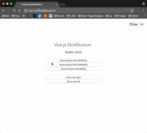
Demo: http://vue-notification.yev.io/
Install
npm install --save vue-notificationHow to
In main.js:
import Vue           from 'vue'
import Notifications from 'vue-notification'

Vue.use(Notifications)
In App.vue:
<notifications />In any of your files:
this.$notify({
  title: 'Important message',
  text: 'Hello user! This is a notification!'
});
Props
All props are optional.
| Name | Default | Description |
|---|---|---|
| group | name of the notification holder, if specified | |
| width | 300 | width of notification holder |
| classes | 'vue-notification' | list of classes that will be applied to notification element |
| position | 'top right' | part of the screen where notifications will pop out |
| animation | $$$ | Velocity animation configuration |
| duration | 3000 | how long notification stays on screen (if negative - notification will stay forever or until clicked) |
| speed | 300 | speed of the animation |
| reverse | false | show notifications in reverse order |
$$$ = {enter: {opacity: [1, 0]}, leave: {opacity: [0, 1]}}
Slot
Optional scope slot named "body" is supported.
Scope props:
| Name | Type | Description |
|---|---|---|
| item | Object | notification object |
| close | Function | when called closes the notification |
Example:
<notifications group="custom-template"
               position="bottom right">
   <template slot="body" scope="props">
    <div>
        <a class="title">
          {{props.item.title}}
        </a>
        <a class="close" @click="props.close">
          <i class="fa fa-fw fa-close"></i>
        </a>
        <div v-html="props.item.text">
        </div>
    </div>
  </template>
</notifications>
API
  this.$notify({
    // Name of the notification holder
    group: 'foo',

    // Class that will be assigned to the notification
    type: 'warning',

    // Title (will be wrapped in div.notification-title)
    title: 'This is title',

    // Content (will be wrapped in div.notification-content)

    text: 'This is <b> content </b>'

    // Overrides default/provided duration
    duration: 10000,

    // Overrides default/provided animation speed
    speed: 1000
  })
Title and Text can be HTML strings.
Style
You can write your own css styles for notifications:
Structure:
// SCSS:

.my-style {
  // Style of the notification itself

  .notification-title {
    // Style for title line
  }

  .notification-content {
    // Style for content
  }

  &.my-type {
    /*
    Style for specific type of notification, will be applied when you
    call notification with "type" parameter:
    this.$notify({ type: 'my-type', message: 'Foo' })
    */
  }
}
To apply this style you will have to specify "classes" property:
<notifications classes="my-style"/>Default:
.vue-notification {
  padding: 10px;
  margin: 0 5px 5px;

  font-size: 12px;

  color: #ffffff;
  background: #44A4FC;
  border-left: 5px solid #187FE7;

  &.warn {
    background: #ffb648;
    border-left-color: #f48a06;
  }

  &.error {
    background: #E54D42;
    border-left-color: #B82E24;
  }

  &.success {
    background: #68CD86;
    border-left-color: #42A85F;
  }
}
Animation
Library uses Velocity javascript animations, the format is:
/*
 * Both 'enter' and 'leave' can be either an object or a function
 */
animation = {
  enter (element) {
     /*
      *  "element" - is a notification element
      *    (before animation, meaning that you can take it's initial height, width, color, etc)
      */
     let height = element.clientHeight

     return {
       // Animates from 0px to "height"
       height: [height, 0],

       // Animates from 0 to random opacity (in range between 0.5 and 1)
       opacity: [Math.random() * 0.5 + 0.5, 0]
     }
  },
  leave: {
    height: 0,
    opacity: 0
  }
}
<notifications animation="animation" />The reason for using Velocity is that it gives more control over animating Height of the element which is important for this library
Development
To run an example:

# Build main library

cd vue-notification
npm install
npm run build

# Build and run demo

cd demo
npm install
npm run dev